As reqeusted by the support team I’m opening up a new thread.
I’m using two different top bars for mobile and desktoop. everthing seems to work so far, exept that the spacing of the top bar for mobile and tablet screens are different.
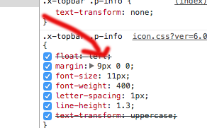
The code looks like this.
@media (max-width: 970px) {
.x-topbar .p-info {
   padding-top:0.8em;
  padding-bottom:0.5em;
}
}
When I cange the value for padding-top to 0, the spacing of the mobile view is too small; changing it to a higher value, it looks good on mobile but is too big on tablet…
Can you maybe provide a code to separately adjust the values for mobile and tablet screens?
Thanks!