Hi,
We have 4 columns on the computer version of our website (www.stixdrinks.com/shop).
On the mobile version we would like to display two columns (not one - as it currently is)
Please can you advise how to do this.
Thanks,
Tom
Hi,
We have 4 columns on the computer version of our website (www.stixdrinks.com/shop).
On the mobile version we would like to display two columns (not one - as it currently is)
Please can you advise how to do this.
Thanks,
Tom
Hi Tom,
Try adding this custom CSS on Theme Options > Global CSS:
@media (max-width: 480px){
 .woocommerce .cols-4 li.product{
    width: 48%;
}
}
Hope this helps.
Thats great, Thanks.
Is there a way to reduce the font size for the titles (only on mobile). They are now missing the pricing and are too large.
Thanks,
Tom
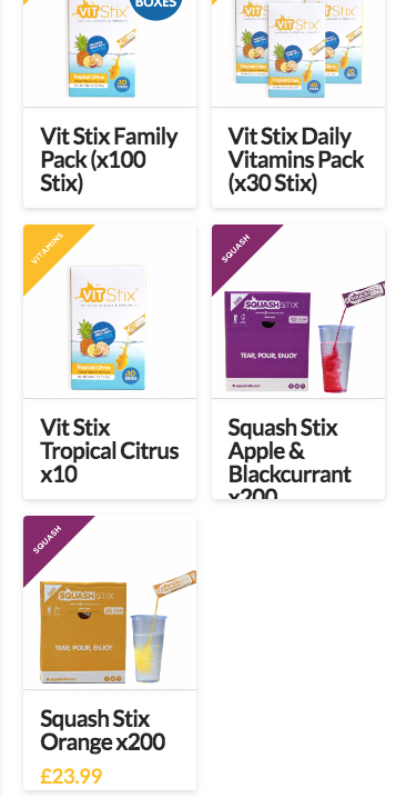
Hey Tom,
In the code provided by Lely, you need to add additional code inside the media query which makes the code inside it work only on the specified screen size. Update the code to this:
@media (max-width: 480px){
 .woocommerce .cols-4 li.product{
    width: 48%;
}
.woocommerce li.product .entry-header h3 {
    font-size: 94%;
}
}
Change the font-size value as per your design requirement.
Hope that helps.
This topic was automatically closed 10 days after the last reply. New replies are no longer allowed.