-
AuthorPosts
-
December 26, 2014 at 10:05 am #171335
 AlexanderKeymaster
Hi Luke!
Great use of Integrity! It’s also really nice to see BuddyPress and bbPress being used here. Thanks for sharing!
December 27, 2014 at 9:28 am #171760 Tobias AParticipant
Hi
i have built the website for our handballclub with X.
Check it out here: http://hclauchringen.de/Cheers Tobias
December 27, 2014 at 11:03 am #171810 neilhartleyParticipant
Hi,
http://www.unmask.us is a site featuring song meanings but only from the songwriters themselves. It’s a very simple and clean design based on Renew.
Wishing you all a happy and prosperous 2015!
NeilDecember 27, 2014 at 1:22 pm #171847 RadModerator
Nice but simple looking sites guys! Thanks for sharing 😉
December 27, 2014 at 4:00 pm #171913 tonybridgeParticipant
Kia ora everyone:
I think it is at a point where I can kick it out of the nest and into the world.
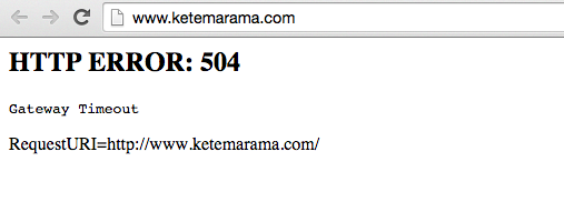
http://www.ketemarama.comFeedback REALLY appreciated.
AND a BIG THANK YOU to the developers. At last! A theme with real support, not a surly Romanian developer who doesn’t want to know!December 27, 2014 at 9:56 pm #172033 RadModerator
Oh snap! All I could see is this Tony,

You should fix that for best user experience 🙂
Cheers!
December 28, 2014 at 10:02 am #172266 stravelakisBlocked
Hey all! my first site is http://freehappyhuman.com
December 28, 2014 at 1:25 pm #172317 KyleKeymaster
Looking good, Lambros! It’s great to see some of the Extensions in use as well – I noticed Smooth Scroll and Content Dock.
December 28, 2014 at 4:24 pm #172361 amber sParticipant
http://intothesoul.com – would love your feedback guys… x
December 29, 2014 at 8:41 am #172747 Ryanbrown1987Participant
Hey all, Just beginning to build mine but I have some of the graphics done and using a lot of collage surrealism in it, let me know what you think, it’s a travel blog.
December 29, 2014 at 11:38 am #172869 KyleKeymaster
Coming together nicely…
Ryan, the header graphic is a bit much to me personally on each page as it makes it so the user has to scroll down a lot to get to the content (which is why they are there). I think creative headers like that are more effective in a single use on the homepage for example.
December 29, 2014 at 6:29 pm #173086 gleechowParticipant
Hi Tobias,
can you please let me know what next event calendar listing is that ?
thanks
December 30, 2014 at 3:35 am #173279 Tobias AParticipant
Hi Gleechow,
I´m using the timely event calender plugin, which you can get here: https://time.ly/wordpress-calendar-plugin/
German translation and also a testreport (if needed) I found here: http://fotobeam.de/wordpress/test-event-kalender-wordpress-plugin/
But at least one tip: Install updates not until few days after the release – sometimes they have bugs.
Good luck.Tobias
December 30, 2014 at 1:43 pm #173655 Donni HParticipant
Amber – your site looks great! So much content – wow!
Ryan – agree regarding comment above about the header – the artwork is fantastic!
I’d like to share my humble site, a long term work in progress: http://www.nativesymbols.info
Thanks guys!
December 31, 2014 at 3:02 am #174001 KyleKeymaster
Hi Donni,
Thanks for sharing. I think you’re off to a good start. If I may share a couple ideas: 1) The font size is hard to read in that top section. I would look into making it larger (about the size that the type is in that second paragraph with the background image) then make that more universal across the site. 2) The recent posts are hard to read they are that narrow. Perhaps consider stacking them but using the more vertical layout then the horizontal one. 3) I would continue to work on the finer formatting things related to color scheme/spacing, etc. I think that would start to help bring everything together under a cohesive direction.
Many thanks for your (repeat) business!
-
AuthorPosts
- <script> jQuery(function($){ $("#no-reply-7201 .bbp-template-notice, .bbp-no-topic .bbp-template-notice").removeClass('bbp-template-notice'); }); </script>
