-
AuthorPosts
-
July 31, 2015 at 12:05 am #346019
 UnSungHer03Participant
I can’t for the life of me figure out a way to put padding and margins on column and sections that are only visible or take effect on a desktop or pad browser.
the reason i would like to do this is the way things stack on a phone, having certain elements with padding or margins severely distorts them on a screen with smaller resolution…
is there a way to make padding and margin css specific only to browsers of certain size, but standard on phones?
July 31, 2015 at 12:52 am #346050 John EzraMember
Hi there,
Thanks for writing in! Yes there are a few ways. One way is via custom CSS and media queries. This will limit the CSS to specific screen size range, that is specified. Another way is to use the visibility buttons within Cornerstone. You can create separate layouts for mobile and desktop by using these. Then you could just put margins and padding changes on the layout you want.
If you need further assistance, please provide us your URL and itemize what you would like to achieve. If it is within our scope we will be able to tailor our advice.
Hope this helps – thanks!
July 31, 2015 at 1:00 am #346051UnSungHer03Participanti want to basically remove all the padding and margin custom css from this page on mobile devices: http://www.strongeight.com
July 31, 2015 at 1:18 am #346078John EzraMemberHi there,
Thanks for updating the thread! Would you mind telling us where your changes are found specifically? Did you make theme through cornerstone using the inline styles field or the settings on each element or did you use Custom CSS. If you did use custom CSS, you can put them all under a media query with a minimum screen size, so when the screen size goes below a the set width, the style will revert back to original.
Example:
@media (min-width:480px) {
   .custom-css1 {
     margin: ...;
     padding: ...;
   }
}
This would make it so all sizes above 480px will keep your custom CSS, while 480px below will revert back to X standard CSS.
If you edited the areas individually via settings or inline style field, then we will need to know which areas on the page you have them so we can advise you accordingly.
Hope this helps – thanks!
July 31, 2015 at 1:37 am #346092UnSungHer03Participantunfortunately i did it in visual composer in individual elements like column and rows – is there a type of tag i could use specific to padding for columns and sections?
July 31, 2015 at 2:15 am #346121Paul RModeratorHi,
You can add this under Custom > CSS in the Customizer.
@media (max-width: 767px){
    body .no-pm {
        padding:0 !important;
        margin:0 !important;
    }
}
After that, you can add no-pm in the class field of the element you want to remove margin and padding in mobile.
eg.
Column Element – http://screencast.com/t/3a7ATPcOhN3
Content band element – http://screencast.com/t/IHzI4oQVt9Y3Hope that helps.
August 1, 2015 at 5:10 am #347073UnSungHer03Participanthey there, this no-pm tag works phenomenal except for one section on this page:
http://www.strongeight.com/sports-performance/battle-tested-sports-performance/
down at the section where it says:
PROGRAM DETAILS
TO QUALIFY FOR COMPLETE PERFORMANCE DEVELOPMENT YOU MUST:the no-pm class isn’t taking effect only in that column, could you look into why this isn’t working? it works perfectly everywhere else.
August 1, 2015 at 5:28 am #347084ChristopherModeratorHi there,
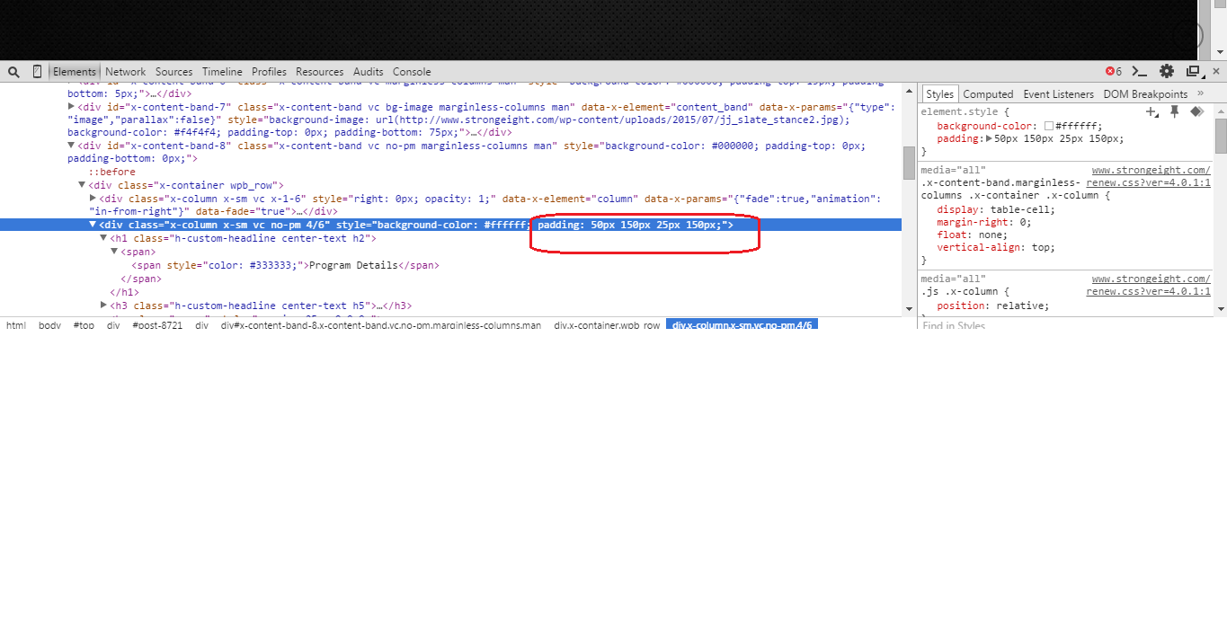
Please remove the padding from this column.
Hope that helps.
August 1, 2015 at 5:38 am #347086UnSungHer03Participantbut that padding keeps the format on the desktop, the CSS i was given removes that css formatting on the mobile device but not on this column
August 1, 2015 at 5:43 am #347087ChristopherModeratorHi there,
Please remove padding from column. Add another class to this column like
my-classand add this CSS.@media (min-width:979px){ .my-class{ padding: 50px 150px 25px 150px; } }Hope it helps.
August 1, 2015 at 6:15 am #347090UnSungHer03ParticipantBeautiful!
You guys truly are the Best! I love this theme! – Terrified to switch to cornerstone though. t’s been such a learning curve to master visual composer
August 1, 2015 at 6:19 am #347091UnSungHer03ParticipantNever mind – now it’s not showing the formatting on the desktop. It is correct on the phone though…
August 1, 2015 at 6:26 am #347094ChristopherModeratorHi there,
Did you add the class ? I don’t see new class added also
padding: 50px 150px 25px 150px;is still there in style field of column.If you follow the thread and the issue persist please provide us with login credentials.
Thank
August 1, 2015 at 6:29 am #347097UnSungHer03ParticipantSorry about that. Looks like it was a darn caching issue. Seems to be fixed now! Thanks again!
August 1, 2015 at 6:31 am #347100ChristopherModeratorYou are welcome.
-
AuthorPosts
- <script> jQuery(function($){ $("#no-reply-346019 .bbp-template-notice, .bbp-no-topic .bbp-template-notice").removeClass('bbp-template-notice'); }); </script>
