-
AuthorPosts
-
January 29, 2015 at 4:22 am #194204
 Adam TParticipant
Hi, is it possible to expand my subheadings by clicking on the subheading itself as well as the little arrows to the right?
For example –
http://www.animalsitting.co.uk
I would like to be able to click services, and open up the lower headings rather than clicking the 2 little down arrows?
Many Thanks, Adam
January 30, 2015 at 12:44 am #194950 FriechModerator
Hi Adam,
Thanks for writing in! Regretfully, at this time I am not entirely certain what it is you would like to accomplish based on the information given in your post. If you wouldn’t mind providing us with a little more clarification on what it is you’re wanting to do (a link to a similar example site would be very helpful, or perhaps some screenshots), we’ll be happy to provide you with a response once we have a better understanding of the situation.
Thanks.
January 30, 2015 at 10:27 am #195318Adam TParticipantHi there,
Please try
http://www.hmv.com on an ipad
When you click the menu, you can click on the subheadings themselves and they will expand.
I would like this on my site, so that you can click the subheadings themselves and the menu expands, rather than just clicking the arrows to expand the menu?
Also on a second note, when you open up my menu subheadings on an iPad, they seem to be very squashed to the left, and the click down arrows are on top of some of the sub headings rather than to the side of them?
Many Thanks, Adam
January 31, 2015 at 4:56 am #195837ZeshanMemberHi Adam,
Thanks for writing in!
This behaviour is to make the parent link clickable as well as to open the submenu (upon clicking the arrows). However, if you wish to expand the submenu on clicking the parent menu link as well, you can try to achieve it by adding following code under Custom > JavaScript in the Customizer, though it will disable the parent menu link:
jQuery(document).ready(function($) {
   var subMenuLink = $('.x-navbar .mobile .x-nav li.menu-item-has-children > a');

   subMenuLink.click(function(e) {
     e.preventDefault();
     $(this).siblings('.sub-menu').slideToggle(300);
   });
});
Thanks!
February 1, 2015 at 8:48 am #196511Adam TParticipantHi there,
I have just added that code but it doesn’t seem to have had any effect?
Many Thanks, Adam
February 1, 2015 at 6:09 pm #196749RadModeratorHi Adam,
I don’t see the script added at your site.
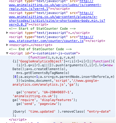
Please re-add and clear your caching plugin’s cache.Thanks!
February 2, 2015 at 4:28 am #196994Adam TParticipantHi there,
Sorry, I had added it to the css rather than the javascript, it works great now thank you.
Can you just have a quick look at how the mobile menu is formatted when viewed on an iPad?
If you click the mobile menu button and then services, the arrows are covering some of the sub heading ‘Home Cat Boarding’
How can I change this?
Many Thanks, Adam
February 2, 2015 at 6:58 am #197114ZeshanMemberHi Adam,
Upon checking, you have added some custom CSS code in your website that’s causing this issue (see: http://prntscr.com/604gzd). To fix it, try inserting following CSS under Custom > CSS in the Customizer:
@media (max-width: 979px) {
    .col-6 .menu-item {
        width: auto !important;
    }
}
Cheers!
February 2, 2015 at 7:07 am #197125Adam TParticipantHi there,
That worked perfectly thank you!
Adam
February 2, 2015 at 8:50 am #197219ChristopherModeratorYou’re welcome.
December 12, 2015 at 10:31 am #704032 bsjolingParticipant
Lovely stuff… just done the same and cured an irritating niggle
great stuff, many thanks
December 12, 2015 at 11:19 am #704071 -
AuthorPosts
- <script> jQuery(function($){ $("#no-reply-194204 .bbp-template-notice, .bbp-no-topic .bbp-template-notice").removeClass('bbp-template-notice'); }); </script>
