Tagged: x
-
AuthorPosts
-
October 13, 2016 at 5:23 am #1214415
 Jayd KParticipant
Hi there,
I wondered if you could help me? I am having trouble removing the logobar text. I am using Renew, and I do know how to remove the logobar text in the navbar, as have done it a few times before using the following code:
` .x-brand.text {
display: none;
}.x-brand.img {
display: none;
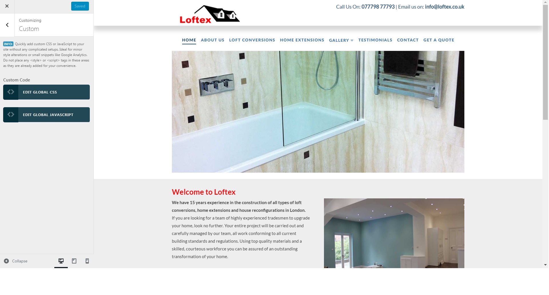
}`However this time, it only removes the logobar text in the desktop view, and NOT in the mobile view. In this particular project, the client wanted his logo and contact details in the topbar, and the navbar appearing to be separate. I have achieved this using the above code. I have achieved this before with no trouble.
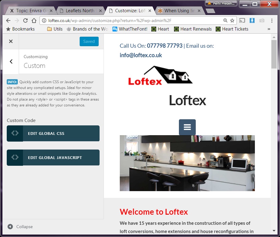
However, I am confused as to why the logobar text is showing up on mobile. This hasnt happened to me before, and I have tried to tweak the code to no avail.
I am posting my CSS code below to let you know all the things I have tried in the Customiser, but sadly that pesky logobar text keeps cropping up on mobile and I have no idea why. Any help greatly appreciated.
CUSTOMISER TEXT
media only screen and (min-width: 980px) {
  .masthead.masthead-inline {
    position: relative;
  }

.x-topbar {
    text-align: right;
}

.x-colophon.bottom {
   padding: 20px 0px;
}

  .x-topbar {
   box-shadow: 0 15px 20px rgba(136, 136, 136, 0.33);
   width: 100%;
   max-width: 100%;
}

  .x-navbar .x-brand {
  display: none;
}

  .x-topbar {
  padding-bottom: 3;
}

  .x-navbar .x-brand {
  margin-top: 0;
}


.topbar_contacts ul {
    margin-bottom: -15px!important;
}

  body .masthead-inline .desktop .x-nav {
    float:none;
}

body .x-navbar .desktop .x-nav>li {
    display: inline-block;
    float: none;
    vertical-align: top;
}


  .x-brand.text {
    display: none;
}

.x-brand.img {
    display: none;
}

  .x-btn-navbar:after {
    content: 'MENU';
}
IMAGES
Here are some images for reference too, so you can see what I mean. I have also used code to show the word ‘menu’ next to the mobile button and this also isn’t working, which is very strange as have never had issues with it before.
The url is http://www.loftex.co.uk Many thanks and looking forward to hearing from you!
Desktop View (no logo in navbar working perfectly fine)
Mobile View (logo text suddenly appearing! Mobile button does not say ‘menu’ despite correct code!)
 October 13, 2016 at 7:53 am #1214569
 JoaoModerator
Hi There,
Your code is being opened by a media query that was never closed.
That meaning:
You have on top of code:
@media only screen and (min-width: 980px) {`
This makes everything that is below it be affected just above 980px. At some point you should add another } and that would close the media query.
I am not sure what was your goal with this and until what point you want it to affect your code, but add another } any where above
  .x-brand.text {
    display: none;
}

.x-brand.img {
    display: none;
}
And the code will work for every device.
Hope that is clear.
Joao
October 13, 2016 at 8:04 am #1214594Jayd KParticipantHi there,
Oh my goodness! What a silly mistake!
Thanks so much for bringing my attention to that, I feel a bit embarrassed. 😉If it isnt working next time, I’ll look for an error like that.
It must have come from a copy and paste error.Thanks again!
October 13, 2016 at 10:54 am #1214891LelyModeratorYou’re welcome Jayd!
Cheers!
-
AuthorPosts
- <script> jQuery(function($){ $("#no-reply-1214415 .bbp-template-notice, .bbp-no-topic .bbp-template-notice").removeClass('bbp-template-notice'); }); </script>
