Tagged: x
-
AuthorPosts
-
July 28, 2016 at 6:29 am #1106940
 markwestParticipant
Hi,
I’ve managed to add a DIV to my navbar by following previous posts.
However, I’m stuck trying to get that DIV positioned and aligned correctly within the nav bar.
I’d like the DIV to align to the right hand edge of my menu-bar (with right margin customisable) please?
The site is in maintenance mode right now as I’m building it – but I’ve attached the _navbar.php and custom css I’ve used so far. The original php example used x-container-fluid – but this caused the nav bar to go full width rather than contained.
Thanks in advance for your help.
Mark
CSS:
@media (min-width: 980px) {
.lb-text {
font-size: 1.8em;
float: left;
font-weight: bold;
padding-top: 10px;
margin-left: 500px;
color: #fff;
}
}July 28, 2016 at 8:22 am #1107046 JoaoModerator
Thanks for writing in! To assist you with this issue, we’ll first need you to provide us with your URL. This is to ensure that we can provide you with a tailored answer to your situation. Once you have provided us with your URL, we will be happy to assist you with everything.
July 30, 2016 at 4:23 am #1109962markwestParticipantThis reply has been marked as private.July 30, 2016 at 4:33 am #1109970Rue NelModeratorHello Mark,
Thanks for providing the information. To resolve this issue, please update your custom css code. You can make use of this code instead:
@media (min-width: 980px) {
    .lb-text {
        display: block;
        float: right;
        font-size: 1.8em;
        font-weight: bold;
        padding-top: 10px;
        margin-top: 30px;
        color: #fff;
    }
}
Feel free to add
margin-right: 20px;if necessary. It should look like this:
http://prntscr.com/bzejorWe would loved to know if this has work for you. Thank you.
July 30, 2016 at 6:14 am #1110021markwestParticipantThis reply has been marked as private.July 30, 2016 at 7:15 am #1110059ChristopherModeratorHi there,
Please update your code to :
<div class="lb-text">
<span class="fa-stack fa-lg"><i class="fa fa-phone fa-stack fa-fw" style="font-size:0.6em;"></i></span>01672 513583</br>
<span class="fa-stack fa-lg"><i class="fa fa-envelope fa-stack fa-fw" style="font-size:0.6em;"></i></span>4 London Road, Marlborough Wiltshire, SN8 1PH
</div>
Add this CSS :
span.fa-stack i {
    border: 2px solid;
    border-radius: 100%;
    vertical-align: text-bottom;
    margin-right: 10px;
}
Hope it helps.
August 8, 2016 at 1:13 am #1121649markwestParticipantThank you for your help so far 🙂
The header bar is now mostly looking ok when in desktop mode, but there a few issues when you start to shrink it down for smaller screens that I’d love some help resolving please.
Firstly, when you start to shrink the width there is a point before the mobile menu appears where the phone number <DIV> jumps from the right hand side to the left, next to the logo and turns grey instead of white.
I’d like it to stay white all the time and only move when the mobile menu appears.
Secondly, when the site is displayed on smaller devices I’d like the logo, phone number and mobile menu to stack – in that order please?
Currently when the mobile menu appears it sits over the top of the logo.
Thank you for your help as I learn more about X and how to make these things happen – it is greatly appreciated.
Cheers
Mark
August 8, 2016 at 1:38 am #1121661Paul RModeratorHi Mark,
I went ahead and added the necessary adjustments.
I added this in your custom CSS
@media (max-width: 979px) {
.x-brand {
    display: block;
    float: none;
}

.lb-text {
    display: block;
    float: none;
    width:100%;
    text-align:left;
  margin-top:0;
}
}
Kindly check on your end.
Thanks
August 8, 2016 at 1:55 am #1121671markwestParticipantHi Paul,
Thanks, that’s looking better – but there is still a small width range where the telephone div shifts to the left (now under the logo) before the menu changes from desktop to mobile.
Is it possible for the logo/menu to move/change at the same width please?
Thanks very much
MarkAugust 8, 2016 at 2:05 am #1121677Paul RModeratorHi Mark,
Yes, it’s possible.
I changed this line
@media (max-width: 979px)
to this
@media (max-width: 959px)
Please check.
Thanks
August 8, 2016 at 2:08 am #1121682ChristopherModeratorHi there,
I’m not able to replicate the issue.
Please see :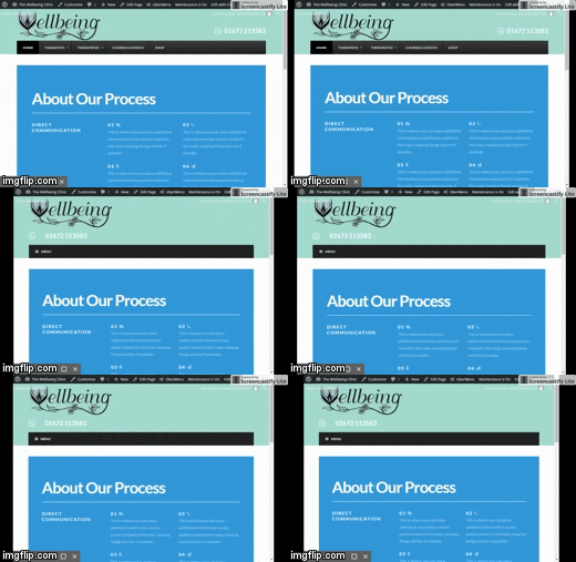
Thanks.
August 8, 2016 at 2:29 am #1121701markwestParticipantHi Paul,
Thanks for resolving.
Hi Christopher,
I think you took a look just a few minutes after Paul’s change which resolved the problem 🙂
Thanks both
MarkAugust 8, 2016 at 2:33 am #1121706ChristopherModeratorYou’re welcome.
August 8, 2016 at 2:48 am #1121724markwestParticipantJust to clear this up for my future understanding – how does the theme know when to change from desktop to mobile. I understand the media queries – but why was the DIV element moving before the menu changed – what caused that to jump across and change text colour/format?
I’m trying to understand how these things all tie together. Is there somewhere in the theme where you can set different output widths – or is it only done with media queries?
Thanks for your swift and thorough help.
MarkAugust 8, 2016 at 2:56 am #1121728Paul RModeratorHi Mark,
It is done by Media queries and by default the menu should change to mobile button @ 979px
But in your case since you are using ubermenu the default is 959px
You can change the breakpoint of the ubermenu mobile button under ubermenu settings.
http://screencast.com/t/c0hHDv9vcS8
Thanks
-
AuthorPosts
- <script> jQuery(function($){ $("#no-reply-1106940 .bbp-template-notice, .bbp-no-topic .bbp-template-notice").removeClass('bbp-template-notice'); }); </script>
