Hey @cdb788,
Thanks for writing in! I just wanted to take a moment to give a little rundown on how the v2 Image Element functions within the scope of the builder and how you can achieve this look, along with some other solutions that you might want to explore as well that might better suit what you’re after. The v2 Image Element is built on a few foundational pieces of information:
-
It always has a wrapping element. Since users can choose to turn images into “linked images” that are wrapped in an
a tag, instead of having inconsistent markup that could lead to confusion or stylistic patterns that break easily, we opted to always ensure that the v2 Element always has a wrapping tag (either an a when a link as previously mentioned or else, a span). This wrapping element is what gets our x-image class for the element, and can be used to consistently target all v2 Image Elements regardless of if they are linked at not. To target the image within, we can use .x-image img across all contexts.
-
They are “retina ready” by default. This is something that before developing any of our v2 Elements, many of our users responded with in a poll letting us know that having all image content be “retina ready” by default was very important. What this effectively means is that the physical dimensions of the image itself are halved in the markup to ensure that images always look crisp on high pixel density devices (i.e. “retina” displays). Having the consistent outer container with the image inside allows us to have extra options to play with and how we want to use those retina settings. This setting can be disabled if desired, but is recommended to be left on. We will go into some of this in more detail in an example below.
-
It is
display: inline-block; by default. This gives us the characteristics of being block-level, but allows it to sit inline with text. This is useful for patterns such as having an image, headline, and text, all of which you want to be centered within a column. If the Element was block-level, you could center all of the text within the column using text-align on that parent, but the image would need to be centered using margin. Being inline-block allows tricks such as centering a whole column with text-align include images into that pattern, which is generally a somewhat expected behavior due to the type of content images are.
Once you understand those, you’ll have a little better picture of why things are the way they are, what we’re working with, and how to alter it if needed (also, if what we’re trying to do isn’t necessarily the best fit for the element). To see how this all fits together, let’s take an example and explore some of our options to see how it will effect the overall appearance, as well as the markup and style changes that are happening behind the scenes. We’ll use the screenshot below as our starting point:
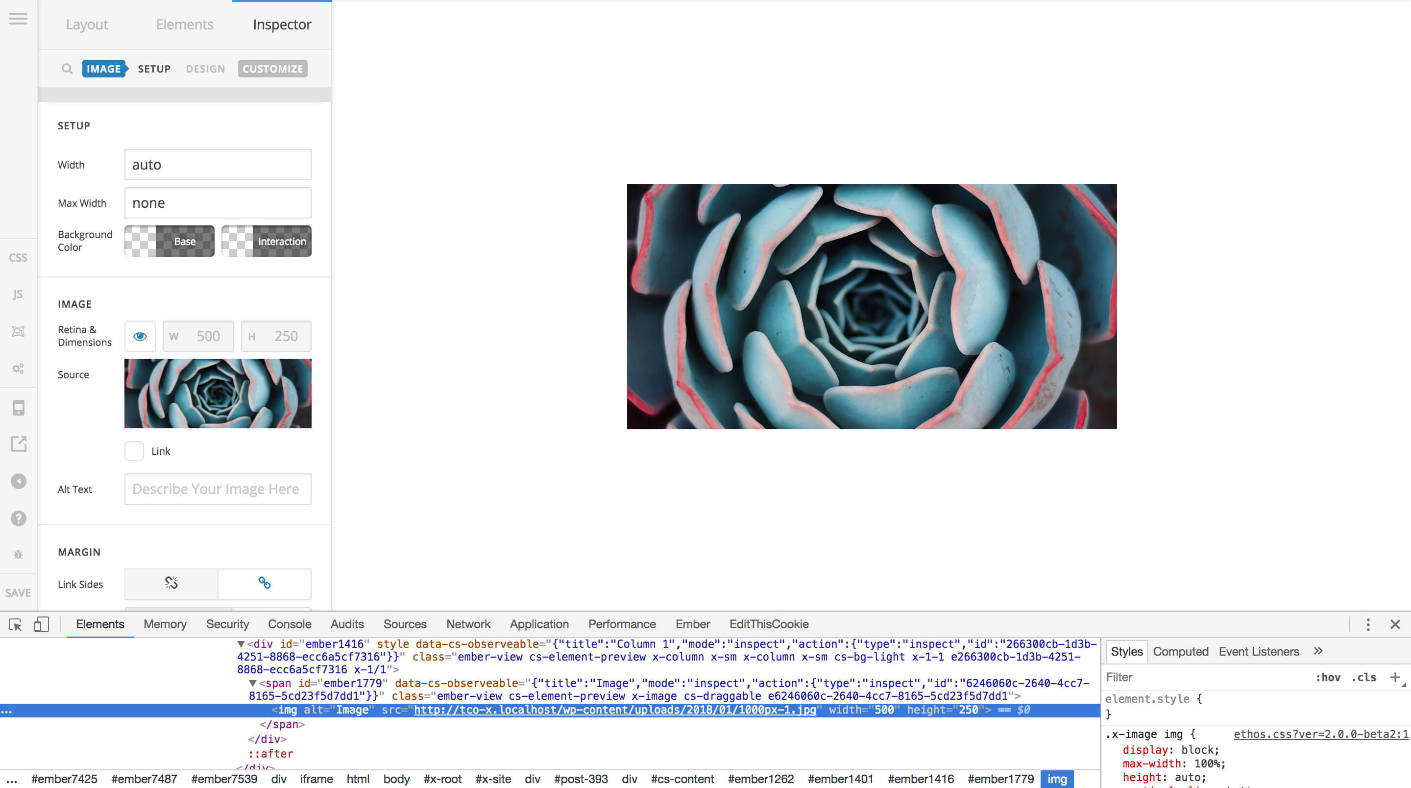
What we have here is an image that is physically 1000px wide. This is in a Section that has the centered text option enabled, which is how the image is being centered within that Section. You’ll notice that the image doesn’t appear to be 1000px wide though. This is due to the default “retina” option that is enabled when you select an image. You can see in the control section titled Image that the very first setting is labeled Retina & Dimensions. Currently, the retina option is on, so the dimensions are being halved to 500 for the width attribute and 250 for the height attribute. These value are output directly onto the img element, and allow us to constrain its dimensions out of the box (but we can still style it as desired, giving us the flexibility we might need). We can begin to see the importance of the outer container if we decide to style the Image a big by giving it some padding and a box-shadow:
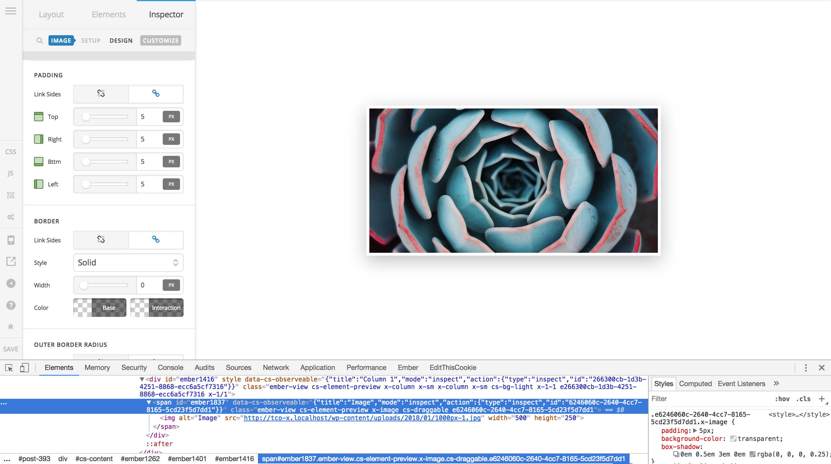
Here we’ve added 5px of padding all around the image and a large styled box-shadow. If this were applied directly to the image, it would actually constrain the image even more, potentially resulting in an undesirable fuzzy look which can happen when the image is only slightly compressed. However, if you could inspect that image directly you would find that the image itself is still 500x250, our exact retina dimensions.
Alright, so let’s remove the styling above and disable the “retina” dimensions and allow the original image size to be on full display:
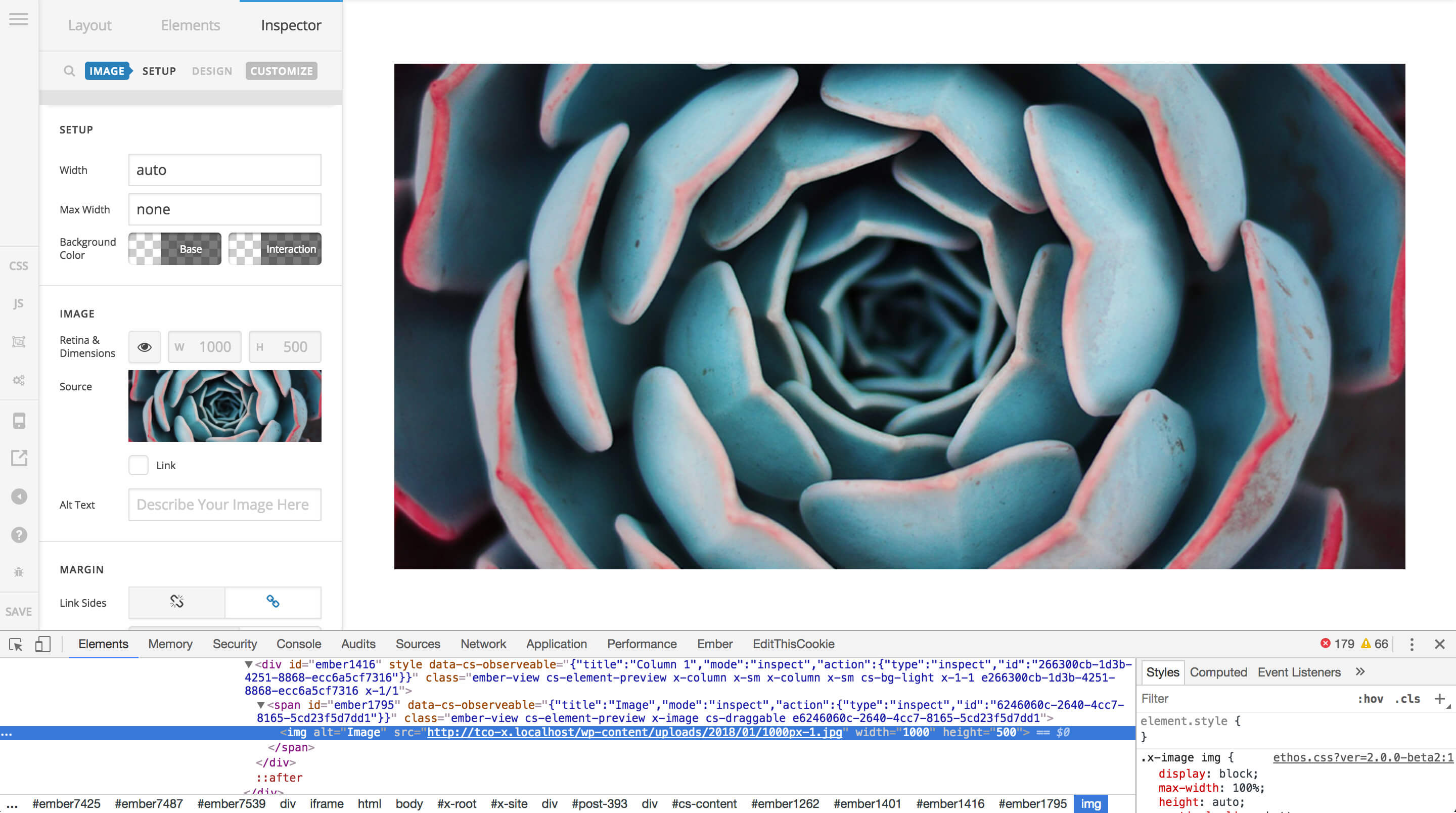
By unchecking the eye next to our dimensions, we’ve allowed the original dimensions of the image to be set on the img element, which does not constrain it at all. While this image looks decent this way, certain images that rely on fine lines or simple shapes and colors would look quite fuzzy on high pixel density screens this way. However, since we’re using a standard photo, things don’t look too bad, and we might even wish to make the image full width as you had noted in your post. Your first inclination might be to simply add 100% to the Width option in the Setup control box like so:
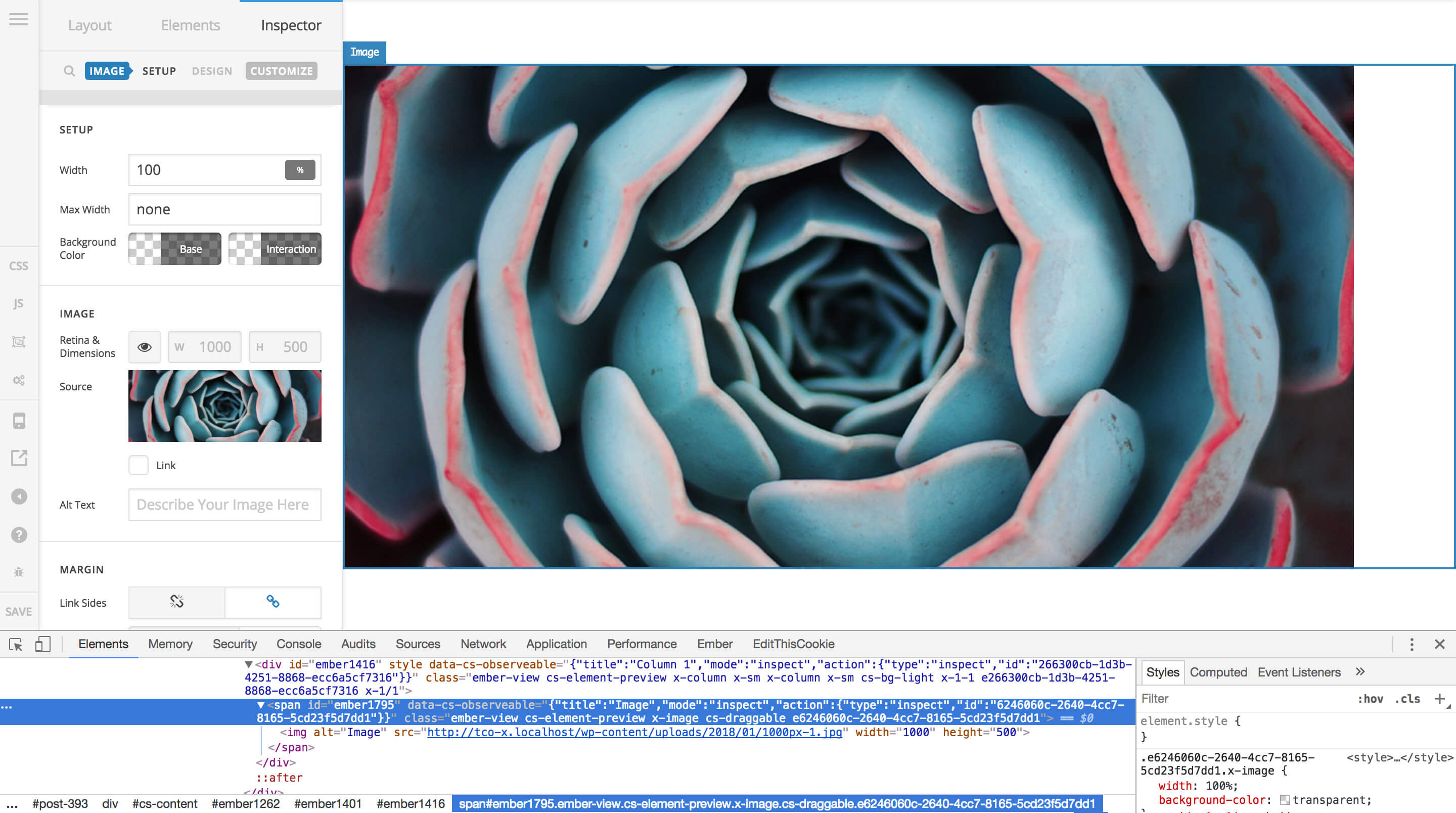
However, as you can see when we inspect the Element in the preview, while the Element itself is indeed spanning the entire width of the container, the image inside the Element is not. This is because the styling applied from the Width setting is going on the container around the img. If we wished to make the img inside the container span the entire width as well, we would need to use some custom CSS, which can be done in many ways:
- Using the page-level CSS editor in the builder to alter the image as needed.
- Adding a global style in the theme’s global CSS editor and adding that class to each image you wish to apply the style to.
- Adding a global style in a child theme’s CSS file and adding that class to each image you wish to apply the style to.
- While not yet available at this time (but soon to be released in the next major versions of Pro, X, and Cornerstone), our new Element CSS feature will allow you to dynamically target child elements directly on the element itself. It’s almost like “inline CSS on steroids,” in the sense that you’re adding the CSS “inline” in the builder, but the CSS itself is dynamically processed and included with the builder’s generated CSS (so do keep in mind it’s not physically “inline” on the Element).
All that being said, for your particular example, it seems with what you’re looking to accomplish there might be better options at your disposal. It would appear that what you’re wanting to do is display an image that already has text within it, and have that span the entire width of a container as sort of a banner or “hero” image. For this type of application, you may find that using our Background Partial on a row with one column, and then placing text within that column is a better choice for many reasons. First, to learn more about the “Partials” used throughout the v2 Elements, make sure you check out this article:
There are tons of great resources within that article, but you will certainly want to check out the two available on the Background Partial. For instance, you could take your star background being used in your image and apply it to the background of the row, then within that row itself, use physical text to type out what you want in your message. This is an improvement upon a static image for a lot of reasons:
- The Background Partial is far more flexible, allowing you to include things like color overlays over your background image for easy tweaks in the browser, as well as being able to enable parallax for and engaging motion effect if desired.
- Using text within an image like this is generally considered an undesirable practice from multiple standpoints. Not only is it unable to be scanned and picked up by search engines for indexing, it is also inaccessible to users who might be browsing your website using assistive devices, such as screen readers.
- Using an actual Text Element for your text gives you greater real-time styling, similar to using the Background Partial. If down the road you decide that you don’t want your text to be white anymore and would prefer another color, you can simply update the color within the builder. Otherwise, you need to go find that PSD on your computer, update the color of the text, export the image, upload to your website, reassign within the builder, et cetera. Overall, you’ll likely find text to be a much cleaner choice in these situations.
I know that’s a bit of information to run through, but I wanted to make sure to provide a thorough foundational resource that helps to explain how the Image Element works and that others might find helpful as well. I’m going to go ahead and close down this thread as this topic has already strayed from the original question and I don’t want it to continue on and get too long, but if you happen to have any further questions, don’t hesitate to open a new thread and reference this response and we can answer anything you might need.
Cheers!


