Swap columns on desktop

Hi there,

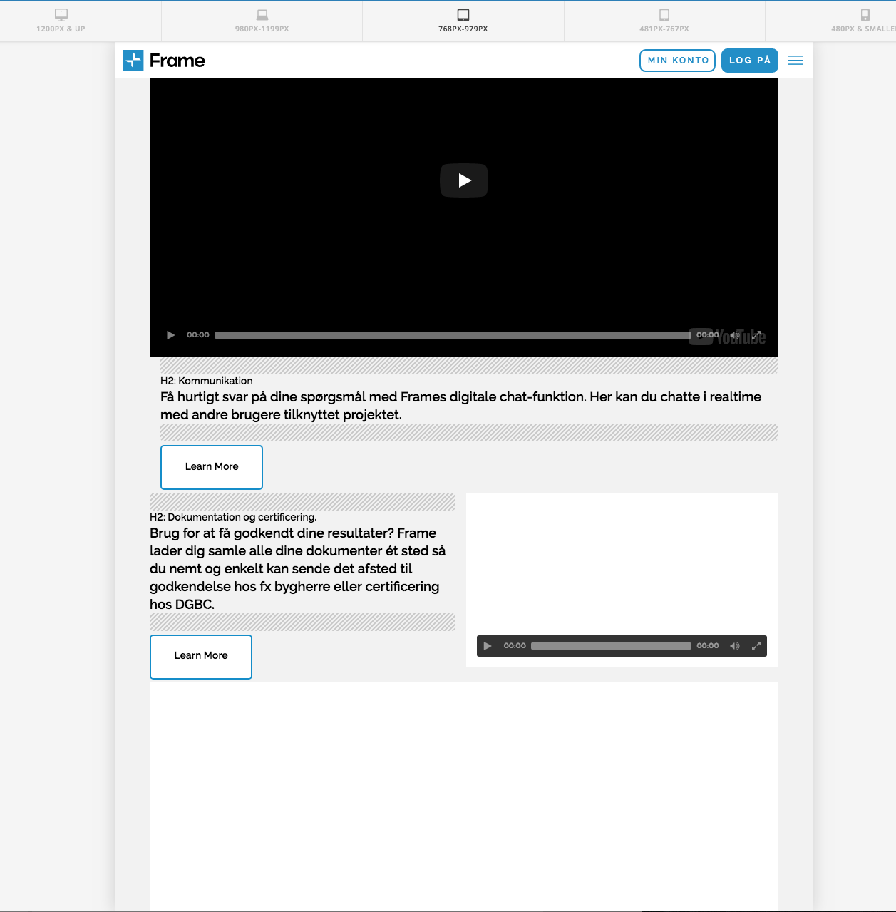
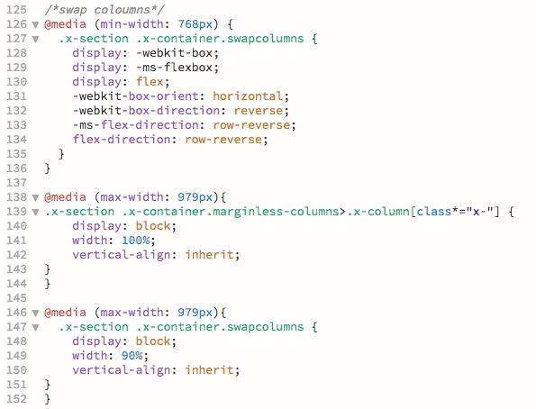
I followed this great guide: https://xthemetips.com/swap-columns-mobile/416/ and its working perfectly. However, for my purpose, I would like to skip what is happening to the layout on screens between 978-769 px. I would like to swap columns on screens min. 980px and then align the content vertically on from 979px and smaller. The current code align the columns vertically at 768 px and smaller. Can you help me adjust the CSS to achieve this?

Here is where I’ve added the effect on my website: https://frametest.knowledgeworker.dk/funktioner/

Thanks!

Actually, I have another problem with this page - suddenly my videos are not working. Maybe you can help me figure out why?

Hi @KnowledgeWorker,

Thanks for writing in.

Add this in your X > Theme Options > CSS:

@media (max-width: 979px){
.x-section .x-container.marginless-columns>.x-column[class*="x-"] {
    display: block;
    width: 100%;
    vertical-align: inherit;
} }

The code above will arrange your column earlier.

In regards to your video, as I checked the video URL it is now working or the video could not be found.

And also, I could see that there is a lot of error that could possibly stops the video to work. This could be a plugin or script problem. Remove your scripts to test if it is causing the video to stop or deactivate 3rd party plugins one by one to see what is conflicting.

Let us know how it goes.

Thanks.

Hi there,

Thanks for the code! It does, however, not work on the rows with class swapcolumns, which means the code only applies on every second row. Please see attached image.

I made it work by targeting them separately, but would it be possible to just adjust the code making the columns swap in the first place so I do not need the extra code for screens between 978-769 px?

In regards to the videos, we made it work - it was something with the links.

Hi,

I’m feeling a little bit confused regarding which columns you want to apply this effect on and which not and on which devices. However, I’m pretty sure that using the pseudo element :not() in CSS should help you in excluding certain classes that would make your code clean. Check this reference to know more about it:
https://developer.mozilla.org/en-US/docs/Web/CSS/:notebook:

Thanks.

Hi there,

Sorry for the confusion. I’m not trying to exclude any columns - I want to apply it to all columns to achieve a consistent layout. I achieved this with the CSS in the attached image above. What I am asking is, if it is possible the merge some of the styling to have less code.

Line 125-136 is the code from the guide I followed making my columns swap.

In order to skip what is happening to the layout on screens 978-769px your colleague provided me with the code line 138-144. However, this code only apply to every second row, which does not give me a consistent layout.

Then I added the code in line 146-152 and achieved what I wanted.

I’m just asking, if I could adjust the original code (line 125-136) to achieve the same result or if I should just go with the above? I tried to adjust the code, didn’t succeed, hence I’m asking you guys if you can help me :slight_smile:

Thanks.

Hi,

Thanks for the clarification, I can understand the situation now, please replace the previously mentioned CSS snippet by my colleague here, with:

@media (max-width: 979px){
.x-section .x-container.swapcolumns, .x-section .x-container.marginless-columns>.x-column[class*="x-"] {
    display: block;
    width: 90%;
    margin-left: 5%;
}
}

That should do the trick,
Thanks.

Thanks, it worked!

You are very welcome :slight_smile:

This topic was automatically closed 10 days after the last reply. New replies are no longer allowed.