Header Not Moving When Scrolling Smaller Devices

Hi there,

The header follows me down the page of the website really well until I try the same on 481px-767px and also on 480px and smaller. Please can you help me have this feature on all devices? If it requires that I set up a custom header then please advise me how to do that while transferring over my existing settings for the header. Many thanks! See: www.flowcise.com

Mark

Hi Mark,

The fix header is intentionally turned off in mobile by design. If you need to it to be fixed, you need to add the code below in Theme Options > CSS

@media (max-width: 979px) {
.x-nav-wrap.mobile {
    background: #000;
    background: #000;
    padding: 0 20px;
}

.x-navbar.x-navbar-fixed-top {
    position:fixed;
}
}

Hope this helps

Hi @paul.r this is great thank you! One adjustment that I need to make - when the menu scrolls down on these smaller sizes the first section of the front page with the original header and menu loses that original height so when I scroll back up the section 1 text and the header logo overlap. Is there a way to prevent this from happening?

Also, how can I move the menu links slightly to the right so it lines up with the header text on these smaller screen/browser sizes?

Many thanks in advance!
Mark

Hi Mark,

I checked and it seems to be okay, no overlapping. But overlapping is just normal our intentionally made it float. Would you mind providing a screenshot?

Thanks!

On some screens it doesn’t overlap but I think on all screens the original height of the header is lost and impacts the full page section effect I want to keep.

Hello Mark,

Please have your custom css updated and use this instead:

@media (max-width: 979px) {
	.x-nav-wrap.mobile {
	    background: #000;
	    background: #000;
	    padding: 0 20px;
	}

	.x-navbar.x-navbar-fixed-top {
	    position:fixed;
	}

	.x-navbar .x-container.max.width {
		width: 96%;
	}

	.x-main.full {
	    margin-top: 75px;
	}
}

Please check out your homepage again.

Hi @RueNel this is great. I have noticed on these smaller browser sizes that the first section, column - in purple color is slightly out of line with the header and the same with each of the headings on the following sections. How to fix so each are in line? See attachments. Also can you please advise how I can get the header text of each section to match the size of the text inside the header logo (not the logo itself). I have been experimenting with the theme options typography but can’t seem to find the size needed. Many thanks

Hey Mark,

The slight misalignment in mobile is because of the previously given code.

Please find that part in the code and change the max-width value to 100%.

Alternatively, you can add a custom max-width in the same breakpoint to the row containing the headline.

You can do that by adding this code in the Row’s Element CSS.

@media (max-width: 979px) {
  $el.x-container {
    max-width:97%;
  }
}

You can also use a combination of the methods I’ve mentioned and you can use them to each individual rows so they’ll align too.

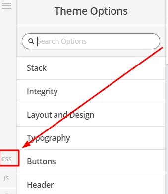
To match the font size of the headline to your logo, regretfully, you’ll need to manually play with the Font Size value of the Headline element. This can’t be adjusted in Theme Options > Typography and this applies to all V2 elements in general.

Hope that helps.

@christian_y super helpful thank you!

You’re welcome. Glad we’re able to help.

This topic was automatically closed 10 days after the last reply. New replies are no longer allowed.