Hello,
Is it possible to perform this update in future versions? (pro).
I want to customize the size and position of the background images for each screen size.
Example with this link : (pdf : https://we.tl/t-RqasO2ftaU )
Or do you have a solution that I don’t know about?
Thanks for reply 
Christophe
1 Like
Hi Christophe,
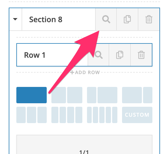
A workround for this is to add a custom CSS through the section’s Element CSS option.
Please try this code in the section’s Element CSS:

@media (min-width: 1200px) {
  $el .x-bg .x-bg-layer-lower-image {
		background-position: center !important;
    background-size: cover !important;
  }

  $el .x-bg .x-bg-layer-upper-image {
		background-position: center !important;
    background-size: cover !important;
  }
}

@media (min-width: 980px) and (max-width: 1199px) {
  $el .x-bg .x-bg-layer-lower-image {
		background-position: center !important;
    background-size: cover !important;
  }

  $el .x-bg .x-bg-layer-upper-image {
		background-position: center !important;
    background-size: cover !important;
  }
}

@media (min-width: 768px) and (max-width: 979px)  {
  $el .x-bg .x-bg-layer-lower-image {
		background-position: center !important;
    background-size: cover !important;
  }

  $el .x-bg .x-bg-layer-upper-image {
		background-position: center !important;
    background-size: cover !important;
  }
}

@media (min-width: 481px) and (max-width: 767px)  {
  $el .x-bg .x-bg-layer-lower-image {
		background-position: center !important;
    background-size: cover !important;
  }

  $el .x-bg .x-bg-layer-upper-image {
		background-position: center !important;
    background-size: cover !important;
  }
}

@media (max-width: 480px)  {
  $el .x-bg .x-bg-layer-lower-image {
		background-position: center !important;
    background-size: cover !important;
  }

  $el .x-bg .x-bg-layer-upper-image {
		background-position: center !important;
    background-size: cover !important;
  }
}
Please update the values of the background in the code above accordingly.
Hope this helps.
1 Like
This topic was automatically closed 10 days after the last reply. New replies are no longer allowed.