Basics about configuring elements: Text, Image

Hello,
I’ve spent hours on the internet, including looking at your KB trying to learn how to design a webpage but couldn’t find the info to get me off the ground. Basically I’d like a webpage with an image and 3 words sliding in one at a time on top of the image: one word on the top part of the image, the 2nd word in the middle of the image, and the 3rd word on the bottom part of the image. Could you be so kind to guide me:

a) What element should I use for the image and words? What’s the difference btw “Headlines” & “Text”? Will the words be automatically responsive for different devices?

b) Should I create a new “row” for each word, & insert the image in the “section”?

c) How do I change the font? Under Inspector, “Font Family” only offers 3 options.

d) I’d like the 1st word to slide in and end somewhere on the left portion of the image, and the 3rd word to be on the right portion of the image - how do I achieve this?

e) If I like the image to fill up the whole page, what dimensions of the photo should I use? Should I use a portrait photo for the phone view, and a separate landscape photo for the laptop view?

f) If I like the word to slide in together with another image (i.e. each word is pre-affixed on top of a smaller image), I suppose I have to first photoshop the word onto that smaller image? In which case, what element should I use? Can I have these 3 smaller images (with wording) overlay on the static bigger image?

Hi There,

Thank you for writing in, you can set your image as the section’s background and then have 3 Rows (for each text) that should give you a head start.

Then you can enable the Fade In effect on the Column for your slide in effect.


The headline element is for headings, and the text element is for copy text/paragraphs. Use the rem or em unit for the font-size value and that will be responsive.

Configure your fonts on Font Manager, you can define as many fonts as you want in there. But commonly you should only use 2 to 3 fonts on your site.

That cannot be achieved by the column Fade In effect that I mentioned above, if this is what you need, then you need to create that portion of your page as a Slider, you can create a slider using the Revolution Slider extension.

Yes, that is one possible solution. But please show us what you already have first so we can provide a proper advice.

Yes, you can edit your smaller images to have the text embed, or you create all of them on the Revolution Slider layer by layer (this will give you more control over the images and text.)

Cheers!

Awesome, Friech- that was educational!

As a follow-up question:
A) I intend to have another image with also 3 similar words but this time I want these words to appear on the top part of the image. When I created a row for each of these 3 words, they spread across the whole section. Should I create empty rows below?

B) How do I fix the height of that section (containing the image)? On phone view, I like the image to take up the whole screen. But on a desktop, I like the image to take up 33% of the desktop. Likewise, how do I limit a row to say, 10% of the height of the section?

C) I did try to use Revolution Slider. But when I activated it, there was an error message on my Home page (something about the template agency not found). No matter how, I couldn’t rectify it after reading all the Support pages. So I’m quite scared to use it! Also someone said it slows down loading time on the phone. Is it still true?

Hi @iamwithU,

A) I’m not sure if I’m following it correctly. The row will always spread the whole section, perhaps what you need is columns? And even if you create an empty row, it will still spread to the entire section. Would you mind providing a mockup design of what you’re trying to achieve?

B) Please inspect your image and go to its Customize section then add this CSS to Element CSS input field.

$el {
width: 33%;
}
@media ( max-width: 767px) {
$el {
width: 100% !important;
max-width: 100% !important;
}
}

About the height, it varies depending on device relative to current width. So I’m not sure if it’s possible, unless if you’ll set it to static (like adding 300px to section’s inline style field) but it isn’t 10% less.

C) All features that use javascript could slow down on the phone. It’s how much active effects and content running at the same time. If you have a heavy content in your slider (animations, videos, large images) then it will really slow that, it could happen on desktop too. Hence, if it’ just simple then you’re okay :slight_smile:

About the error, the slider is missing. And you probably imported the demo without the Revolution Slider. You should select another slider instead, you can do that by editing your page and go to Slider : Above or Below Masthead section and change it.

Thanks!

I don’t understand 2 sentences in the above reply.
(1) May I know what you meant by this: “About the height, it varies depending on device relative to current width.”

What I meant by height of a row is this:
Say I want a row of text to appear on top of an image. I like the height of the text to take up only 10% of the height of the image. Is there a way to achieve this? Or do I just choose the font size? If I just fix the font size, how will the text vary on different screens, and if there are many more sections or images for the same webpage on a laptop? Should the height of the row not be relative to the section?

(2) Your last sentence: “You should select another slider instead, you can do that by editing your page and go to Slider : Above or Below Masthead section and change it.”

What is “another slider”? What other slider or option is there for me to choose? Which page do I edit? My problem is when I activated the Rev Slider, the error message appears on my Home Page. So should I edit it in my Home Page? What do I change to?

Hi @iamwithU,

  1. It’s not possible, it’s only the width the respond and the height varies depending on content. Plus narrow width could increase content height too, so 10% less or more isn’t going to work 100%. What you’re trying to maintain is aspect ratio and doing that on a standard row with standard content would require complex customizations.

I recommend creating it in revolution slider, it can maintain aspect ratio and automatically resize its content and layers. Then add it to your section, and the slider will define the width and height that you preferred.

  1. Your own created slider, you can select that and assign it. That missing slider isn’t imported along with the demo. But if you intend to only remove that message then edit your home page and find Slider - Masthead sections and deactivate it.

Standard Editing :

OR

Builder setting (cog icon)

But if your slider is added through the builder as an element, then just edit your home page in the builder and remove that element.

Thanks!

(1) I see what you mean.

(2) No, I have not created any slider at all. I was only exploring Revolution Slider. After I had installed Revolution slider in the WordPress dashboard, the error message appeared on my Home page. So I don’t understand what you mean by finding the “Slider - Masthead” section. There is no slider to begin with.

Curiously, where do I find the “Standard Editing or Buidler setting (cog icon)” pages?

Hello @iamwithU,

I am kind of getting confused. If you would like to remove the error message and then under Slider Above Masthead select Deactivate. However, if you would like to use Revolution Slider then I suggest you to install and activate the same and then import Demo contents.

You can find the cog icon in bottom left section of the page. Here is a screencast.

Thanks.

Your screencast is awesome - it’s very helpful. I wish most of your KB has screencast like yours to help non-techies like me. Thank you!

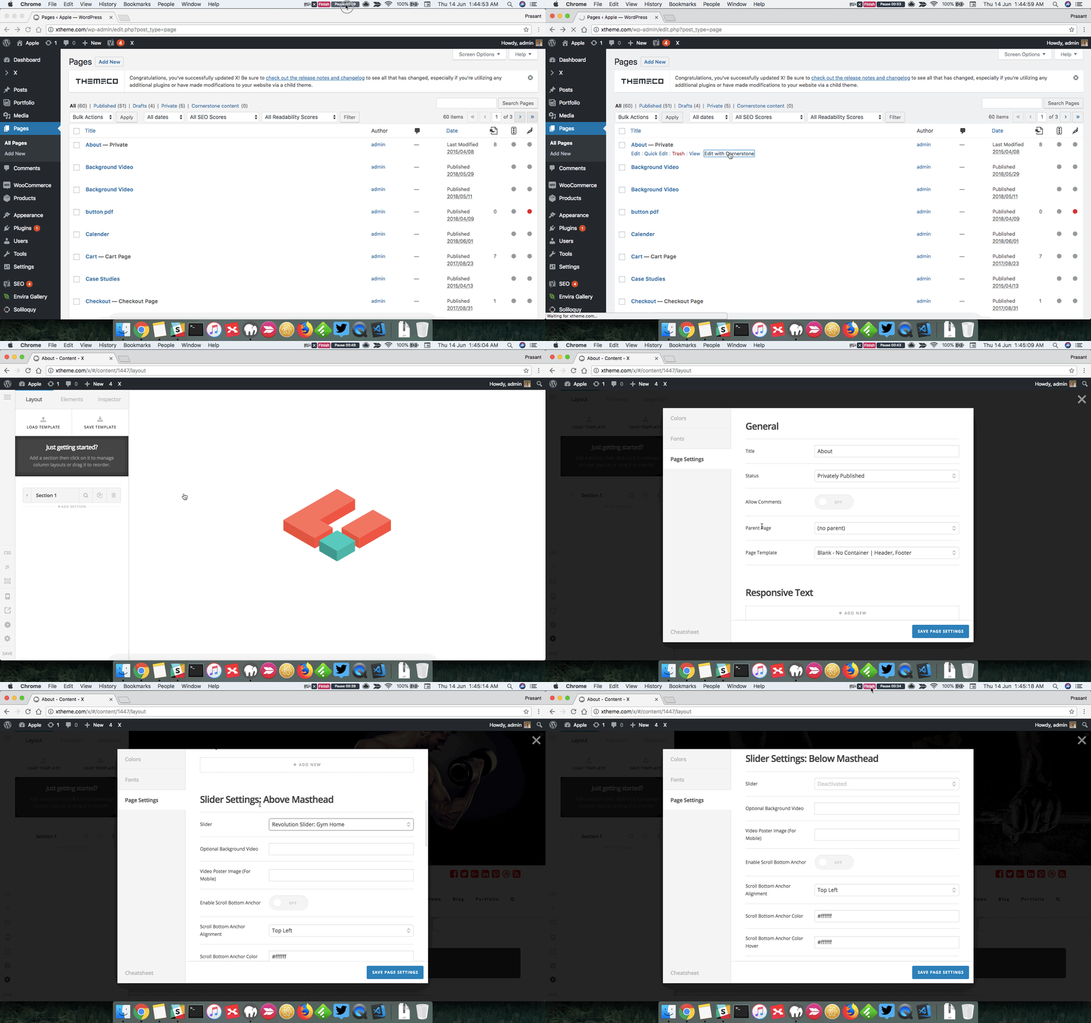
But if you see my screen shots, I have a slightly different version. Is it because my Cornerstone is a new version?

Screenshot 1 shows I am in Cornerstone.
Screenshot 2 is after I select the cog icon on the Editor pane (settings). It shows General.
Screenshot 3 is after I select the Meta Settings.

So as you can see, I don’t have Page settings like yours. Why is that so? More importantly, I don’t have Slider settings. Is that because I have not selected any Slider element?

To recap, what happens is this: I have tried designing a website using X Theme’s template -without any slider. I’m told that I should use Revolution Slider. So I go to WP Dashboard and installed the Revolution Slider. But an error message shows up to say “…agency not found”. Rad asked me to go to select “another slider” or “deactivate it”. But I have no slider to begin with. The only way for me to remove the error message on Home page is to un-install the Rev Slider… :frowning:

Hello There,

It seems that you are using incompatible X theme and Cornerstone version. Could you please update to the latest versions?
Our latest versions are:
- X theme 6.1.6
- Cornerstone 3.1.6

This latest release contains fixes for several issues so be sure to check out the changelog (http://theme.co/changelog/).

_After doing the updates, always remember to clear all caches (if you are using WP Rocket, WP SuperCache or W3 Total Cache) when updating so that the code from the latest release is always in use. This will help you to avoid any potential errors.-

Please let us know how it goes.

Hi RueNel,
Thanks for pointing out that my theme & Cornerstone need to be updated, which I did.
After that, I go to WP Dashboard, and under X “Validation”, I installed the “Slider Revolution”. Then I activated it in my WP Dashboard, under “Plugins”

Unfortunately, the error message (of some agency not found) appeared on my Home page, like before. To remove the error message, I need to uninstall the Slider Rev, and deactivate the plugin.

Hi There,

It seems the agency home slider is missing, please import it to your website.

http://www.mediafire.com/file/30dy639x398ti7g/agency-home.zip

How To Import Revolution Sliders
Step 1 - Go the the Revolution Slider tab in your WP Admin, and click the Import Slider button.

Step 2 - Choose the .ZIP file of the slider you'd like to import.

Step 3 - Once you've chosen the .ZIP file, an Import Slider button will appear.

Step 4 - Click the Import Slider button, and wait for it to finish uploading.

Step 5 - Once it's finished uploading, you will now see your imported slider in the list of Revolution Sliders available.

Let us know how it goes!

Thank you Thai, for your prompt reply. And thanks to you, I now see where I have to import slider. I did as you suggest, but I still get an error message - a different one. It says:
"Revolution Slider Error: Slider with alias restaurant-home not found. Maybe you mean ‘agency-home’.

Also, I tried selecting “Add Slider Template”, and chose one free slider template. A window appears as follows:

According to Themepunch support center, I have to choose: “examples-v5.x”

Where is my “plugin’s original download source”?

Grateful if you can point me in the right direction.

Hi @iamwithU,

What’s the same of your newly imported slider? Importing another will not hide the message since the missing one is still selected. I still recommend editing your page and change the selected slider. You can do that by clicking the cog icon and find the above or below masthead setting.

If your slider is added as builder’s element, then inspect the slider element and change the slider.

Though maybe the import failed too and the name is not listed and I like to check your current setup to see what caused this. Would you mind providing your login credentials in a secure note? You can download other free samples here https://revolution.themepunch.com/free-slider-exchange/

Thanks!

I finally found the “above or below masthead setting”. When I chose the only imported slider there, the error message disappears. But so did the rest of my Home page, leaving only the footer. Likewise, when I chose “deactivated”. Let me follow up on this later - perhaps my problem can be solved if I tried setting up a slider.

Meanwhile, I went to your link to download free samples, and after several hours, I finally found the download icon!

Hi @iamwithU,

Yes, the examples section got me confused too :slight_smile:

As for the slider, you’ll need to create a full-screen slider if your home page is meant to have a slider-content only. That should push the footer and make it taller.

Thanks!

This topic was automatically closed 10 days after the last reply. New replies are no longer allowed.