Architecture Portfolio design cloud

Hi,

I’m using the Architecture Portfolio of the design cloud.

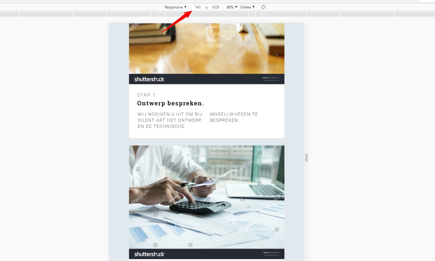
The normal template has a button below the background image. I didn’t need a button so I changed it to text. See image below:

But when I check this on mobile the image is gone. How can I get this image back? (This only happens on mobile.)

Hi There @djinnie

Thanks for writing in! Could you please check your hide during breakpoints in your elements and see if you have different elements set for mobile. Please refer to the following article on hide during breakpoints (https://theme.co/apex/forum/t/hide-during-breakpoint-explained/17378).

Also you can use the mobile button in the content builder,

Then check different device widths of your page.

If you’re still having issue, provide us with an example page URL to check your issue further.

Thanks!

Hi,

Thank you for your reply.

Hiding during breakpoints is not the issue as I just copied the row of the template. See attached note for the URL.

Hi @djinnie,

They are background images and they may appear differently on every screen this is the custom styling responsible for that

margin: calc(5rem + 15vw) 0px 0px 0px;

And looks like it’s only working on a container with float styling. You have two options to fix this

  1. Add this CSS to your Theme Options > CSS

    @media (max-width: 767px){
.x-column.x-sm {
    float: left;
    width: 100%;
    clear: both;
}
    }

  1. Or, instead of adding background images in your column, you can simply add the image as actual image element above those texts. And simply remove the margin styling of the texts (eg. calc(15rem + 15vw) 0px 0px 0px ).

Thanks!

Thanks. I chose for option 2.

Another question.

How can I make the left column the same height as the right column?

Hey @djinnie,

An easy and simple way to achieve that is to display flex your rows inside a section by using custom CSS. Below is a sample code that should be added in the section’s Element CSS.

$el .x-container {
    display:flex;
    flex-wrap: wrap;
}

Alternatively, you can assign a class to your section and change $el in the code with your class and put it in global or content CSS instead to make it reusable.

The code will make the columns inside the row the same height because of the display flex.

Flex wrap will make the columns stack in small screens.
To learn more how Flexbox works, please see our Flexbox tutorial at https://theme.co/apex/forum/t/using-flexbox/24851

Hope that helps.

This topic was automatically closed 10 days after the last reply. New replies are no longer allowed.