Course & Expansion Pack
Discover how one simple Cornerstone Element can supercharge your site building powers.
(Fun Fact: This changing background is an example of our new Slider in action)!
Our new Slider Element almost didn't happen…
As a matter of fact, it would have never seen the light of day were it not for one Devin Elston.
Who is Devin Elston I hear you asking? Well here he is with us in 2018.

Aside from being a long-time Themeco customer and all-around good man, Devin is a developer's developer. He has worked with some of the biggest brands including Hulu, CBS, and currently Beachbody.
He has the unique and rare ability to talk tech, wrangle code, and think strategically…all at the same time!
“You know what you need, Kyle” he said. “You need a Slider Element.”
Now let me pause for a moment and say that, as you can expect, we get a lot of requests for features. It comes with the territory, and it helps us keep Cornerstone the best website builder on the market! But just as soon as he said this, I had the answer in mind.
“Yeah, I agree buddy…that's why we already have a Slider Element.”
(Kyle 1, Devin 0).
“No, I'm not talking about the old Element…it's great and all, but what you really need is something more powerful.”
Again, I had the answer ready.
“Well, what about those 3rd party plugins we include? You can do anything you want with those.”
(Kyle 2, Devin 0).
At this point Devin shared his vision for a more powerful, native Slider Element. One that could take the simple elegance of what we had already built and give it more versatility, more customizability, more applications.
Needless to say, by the end of our conversation the game was over, and Devin won.
Fast forward a couple of years, and the team was discussing our development roadmap. On a whim I said, “What about the Slider Element?”
Now at this point our team goes through a rather unique and unorthodox process.
Instead of just moving forward with the idea—as though it is going to happen—we first try and poke holes in it.
- ‘Here's how it won't work…’
- ‘Here's where it breaks down…’
- ‘Here's why no one cares about that…’
- ‘Here's why no one should care about that…’
But as we started scaffolding the idea for the new Slider Element, pretty much the exact opposite happened.
We loved it! We loved what it represented, and more importantly we loved what it could become.
You see, most people think of a “slider” as those late 90s, early web monstrosities. They're generally slow, random, and serve almost no discernible engagement value. Honestly, most of them are eye sores.
People typically fill them with images or catchy slogans then slap it up at the top of their site—the most important real estate—without even a second thought.

To make matters worse, they can also be performance hogs. This will not only frustrate your visitors (who likes to sit and wait for a pointless slider to load?), they can also negatively affect your search rankings.
We know that Google tracks performance, engagement, and bounce rate as 3 important metrics. The last thing you want is to give them more reasons not to rank you.
Modern sliders, on the other hand, are much more versatile. Much more subtle. Much more effective.
There was just one big problem.
No one had really cracked this yet in any of the website builders on the market. At least not our vision for it.
The options were either too narrow (underwhelming), or you had to use a complicated plugin that is the very definition of overkill.
We saw this as a unique opportunity.
So we set out to redefine what a Slider could be and then create a native Element for our Cornerstone site builder.
For those who may not know, Cornerstone is the site builder behind two of the most popular WordPress themes on the market today—X and Pro.
As the vision came into focus, we realized that a slider could be used for so many different things. Used correctly, it could actually become the secret weapon in any site builder's toolkit.
Modern Sliders could be used for things like…
- Pricing Tables
- Timelines
- Headers
- Product Comparisons
- Even a Netflix-like presentation of content
- And much, much more
So fast forward a couple more years and…drum roll please…we are extremely proud to announce that our new Slider Element is live!
The vision that started from a conversation so many years ago is now a reality, and we couldn't be more excited (and so is Devin…more on that in a sec).
We took everything we knew about how modern sliders should be built and developed a world-class Element for our customers to use.
It's an incredible tool that allows you to natively build some absolutely remarkable web experiences, and the Element is free for all X and Pro customers!
As a matter of fact, within hours of the release, these were just a few of the comments we received about it (p.s. the slider you see below was built with the new Slider Element).
But we didn't want to stop there. There was so much more to this Element than meets the eye.
Yes, you can use it for simple things like testimonials or image galleries—or anything really—that's the power of the Element.
But what if you could look over the shoulder of Themeco lead developer Kory Wakefield as he deconstructs 15 different real life examples?
What if, in addition to looking over his shoulder, we gave you 15 incredible sliders? Things like pricing tables, timelines, headers, and more!
Sliders that were expertly crafted and conversion optimized—ready for immediate use or to use as the perfect starting point—a 100 hour head start!
That's exactly what you get in Modern Sliders, and we invite you to see all that is included in this course and expansion pack.
First up, let's look at the 15 custom sliders you'll receive.
Next, let's take a look at the course. In addition to all of those beautiful sliders, you get expert training from Themeco lead developer Kory Wakefield.
Kory built the first version of X, and is one of the most talented front-end developers in WordPress today.
Look over his shoulder as he takes you step-by-step through the settings and thought process for each slider. Check out just a sample of what you will learn.
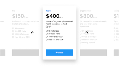
Video 1: Pricing Slider
21 Minutes
Discover how to use the new Slider Element to build beautiful pricing sections. You will learn…
- A neat trick for automatically adjusting all font sizes, padding, and positioning with the click of a button.
- How a simple transform can vertically center the scrolling arrows…the right way.
- How to make your slider “listen” to whether you're at the beginning or end of the chain. This is a super high-end polish item that will make all the difference in your final design.
- The best scroll effects to give your navigation items that subtle pop and animation.
- How the slide balance control can give the perfect transition animation for scrolling through different pricing levels.
Video 2: Fullscreen Slider
8 Minutes
Discover how to create an engaging fullscreen slider. You will learn…
- How to use a background color to make the transitions less jarring.
- Why you should NEVER use swipe interactions on a fullscreen slider.
- Why 100vh is the perfect min height, and what it will do for you (and your visitors).
- One of Kory's favorite Font Size hacks.
- One of Kory's favorite Mix Blend mode hacks.
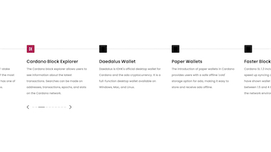
Video 3: Timeline Slider
14 Minutes
Truly limitless possibilities with this horizontal timeline slider. You will learn…
- The secret power of the “At Edges” container option when creating timelines or stepped journeys.
- How min-width can give you the perfect experience for mobile visitors.
- How to use a Looper to setup and mange the line of your timeline.
- How Done, Todo, and Goal can be used to show progress.
- How to use multiple scroll effects simultaneously.

Video 4: Hero Posts Slider
18 Minutes
Did you know you can create “Hero” Sliders? You can, and we'll show you how! You will learn…
- How the swipe interaction works and how to NOT trap your visitors.
- The power and importance of the Global Container.
- How to use multiple slide paginations.
- How to stagger effects to create a beautiful, animated sequence.
- How you can “hide” words until they come into view with overflow.
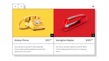
Video 5: Paged Product Slider
26 Minutes
Our De Stijl slider de jour (say that three times fast). You will learn…
- How to create responsive “pages” of content in your sliders.
- Why the Slide Pagination Element included in Cornerstone is so powerful.
- How to utilize the slider's “Gap” control as a faux border between your content.
- A creative centering trick for carousel sliders.
- How to style markup “proactively” in a way that it anticipates various types content and responds accordingly.

Video 6: Hero Prompt Slider
20 Minutes
This is us pushing the new Slider Element to the limit. You will learn…
- How adaptive heights can work with different slides in the sequence.
- The power of CSS Grid and how it can work with the Slider Element.
- How to make the content of your slides respond differently at different breakpoints.
- How to create a staggered transition…automagically.
- How to use a button or text to function as next or previous.
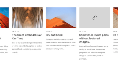
Video 7: Post Scroll Slider
11 Minutes
Discover a fun and modern way to display content. You will learn…
- How to to create a Netflix inspired presentation of content.
- The importance of link child interactions for this type of slider.
- How to use min height and max height to create a floor and ceiling.
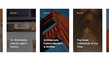
Video 8: Post Carousel Slider
16 Minutes
Learn how posts can be presented in a creative carousel. You will learn…
- A fun hack that allows the shadow on hover to match the tint/hue of your photo.
- How pagination can be both functional and/or aesthetic. Get creative!
- The difference between scrolling by slide and content.
- How to use “transition juggling” to create some truly inventive effects.

Video 9: Logo Carousel Slider
15 Minutes
Show off your trusted partners and biggest fans with this powerful engagement pattern. You will learn…
- How to leverage the “Auto” slide width feature, which allows for smooth transitions between slides with differing dimensions.
- The subtle visual tweaks that need to be implemented for this technique to work just right.
- How to use CSS filters in a creative way to draw the user's attention towards the current slide.
- A particular nuance of the CSS contrast() filter and how to get more mileage out of it.
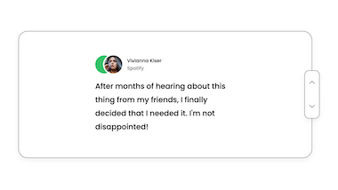
Video 10: Stacked Testimonial Slider
18 Minutes
Got a lot of people who love what you do? Share their words without overwhelming your visitors using this pattern. You will learn…
- How to use the Grid Element to position your slider markup and make easy changes to its sizing from one place.
- Why you need “auto” Grid rows to account for variable height content in your slides.
- How to create a faux vertical sliding container using the Stacked slider mode paired with scroll effects.
- How to implement a unique, vertically oriented slide navigation.
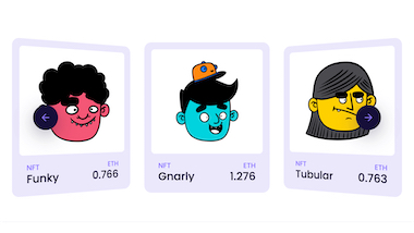
Video 11: Perspective Carousel Slider
20 Minutes
Take your scroll effects to a whole new level with this module. You will learn…
- The secret “balance” and “distance” properties applied to slides that can be used for all sorts of creative effects.
- How to create a 3D coverflow effect.
- About the new CSS clamp() function and how it can be used to wrangle tricky 3D rotations.
- How to pair interaction effects (i.e. the hover state) with scroll effects to create something truly unique.
- How to use responsive navigation for your sliders that create an ideal user experience across all devices.
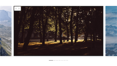
Video 12: Image Gallery Carousel Slider
17 Minutes
Who doesn't love a classy image gallery? You will learn…
- How to setup your markup in ways that will help you get more mileage out of your designs.
- About the special “escape hatch” Cornerstone's sliders have that can allow your content to always stretch fullwidth across your site, no matter now deeply nested your markup is.
- How to output optional content in your designs using Element Conditions.
- How to pair conditional content with scroll effects to draw the user's focus towards that content only when you want them to.
- How using blur on your backdrop filters can be implemented to reduce the visual noise around your content.
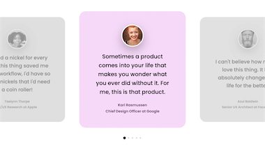
Video 13: Standard Testimonial Carousel Slider
14 Minutes
Got even more glowing recommendations from your customers? With this slider pattern you can make them shine. You will learn…
- How to vertically center your slider navigation on your content using a helpful CSS trick.
- Why you need the “No Pointer Events” option found in Cornerstone to properly implement your vertical navigation without obstructing your user experience.
- How the “Align” control can change the feel of your content with the click of a mouse.
- How to use scroll effects that pair CSS filters, transforms, and opacity so that inactive slides transition from a smaller, grayscale output to fullscale with color when becoming the “current” slide.
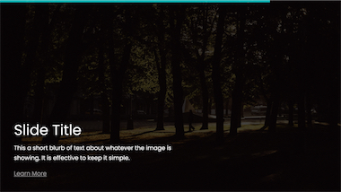
Video 14: Autoplay Progress Slider
21 Minutes
Custom UI Elements are easy to create with Cornerstone's Slider API. You will learn…
- All about the autoplay progress custom attribute and how to build a progress indicator.
- An incredibly inventive way to use clamp() that leverages this property.
- How to combine transform and opacity effects for a smooth transition between content.

Video 15: People Carousel Slider
11 Minutes
A simple and attractive slider that features a creative cut-off aesthetic. You will learn…
- How to add subtle movement using the “Autoplay” control to what would be an otherwise static section of content, helping it to stand out on your page.
- How to size slides using the vmin unit paired with a “floor” and “ceiling” to control your content.
- The difference between box-shadow() and the drop-shadow() filter.
- How to apply Photoshop-esque filters in the browser.


