Hey @redleaf,
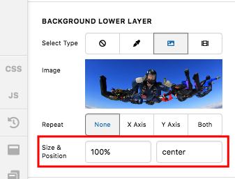
Sorry for the confusion. I have edited your page again and change the background size to 100% instead of cover. I then reset the minimum height if the column to 0 and I added a gap element so that on smaller screens, there will be enough space to display the background image.
And by the way, I would like you to try this demo here: https://davidwalsh.name/demo/background-size.html which would explain how background image works.
We use the background-image: cover; which would cover the whole area of the container. This is responsive enough which will always covers the whole area. The only thing to consider here is that if your image size is smaller, it will be stretch out and if you have a bigger image, it will get cut off.
Yes we can use background-size: 100% 100%; which is also responsive but your image will either be stretch out or get squeezed depending on the size of the container.
Yes we can also use background-size: 100% auto; but then as soon as you resize your browser or on smaller screen sizes, you will probably have white spaces around the image.
Or we can also use background-size: contain; but then this is not a good choice because you will see white spaces around your image.
If you want to specifically define the height of the column in each respective screen size, you can add more gap element with different height settings in the column. You just show/hide the gap element by utilizing the “Hide During Breakpoints” option. To know the “Hide During Breakpoints” option, please check this out: https://theme.co/apex/forum/t/hide-during-breakpoint-explained/17378
Hope this helps.


