I’m trying to decrease the left and right margins or padding on the Home page around the main content (which is an Essential Grid) on phone size screens.
Hello @bluekat,
Thanks for asking. 
To adjust the spacing on mobile screens, please follow following steps:
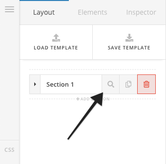
- Inspect the section by clicking on the search icon. https://cl.ly/013cea3e4aaa
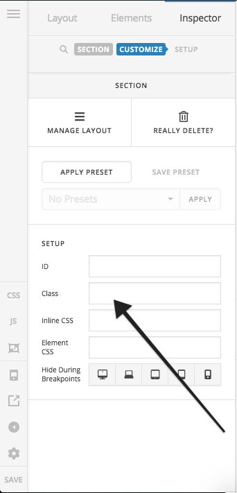
- Assign class to the section under Customize > Setup > Class. https://cl.ly/f7d32253695e
- Next, add following CSS under X > Theme Options > CSS:
@media only screen and (max-width: 600px) {
    .change-spacing-mobile {
    padding-left: 15px;
    padding-right: 15px;
}
}
Please change change-spacing-mobile class name as per your requirement.
If you would like to learn more about media queries, please take a look at following resources.
https://www.w3schools.com/css/css_rwd_mediaqueries.asp
https://developer.mozilla.org/en-US/docs/Web/CSS/Media_Queries/Using_media_queries
Thanks.
Is there supposed to be something in the image box on steps 1 and 3? I see your code on step 4, but others are blank.
Hello @bluekat,
Thanks for updating the thread.
Have you tried reloading the page and see if image is loading on our end. Having said that, I have also shared the image URL that you can click to view the image.
Thanks.
This topic was automatically closed 10 days after the last reply. New replies are no longer allowed.