Create Beautiful Mega Menus in WordPress with Cornerstone

Hi,

I was playing around to build a mega menu like Josh explained in his video.

It is looking allready well as you can see here: https://cresult.nl/wp/1-foto-fixed/

(just an test page…)

Some questions:

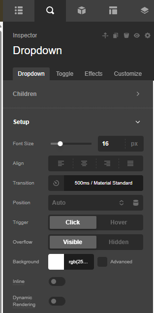
  1. is it possible to close the dropdown also by clicking the toggle? Just like with the Navigation dropdown element?

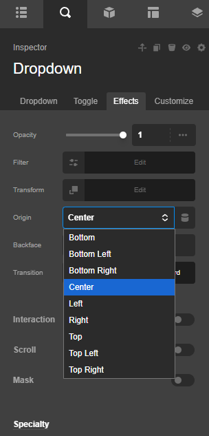
  2. Is it possible some way to open the dropdown behind the bar. I tried some z-indexes but because but no succes. I now played with some top margin in the Dropdown element to make it look it’s okay but when I, for example, want to have some shadow under the bar, it’s nog gona work because the dropdown comes on top.

  3. How to control the effect the dropdown opens. It looks like it’s coming in from the bottom but how to slide it down from the top (from behind the bar if possible for example)

THX in advance, Carel

Hello Carel,

Thanks for writing in!

1.) In your Dropdown element settings, set the “Trigger” to click.

2.) If ever you want the Dropdown element content to be behind the Bar element, an inline element CSS for the Dropdown is needed in setting the z-index. For example;

$el.x-dropdown.x-active {
  z-index: 100;
}

3.) Check the Effects module of the Dropdown:

Best Regards.

Hi,

Okay, thank you.
But for 2, I set this in the custom css of the Dropdown, but no change. The dropdown is still over the bar. I made the dropdown red to make this clear.

And for 3, what ever effect I choose, I see no difference in the dropdown behaviour…

Hello @cvdw,

I would suggest you please set the Dropdown element’s margin-top to 40px and set the z-index to auto.

Add this element CSS code.

    $el.x-dropdown.x-active {
      z-index: auto;
    }

Please clear your browser cache and check it again.

Thanks

But it is still not behind the bar… I don’t know this is even possible… And because the bar is shrinking on scroll, then the 40 px margin is too much and there is a gap… So the best will be that the dropdown is behind the bar or an variable margin so there is no gap when shrinking…

And what about the effects? I don’t see any difference?

Hello @cvdw,

The “Inline” option must be disabled.

And then you add a custom inline CSS to the Dropdown element:

$el.x-dropdown {
    inset-inline-start: auto !important;
    inset-inline-end: auto !important;
}


$el.x-dropdown.x-active {
  z-index: 100;
}

This is taken from Josh Donelly’s video (https://www.youtube.com/watch?v=-EujzKMZL-E). The z-index is added to make sure that the dropdown is behind the Bar element.

As for the effect, it may not be possible to change the direction. Check your header now.

Thanks.

Hi!

Almost there I think! But in this video of Josh https://youtu.be/8_VsXYSlHH4?si=rHHnJo_zSEZCDHH- , he says it has to be set to inline because of the navigation structure so you can tab through the navigation and with inline disabled, the navigation is flickering a lot if you scroll in the navigation. The help text of in inline option also says: “Display the content of the dropdown inline with the button, helps to prevent flickering if your dropdown is in a moving area like a sticky bar”. And that is what’s happening.

Is there an option we can make this happen with Inline turned On…?

Hi,

Please look at above problem please…

Hello @cvdw,

The option I suggested resolves the issue of having the Dropdown behind the Bar element. This created another issue, though, which is the flickering as soon as you scroll the page. Adding position: fixed; to the Dropdown’s custom inline CSS may reduce the flickering.

There is no option to position the Dropdown behind the bar element when it is inline. The z-index will not apply when the Dropdown is set to “Inline”. I would recommend adding a box shadow to the Dropdown to separate it from the Bar element, even if it is on top of the Bar element. Please check the secure note below for comparison with your current header.

Thanks.

Okay, thank you.

Then the https://cresult.nl/wp/1-foto-fixed/ is no option because on mobile you get crazy of the flickering.

For the example with inline disabled, with a smaller screen the columns switch to vertical and not all items fit the screen, now it is not possible the scroll thrue the dropdown. Is this possible so you cab scroll true all the content in the dropdown?

THX

Hello @cvdw,

You can add a DIV container inside the Dropdown and allow the Y overflow to be scrolled.
Check out the demo here: https://cresult.nl/wp/1-foto-fixed/

Thanks.

This topic was automatically closed 10 days after the last reply. New replies are no longer allowed.