The Content Area Off Canvas element is available for both the header and footer builder. It’s very similar to the other availableContent Area elements with the exception that this content area elements shows in an off canvas area on click.
Click on Add and then click on the Content Area Off Canvas element to add it your header. You should then see something like this:

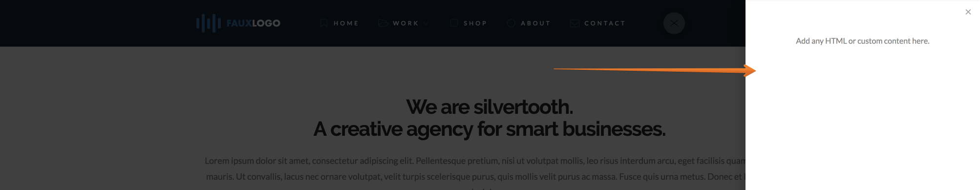
When you click on the element itself it’ll open the Off Canvas area like this:
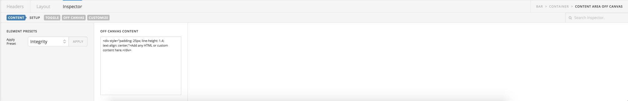
Click on the Magnifying glass icon to open the inspector for the Content Area Dropdown which will render the available controls like this:
Like other Elements controls are split up into multiple sections for the Content Area Off Canvas those sections are:
- Content
- Toggle
- Off Canvas
- Customize
Clicking on a specific link will take you to those controls. First of all you’ll be on the Content section. The controls available within the Content section are:
- Off Canvas Content – The content that shows within the Off Canvas content area, supports HTML and plain text
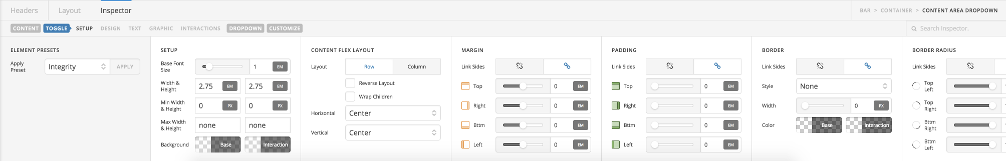
Now if you click on Toggle you should see the rendered Toggle controls like this:
The available Toggle controls are:
Setup
The setup controls consist of:
- Base Font Size – The font size of the button text
- Width & Height – The width and height of the button set to auto by default. Can be changed to any required value.
- Min Width & Height – The minimum width and height the button should be. Useful if you want your button to always be say 50px wide.
- Max Width & Height – The maximum width and height of the button at any time. Useful if you want your button to never exceed a specific size.
- Background – Offers two options one called Base base is the background color of the button at all times apart from on hover. And the second option called Interaction interaction is the background color of the button on hover and when the button is interacted with.
Content Flex Layout
The Content Flex Layout controls consist of:
- Layout – Either set to Row or Column
- Reverse Layout
- Wrap Children
- Horizontal
- Vertical
Margin
The Margin layout controls consist of:
- Link Sides – Link sides allows you to link up every option within the margin controls so when you change one value all values change. Or you can unlink sides and set each margin option individually.
- Top – Sets the top margin.
- Right – Sets the right hand side margin.
- Bttm – Sets the bottom margin
- Left – Sets the left hand side margin.
Padding
The Padding controls consist of:
- Link Sides – Link sides allows you to link up every option within the padding controls so when you change one value all values change. Or you can unlink sides and set each padding option individually.
- Top – Sets the top margin.
- Right – Sets the right margin.
- Bttm – Sets the bottom margin.
- Left – Sets the Left margin.
Border
The Border controls consist of:
- Link Sides – Allows you to link up the border control for all sides or unlink sides to control each border side individually.
- Style – Sets the style of the border such as dashed, dotted etc.
- Width – Sets the width of the border in pixels by default. Or click on PX to change the value to the units you’d like to use (EM, REM)
- Color – Sets the color of the border.
Border Radius
The Border Radius controls consist of:
- Link Sides – Link all sides of the border to control all border radius options at the same time, rather than configuring each value individually. If you unlink sides. You can set the border radius controls individually.
- Top Left – Set the top left radius of the border.
- Top Right – Set the top right radius of the border.
- Bttm Right – Set the bottom right radius of the border.
- Bttm Left – Set the bottom left radius of the border.
Text Margin
The Text Margin controls consist of:
- Link Sides – Link sides allows you to link up every option within the margin controls so when you change one value all values change. Or you can unlink sides and set each margin option individually.
- Top – Sets the top margin.
- Right – Sets the right hand side margin.
- Bttm – Sets the bottom margin
- Left – Sets the left hand side margin.
Primary Text Format
The Primary Text Setup controls consist of:
- Font Family – A font selector for the primary text. Default is inherit or you can select a font that’s setup within the Font Manager.
- Font Weight – The font weight for the primary font selected. Available weights depend on the font family selected.
- Font Size
- Letter Spacing
- Line Height
Primary Text Style
The Primary Text Style controls consist of:
- Font Style – Normal or Italic
- Text Align – Left, Center, Right, Justify.
- Text Decoration – Underlined or Strikethrough.
- Text Transform – Uppercase (force all text to be uppercase), Capitalize (forces the first letter in each word to be a capital), Lowecase (forces all text to be lowercase).
- Text Color – offers two options. 1: Base, sets the base color of the text. 2: Interaction. Sets the text color when interacted with (on hover) etc.
Primary Text Shadow
The Primary Text Shadow controls consist of:
- X-Offset – Set the offset of the text shadow for the X axis.
- Y-Offset – Set the offset of the text shadow for the Y axis.
- Blur – Set the blur of the text shadow.
- Spread & Position – Set the spread and position of the text shadow.
- Color – Sets the color of the text shadow.
Graphic Setup
The Graphic Setup controls consist of:
- Enable – Enable or Disable the output of a graphic. When Graphic setup is set to On you’ll see another option within the Graphic Setup controls and another two set of controls called Graphic Margin and Graphic Icon.
- Type – Select what type of graphic you want to use either a Icon, Image Or Toggle. Only shows if Enable is set to On.
Graphic Margin
The Graphic Margin controls consist of:
- Link Sides – Link sides allows you to link up every option within the margin controls so when you change one value all values change. Or you can unlink sides and set each margin option individually.
- Top – Sets the top margin.
- Right – Sets the right hand side margin.
- Bttm – Sets the bottom margin
- Left – Sets the left hand side margin.
Graphic Icon
The Graphic Icon controls only show if you selected the icon option in the Graphic Setup control and the controls consist of:
- Font Size & Secondary – If you check the Secondary box you’ll see a new option called Secondary Icon.
- Width & Height – The width and height of the icon
- Primary Icon – The main icon visible, used until the icon is interacted with. Click Select Icon to open the Icon picker
- Secondary Icon – The icon visibl, used when the button is interacted with (on hover etc). Click Select Icon to open the Icon picker.
- Color – offers two options. 1: Base, sets the base color of the icon. 2: Interaction. Sets the icon color when interacted with (on hover) etc.
Primary Graphic Image
The Primary Graphic Image controls only show if you selected the image option in the Graphic Setup control and the controls consist of:
- Retina & Dimensions – Retina support is enabled out the box. Click the Eye to disable the Retina support. Also supports options to set the width and height of the image.
- Source – The image to be used. Click to select an image from the WordPress media library or upload a new one.
Secondary Graphic Image
The Secondary Graphic Image controls only show if you selected the image option in the Graphic Setup control and the controls consist of:
- Enable – When enabled you’ll see a new option within the Secondary Graphic Image controls to set a image that shows on hover.
Graphic Toggle
The Graphic Toggle controls only show if you selected the image option in the Graphic Setup control and the controls consist of:
- Type – The type of toggle you want to use options available are, Burger, Grid, More Horizontal, More Vertical. Both More Horizontal and More Vertical output an elipsis.
- Burger Size – Set the size of the burger toggle. Only shows if Burger is selected under Type.
- Burger Spacing – Sets the spacing around the burger. Only shows if Burger is selected under Type.
- Burger Width – The width of the burger. Only shows if Burger is selected under Type.
- Color – Base. Sets the base color used when the Toggle isn’t being interacted with.
- Color – Interaction. Sets the color to be used when the Toggle is interacted with.
- Grid Size – The size of the grid used for the Toggle. Only shows if Grid is selected under Type.
- Grid Spacing – The spacing around the grid. Only shows if Grid is selected under Type.
- More Size – The size of the More Toggle. Only shows if More Horizontal or More Vertical is selected under Type.
- More Spacing – The spacing around the More toggle. Only shows if More Horizontal or More Vertical is selected under Type.
Interactions Setup
The Interactions Setup controls consist of:
- Text – The text interaction, how the text changes on hover. Available options include: None, Slide Top, Slide Left, Slide Right, Slide Bottom, Scale Up, Scale Down, Flip X, Flip Y.
- Graphic – The graphic interaction, how the graphic changes on hover. Available options include: None, Scale Up, Scale Down, Flip X, Flip Y.
- Particles – When you enable Primary Or Secondary particles you’ll see new controls and options for the particle setups. This allows you to add particle effects on hover, great to make your menu stand out!
Now if you click on Off Canvas you should see the rendered Off Canvas controls like this:
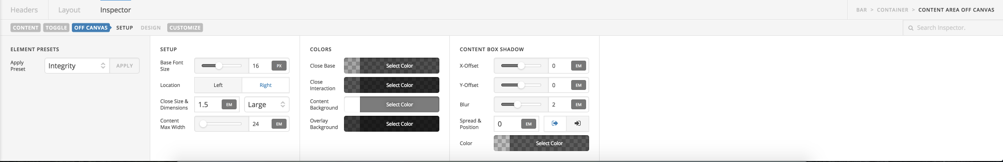
The available controls within the Off Canvas section consist of:
Setup
The Setup controls consist of:
- Base Font Size – The size used for the font within the Off Canvas area.
- Location – Left or Right. Wether you want the Off Canvas area to come in on the right hand side of the screen or the left hand side of the screen.
- Close Size & Dimensions – The size of the close button within the Off Canvas area.
- Content Max Width – The maximum width of the content within the Off Canvas area.
Colors
The Colors controls consist of:
- Close Base – Color of the close icon within the Off Canvas area when not being interacted with.
- Close Interaction – Color of the close icon within the Off Canvas area when being interested with (on hover etc).
- Content Background – The Background of the content within the Off Canvas area.
- Overlay Background – The Background Overlay color.
Content Box Shadow
The Content Box Shadow controls consist of:
- X-Offset – Set the offset of the border shadow for the X axis.
- Y-Offset – Set the offset of the border shadow for the Y axis.
- Blur – Set the blur of the box shadow.
- Spread & Position – Set the spread and position of the box shadow.
- Color – Sets the color of the box shadow.
Lastly are the available controls within the Customize section. If you click on Customize You should see the available controls like this:
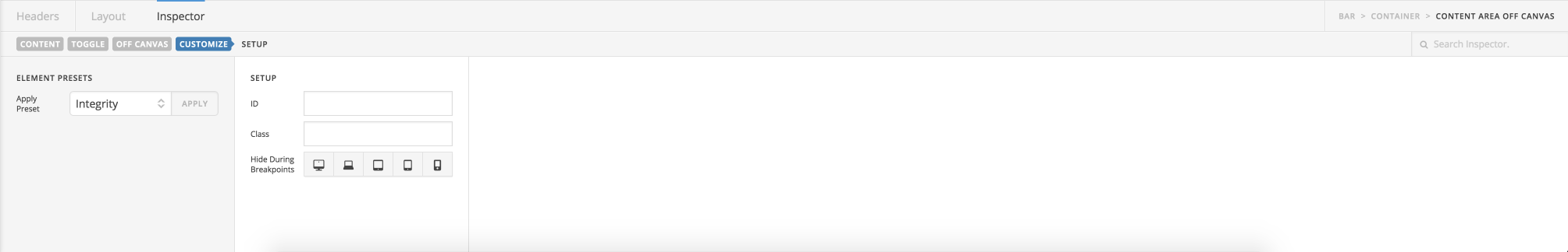
The available controls within the Customize section are:
Setup
The Setup controls consist of:
- ID – A custom ID you want to assign for use with custom CSS.
- Class – A custom class you want to assign for use with custom CSS.
- Hide During Breakpoints – Select different screen sizes you want to disable the output of the specific element on. Perfect for creating custom responsive headers.