Tagged: x
-
AuthorPosts
-
February 3, 2017 at 8:51 pm #1357548
 AlCAtParticipant
Hi,
I would like my navbar to be transparent on mobile and tablet. The background would only be revealed when triggering the menu. Can you help me with the CSS? 🙂
Thanks!
February 3, 2017 at 8:52 pm #1357550AlCAtParticipantThis reply has been marked as private.February 4, 2017 at 2:11 am #1357720 ChristopherModerator
Hi there,
Please find and remove following code :
@media only screen and (max-width: 979px) {
.x-navbar {
    background-color: rgba(0,0,0,1) !important;
}
}
/*Mobile Nav bar background*/
.x-navbar {
  background-color: transparent !important;
  left: 0;
  position: absolute;
  right: 0;
  top: 0;
  z-index: 9998;
}

html { margin-top: 32px !important; }
	* html body { margin-top: 32px !important; }
	@media screen and ( max-width: 782px ) {
		html { margin-top: 46px !important; }
		* html body { margin-top: 46px !important; }
	}
Add this:
@media (max-width:979px){
.x-nav-wrap.mobile {
    background-color: rgba(0,0,0,0.5);
    padding: 10px;
}
header.masthead.masthead-stacked {
    position: absolute;
    top: 53px;
    z-index: 999;
    width: 100%;
    height: 0;
}
}
Hope it helps.
February 5, 2017 at 4:41 am #1358473AlCAtParticipantHey Christopher,
Thank you for the reply!
I removed the CSS except for the HTML part that I couldn’t find.
I have applied the new CSS but the bar is still showing and is not placed on top.
February 5, 2017 at 6:39 am #1358534ChristopherModeratorHi there,
Please add this code :
@media only screen and (max-width: 979px){
.x-navbar {
    background-color: transparent !important;
}
}
It will give you following result :
Hope it helps.
February 5, 2017 at 7:48 am #1358578AlCAtParticipantWorking great! Is there a way to bring the menu higher? 🙂
February 5, 2017 at 9:54 am #1358642RupokMemberHi there,
Thanks for writing back. It’s just under the Navigation button, so not sure how do you want to bring it higher. You can use this CSS to eliminate some spacing above :
.x-navbar .mobile .x-nav {
    margin: 5px auto 20px;
}
If you still need help, kindly point us what you are trying to achieve.
Cheers!
February 6, 2017 at 3:48 am #1359392AlCAtParticipantHi Rupok,
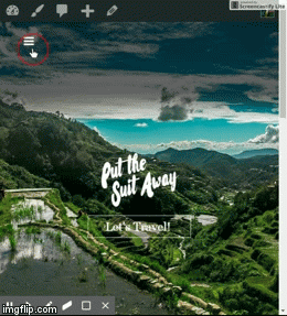
Thank you for the code. Unfortunately it didn’t change anything. In the customizer mobile preview, the menu appears lower than in your screenshot. I have a same issue when viewing the website on my phone.
I have attached a screenshot
February 6, 2017 at 4:46 am #1359439ChristopherModeratorHi there,
Please update your code to :
a.x-btn-navbar {
    margin: -23px auto 20px;
}
Hope it helps.
February 19, 2017 at 4:44 am #1376945AlCAtParticipantThank you very much! 🙂
February 19, 2017 at 5:45 am #1376981ThaiModeratorIf you need anything else please let us know.
-
AuthorPosts
- <script> jQuery(function($){ $("#no-reply-1357548 .bbp-template-notice, .bbp-no-topic .bbp-template-notice").removeClass('bbp-template-notice'); }); </script>
