-
AuthorPosts
-
August 21, 2014 at 8:18 pm #89757
How can i make it fit to window on mobile devices like (ipad,iphone tablets?) My settings in revolution slider is fixed, grid settings is 960×360. When I select it to auto responsive it definitely fit on mobile devices, but in browser view, it zoomed out. Is there any way to fix this?
August 21, 2014 at 8:53 pm #89785Hi there,
Thanks for writing in! To assist you with this issue, we’ll first need you to provide us with your URL as stated on the forum entrance page. This is to ensure that we can provide you with a tailored answer to your situation. Once you have provided us with your URL, we will be happy to assist you with everything.
August 21, 2014 at 9:06 pm #89791This reply has been marked as private.August 21, 2014 at 10:46 pm #89831Hi there,
Thanks for the link. The slider works and respond accordingly. But the image added isn’t.
When using a auto responsive, you have to make sure that your image or layers will automatically scale too.
https://cloudup.com/c4j3BZBW0hm
You could provide an admin login too, and I’ll test your slider on my installation.
Thanks.
August 22, 2014 at 1:49 am #89910This reply has been marked as private.August 22, 2014 at 4:14 am #89952Hope you can assist me regarding this matter. Thanks in advance.
August 22, 2014 at 6:07 am #89999Hello there,
I have set the slider to auto responsive and it is working ok now.
But I see that the top menu goes down in some window sizes, I suggest that you choose a little bit smaller logo to avoid this effect.
Hope it helps.
August 26, 2014 at 2:25 am #92262ok, what would be the possible size of logo that I will use? Did you see that when you set the rev slider to auto responsive, the image on the slider stretch out?
August 26, 2014 at 6:15 am #92323Hi There,
Not more than 300px in width would work fine I think.
August 26, 2014 at 7:58 pm #92888Hi! I will try to resize that to see if that will work. Thanks a lot ^_^
August 27, 2014 at 12:48 am #92981You’re welcome. 🙂
July 26, 2015 at 3:33 pm #341058Hello there,
my website is : http://www.castello.it
I was looking for something that allow the mobile viewer to correctly see the slider on the home page.
I checked each single setting and I could’t find a proper way to fit the slider on the iphone, from 4 to 6plus.
Now In order to set a proper view for a desktop browser at the time I start build the site, I remember choosing to create a double layer slide.
Then from what I read above I do not understand how to fix the text area to fit accordingly.
I need some hints to start looking in the right direction…could you help me on this ?
Thanks in advance.
Best regards,
Roberto
P.S.: In the next private message I am sending credentials if needed
July 26, 2015 at 3:33 pm #341059This reply has been marked as private.July 26, 2015 at 11:02 pm #341292Hi there,
I think the issue is that the text added aren’t responsive. They remain on the same font size regardless of screen size.
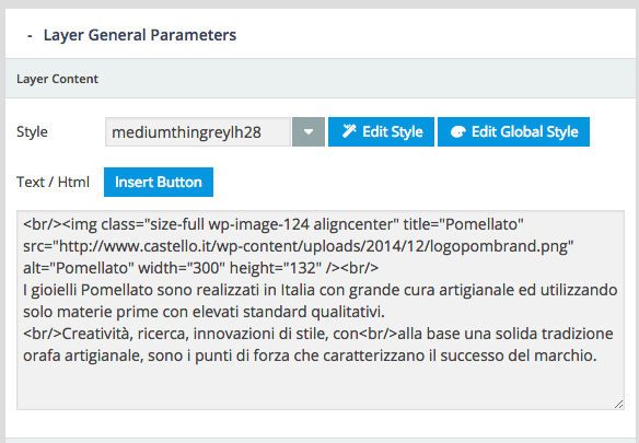
I checked your slide and seems that your image and text is added on same single layer that’s why it won’t respond. Please separate the, use image layer for image, and normal layer for text.
Thanks!
July 27, 2015 at 4:54 am #341618Great…Thanks a lot…Now I have to set up correctly all the remaining slider…but it is definitively worth it.
Now happen that, inserting the navbarcart, that I like a lot and I would like to keep, on the ipad browser view looks awful, see for yourself:
http://prntscr.com/7xhp77Is there a way to fix this ? I was thinking about reducing the size image of the logo but it is a pity because, in my opinion, it looks nice on the portable device view.
Now just a thought, I already know it is something outside the scope of this support, but playing around with portable device for testing my site on those, I realize how nice would it be if you could see the slider not as a slider for desktop browser but as a normal slide view of the camera roll.
Thanks for your patience.
Roberto
-
AuthorPosts
