-
AuthorPosts
-
May 30, 2015 at 10:14 pm #287202
Hi,
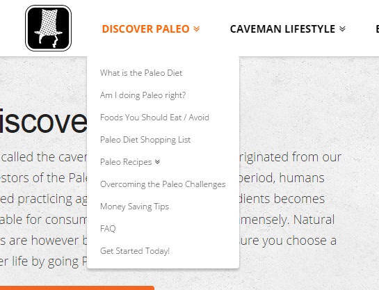
I noticed a problem with the drop-down menu ^when I reduced the size of the window. The problem also occurs on mobile devices. The drop-down menus overlap the categories:

How can I solve this?
Thanks.
May 31, 2015 at 6:45 am #287566Hi there,
Please find and remove
height: 80px;from this code:.x-navbar .x-nav > li { height: 80px; padding-top: 0; }Hope it helps.
May 31, 2015 at 9:07 pm #288043Thanks. It fixes the problem, but some other problems occurs:
#1: The spacings in the Navbar are not good anymore
#2: The breadcrumbs’s spacing is not good either.
#3: The drop down menu should start direct underneath the navbar.I’ve done the following image to show you how it is now:

X should be equal to Y
Z should be equal to 0I have the following code in my CSS (I’ve already removed the ‘height: 80px;’ to fix the drop down menu problem):
.x-navbar-inner {
    min-height: 80px;
}
.x-navbar .x-nav > li {
    height: 80px;
    padding-top: 0;
}
body.x-navbar-fixed-top-active .x-navbar-wrap {
  height: 80px;
}
Thanks.
June 1, 2015 at 2:40 am #288305Hi there,
Please reduce ‘Navbar Top Height’ and ‘Navbar Top Link Alignment’ under Customize -> Header.
Hope it helps.
June 1, 2015 at 5:30 am #288440Thanks for the tip.
I followed your instruction and it solves the problems #1 and #2. How can I solve the problem #3 (problem with the spacing of the drop-down menu, which is even worst now)?
I still have this code in my CSS:
.x-navbar-inner {
    min-height: 80px;
}
.x-navbar .x-nav > li {
    padding-top: 0;
}
body.x-navbar-fixed-top-active .x-navbar-wrap {
  height: 80px;
}
Thanks for your help.
June 1, 2015 at 1:39 pm #288902Hi again,
To solve #3, please add the following code in your Customizer via Appearance > Customize > Custom > CSS:
.x-navbar .desktop .x-nav > li ul {
  top: 50px;
}
Adjust the value if needed. Let us know how this goes!
June 1, 2015 at 8:54 pm #289273Thank you, it solves the problem, but partially only 🙂
It looks like this now:

When I increase (top: 80px), the drop down menus show as I want them to be, but the problem is that you can not access them. They disappear as soon as you try to select one of them:

What’s the solution to fix this?
My next question concerned the menu by a small size window. The menu goes on 2 lines, and it doesn’t look nice as the spacings are not correct:

Ideally, it should look like something similar to this:

How can I fix this?
Thanks for your help!
June 2, 2015 at 9:05 am #289853Hi there,
Please try this code:
.x-navbar .desktop .x-nav > li ul {
  top: 80px;
}
.x-navbar .desktop .x-nav > li > a {
  padding-bottom: 47px;
}
@media (max-width:1298px) and (min-width:979px){

.x-navbar .desktop .x-nav>li>a{
letter-spacing: normal;
}
}
@media (max-width:1160px) and (min-width:1060px){

.x-navbar .desktop .x-nav>li>a{
  padding: 0 1em;
}
}
@media (max-width:1060px) and (min-width:979px){

.x-navbar .desktop .x-nav>li>a{
  padding: 0 0.7em;
}
}
Hope it helps.
June 2, 2015 at 10:02 pm #290503Thank you very much. It works almost perfectly after a few adjustements. I still have on problem, when the media is smaller (> 1060px I think). There is a small gap above the drop-down menu and the logo in not center anymore on the navbar. It seems to be that the spacing-top on the navbar is getting reduced, causing the problem.
Here is how it looks like (first with the bigger device (OK) and then with the smaller:


The code I use is the following:
.x-navbar .x-nav > li {
    padding-top: 0;
}
body.x-navbar-fixed-top-active .x-navbar-wrap {
  height: 80px;
}
.x-navbar .desktop .x-nav > li > a:hover, .x-navbar .desktop .x-nav > .x-active > a, .x-navbar .desktop .x-nav > .current-menu-item > a {
  box-shadow: none;
}
.x-navbar .desktop .x-nav > li ul {
  top: 80px;
}
.x-navbar .desktop .x-nav > li > a {
  padding-bottom: 47px;
}

@media (max-width:1298px) and (min-width:979px){

.x-navbar .desktop .x-nav>li>a{
  letter-spacing: normal;
}
}
@media (max-width:1160px) and (min-width:1060px){

.x-navbar .desktop .x-nav>li>a{
  padding: 0 1em;
  padding-top: 32px;
  padding-bottom: 47px;
}
}
@media (max-width:1060px) and (min-width:1000px){

.x-navbar .desktop .x-nav>li>a{
  padding: 0 0.7em;
  padding-top: 32px;
  padding-bottom: 47px;
}
}
@media (max-width:1000px) and (min-width:979px){

.x-navbar .desktop .x-nav>li>a{
  padding: 0 0.6em;
  padding-top: 32px;
  padding-bottom: 47px;
}
}
Another problem is when I start to have the code in the CSS of the Child Theme, it doesn’t work anymore. I have it on the customizer CSS at the moment. Do you know how to fix this problem? I would like to have all my css in the Child Theme. (I noticed this process for different part of my CSS, but I had no problem with some other parts of the CSS)
Thanks for your help!
June 3, 2015 at 1:25 pm #291288Hi Antoine,
Looks like it’s okay on my end! I’m not getting the same as your second screen shot.
Have you done it already? Good job!
Thanks!
June 3, 2015 at 8:46 pm #291925Hi,
I checked again on 3 different computers to be 100% sure, and the problem I explained earlier is there. It only shows up when you reduced to size of the screen and it might be the reason why you did not see it on your computer.
Could you please also answer my question regarding having the CSS in the Child Theme or on the Customizer. I’d like to be able to understand this.
Thanks.
June 4, 2015 at 3:17 am #292269Hi,
To fix the spacing issue, you can add this under Custom > CSS in the Customizer.
@media (max-width: 1160px)  {
   body .x-navbar .desktop .x-nav > li ul {
      top: 77px !important;
   }

   body #fixed-logo-li img {
      margin-top: -26px !important;
   }
}
With regards to css being in the child theme, try to add body and !important to your css just like the code above so it will have priority to default css.
Hope that helps.
June 4, 2015 at 5:14 am #292367Thanks, it’s now working perfectly.
I’ll try to move the code to the Child Theme tomorrow (it’s running late in NZ now).Thanks again, I really appreciate your great support!
June 4, 2015 at 3:07 pm #292804Glad to hear that! You’re most welcome.
Have a great day! 🙂 Let us know how it goes. Thanks.
-
AuthorPosts
