-
AuthorPosts
-
June 13, 2015 at 10:17 am #300842
 Mark_westcottParticipant
Hey support,
I’m having an issue with a gravity forms element. It’s showing conditional logic all the time in tablet and mobile. Works great on desktop, just anything below 980px is messed.
Could you take a look please: http://fisheyestudio.com/home-draft-testing/
thanks!
June 14, 2015 at 1:24 am #301156 ChristopherModerator
Thanks for writing in! It sounds like you might be having an issue with a third party plugin or script. Regretfully, we cannot provide support for third party plugins or scripts as our support policy in the sidebar states due to the fact that there is simply no way to account for all of the potential variables at play when using another developer’s plugin or script. Because of this, any questions you have regarding setup, integration, or troubleshooting any piece of functionality that is not native to X will need to be directed to the original developer.
Thank you for your understanding.
June 14, 2015 at 4:07 am #301266Mark_westcottParticipantcool. I’ll message gravity forms then.
Thanks anyway.
June 14, 2015 at 6:44 am #301333Mark_westcottParticipantHey Support,
I don’t know why I didn’t try this earlier…
I just duplicated the page to try a few variations out and have narrowed down the problem. Maybe you could help now, as I’ve narrowed it down to an issue inside of X theme. See the problem goes away when I delete one instance of the form. It seems when I have two content bands, loading the same form, it causes conditional logic inputs to show through. I deleted the desktop instance of the form, and the same mobile form that kept showing it’s conditional logic, started behaving as it should.
I can figure out a workaround if I have to (by using only the 1 band and styling each individual element), but I like the approach I’m using now, which is to have 1 mobile/tablet band & 1 desktop band and hide each band based on device width.
Let me know your thoughts.
June 14, 2015 at 6:48 am #301337Mark_westcottParticipantThis reply has been marked as private.June 14, 2015 at 6:46 pm #301780RadModeratorHi there,
I’m not really sure what’s the issue here. Would you mind providing a video recording of the issue?
To what I understand from the coding, that specific content band where the form is, is set to be hidden for desktop? And visible for mobile?
Because the content band has this class show-iphone-contact
And its css is this,
@media (min-width: 980px){
.show-iphone-contact {
  display: none;
}
}
Which means, default to be hidden on desktop but visible on mobiles. It’s just one, there is no other target device sizes which means the effect is the same for all devices. This is custom css and nothing to do with X theme.
There are other css applied for the form too,
@media (max-width: 979px){
#gform_wrapper_1 {
  display: block !important;
  padding: 0 1.2em;
}
}
And there are inline styling applied too which are surely not added by X theme. Gravity form controls visibility of the form through javascript and not css. The conflict is between your custom css and gravity form, and not from X theme.
X theme uses x- prefixes for all the class selectors. And show-iphone-contact is surely not one of them 🙂
Thanks!
June 14, 2015 at 11:22 pm #301897Mark_westcottParticipantHey support,
Here’s the link to the issue:
[video src="http://fisheyestudio.com/wp-content/uploads/2015/06/Gravity-Form-Example.mp4" /]
I realized that the page demo I was asking you to look at before, I had erased one instance of the plugin. As I didn’t save the draft, I didn’t think it would save the deletion. I fixed this, so as of now… there are two instances of the gravity forms shortcode referencing the same form: 1 is visible 980px+, while the other is visible only 979px & below. This is handled by CSS media queries as it would have been too much of a hassle to do this through the visibility shortcode due to not being drag+drop with complete content bands (plus VC was acting strange when I tried)
I’ve also pointed out in the video nothing changes (no CSS or what have you) except me deleting the 980px+ instance of the Gravity Forms shortcode. This is why the custom CSS doesn’t matter. That’s not what is effecting it. I have even tried erasing the css to no help. This is why it kept frustrating me, as I couldn’t narrow down the issue. That is until I deleted 1 of the shortcodes.
This is the test page. Your free to do with it what you’d like as it’s a clone of the actual page.
http://fisheyestudio.com/home-forms-test-for-x/
login info is already supplied above. Thanks!
– mark
June 15, 2015 at 8:55 pm #302954RadModeratorHi there,
Does your video long? I can only play few seconds of it.
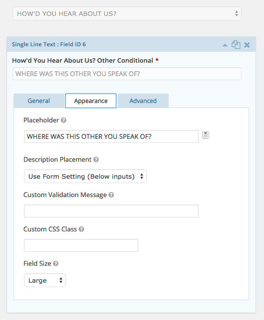
Hhhm, if you wish to control the visibility of that logic form, then why not add your class name directly to that field? You can edit your form and add class name like this,
Though, I don’t think that will work since you marked your fields required. Which means even if you hide them, form will not do the submit since it’s required.
This is not really related to X theme, it’s related to your form composition.
Thanks!
June 15, 2015 at 11:28 pm #303038Mark_westcottParticipantThis reply has been marked as private.June 16, 2015 at 7:51 am #303427ChristianModeratorHey Mark,
Glad you have a workaround. X conditional display based on screen size is best used for non-form elements. With Gravity Forms, you would need to modify or tweak the form yourself or a WordPress developer. X only includes styling for it but not media queries. Also, I would not recommend having several copies of the form in one page. You might want to contact our trusted partners who caters X setup and customization needs. Please see https://theme.co/x/member/custom-development/.
Thank you for understanding.
-
AuthorPosts
- <script> jQuery(function($){ $("#no-reply-300842 .bbp-template-notice, .bbp-no-topic .bbp-template-notice").removeClass('bbp-template-notice'); }); </script>
