-
AuthorPosts
-
October 2, 2014 at 5:58 am #116977
 akiraceoParticipant
Good Day,
I’m having some problems with getting the layout I want. Sorry for being a noob but do save me T3T
This is the layout I wish to get.

Simple but.. I’m facing so much problems with the icon buttons and gaps.
Kindly refer to the image below
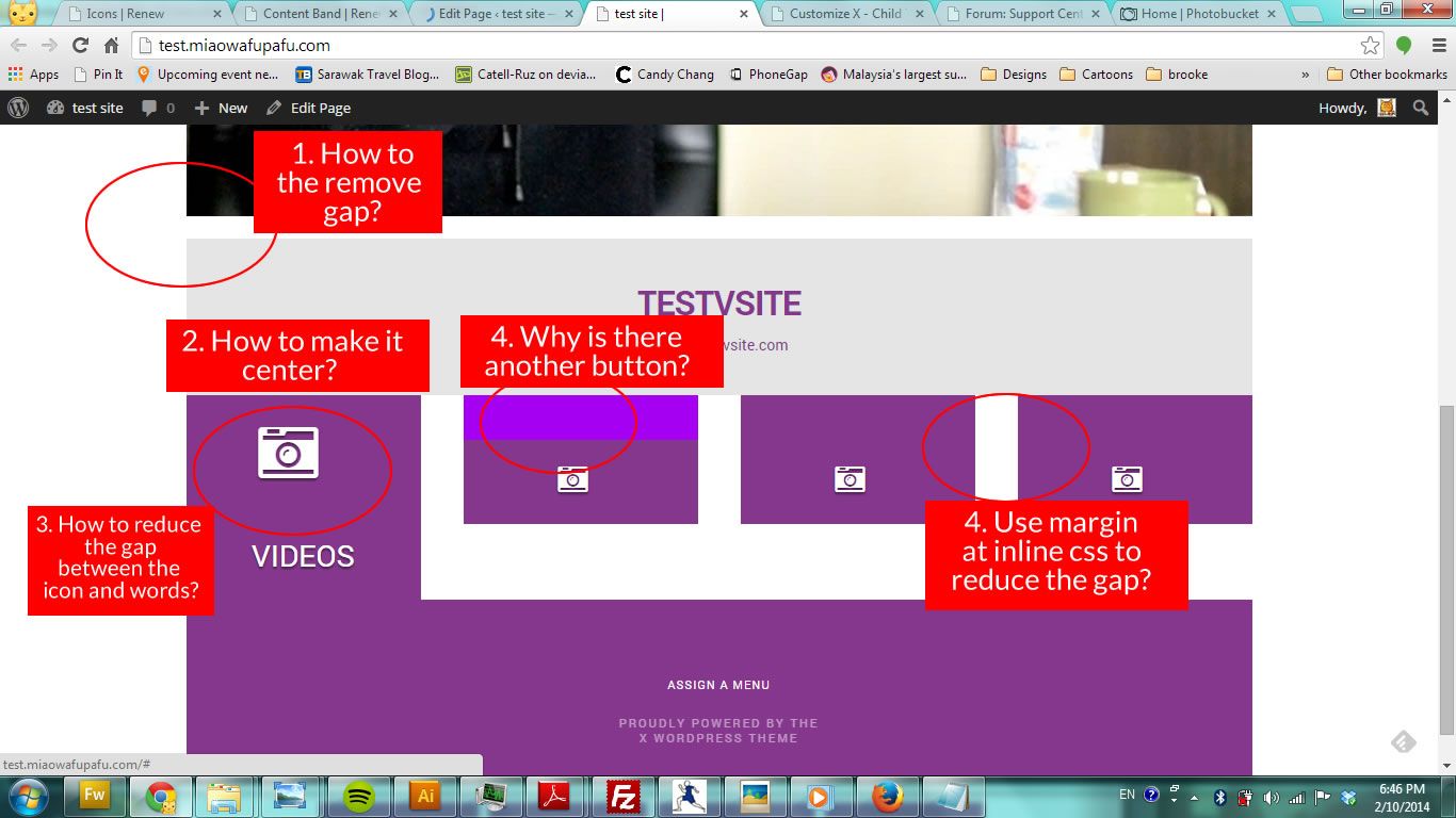
At first, I didn’t know how to adjust the size of the icon.
In the end I manage to find this code in the forum to achieve the size of icon and letters.<p style=”text-align: center;”>[icon style =”font-size: 2em;” type=”camera-retro”]</p>
<p style=”text-align: center;”><span style=”color: #ffffff; font-size: 1em;”>VIDEOS</span></p>But the icons and word is too far apart. I have tried putting some codes in the inline css but nothing happens.
Kindly have to give some headups on where should I look into. Thanks.here’s the url to the page.
http://test.miaowafupafu.comThanks 🙂
October 2, 2014 at 8:07 am #117040 ChristopherModerator
Hi there,
#1 in class field of video element add ‘mbn’ this class will remove bottom margin from any element.
#2 Change the code to
[icon style ="font-size: 2em; margin-right:0;" type="camera-retro"]#3 Put both icon and text inside one <p> tag like this:
<p style="text-align: center;">[icon style ="font-size: 2em;margin-right:0;" type="camera-retro"]
<span style="color: #ffffff; font-size: 1em;">VIDEOS</span></p>
#4 Remove `<a class=”x-btn x-btn-square x-btn-jumbo x-btn-block” href=”#” data-toggle=”none” data-placement=”top” data-trigger=”hover” data-options=”thumbnail: ””>
</a>` from top of those columns.#5 You can reduce the right margin by adding CSS but consider this will bring misalignment to above and below content bands.
the related CSS code will be:.x-column{ margin-right: 4%; }By default it sets to 4% you can reduce it to any number.
Hope it helps.
October 2, 2014 at 10:04 am #117153akiraceoParticipantHi there,
Thanks for the reply.
I’m using the visual composer. Let me know if certain adjustment need to be done in classic mode 🙂#1
** – Hmm where do I put this? I insert ‘mbn’ into the “class name field? I did that, nothing happens. ^^”#2 #3
** – works perfectly. Thanks a lot 😀#4
** – Hmm May I know where can i find them? I searched from the classic and backend mode and couldn’t find the code. I can see it from “inspect element” tho.#5
**- works perfectly. Thanks a lot 😀 I used.x-column.one-fourth { width: 24%; }
.x-column{ margin-right: 1.3%; }🙂
Thanks
RegardsOctober 2, 2014 at 10:32 am #117167CousettMemberCould you provide us with your login information so we can take a closer look?
To do this, you can make a post with the following info:
– Link to your site
– WordPress Admin username / password
– FTP credentialsDon’t forget to select Set as private reply. This ensures your information is only visible to our staff.
October 2, 2014 at 12:10 pm #117243akiraceoParticipantThis reply has been marked as private.October 2, 2014 at 1:39 pm #117452ZeshanMemberHi there,,
Thank you for writing in!
#1: In your [x_video_embed] shortcode, add a class of mbn (see: http://prntscr.com/4sfsbl)
If you are not using visual composer, see this: http://prntscr.com/4sfsog
#4: It seems, that you are were already able to achieve it (see: http://prntscr.com/4sfsuf). Would you mind confirming it again?
Hope this helps. 🙂
Thank you.
October 2, 2014 at 9:21 pm #117715akiraceoParticipantHi there,
#1 I added mbn but nothing happened 🙁
#4 Actually I increased the size of the icon and i think it’s kinda hiding behind it. hahahaha
A new problem arise:
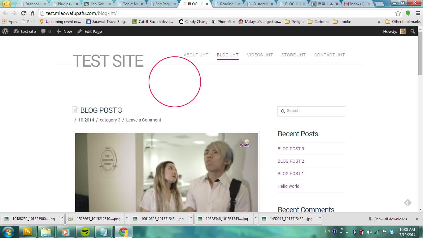
For my blog page, i can’t seems to be able remove the title/ top bar.
Any ideas?
Thanks again
October 3, 2014 at 5:45 am #117858ChristopherModeratorHi there,
#1 Please add
mbnnotmdnand it works.#2 Would you give us URL to exact page so we can see it.
#3 Please add this CSS:
.blog header.x-header-landmark {
display: none;
}
Hope it helps.
October 4, 2014 at 8:53 am #118442akiraceoParticipantHi there,
#1 mbn not working but i solve it by
.x-responsive-video.x-responsive-video-shortcode {
margin-bottom: 0em;
}
🙂#2 title bar solved!! Thanksss
————
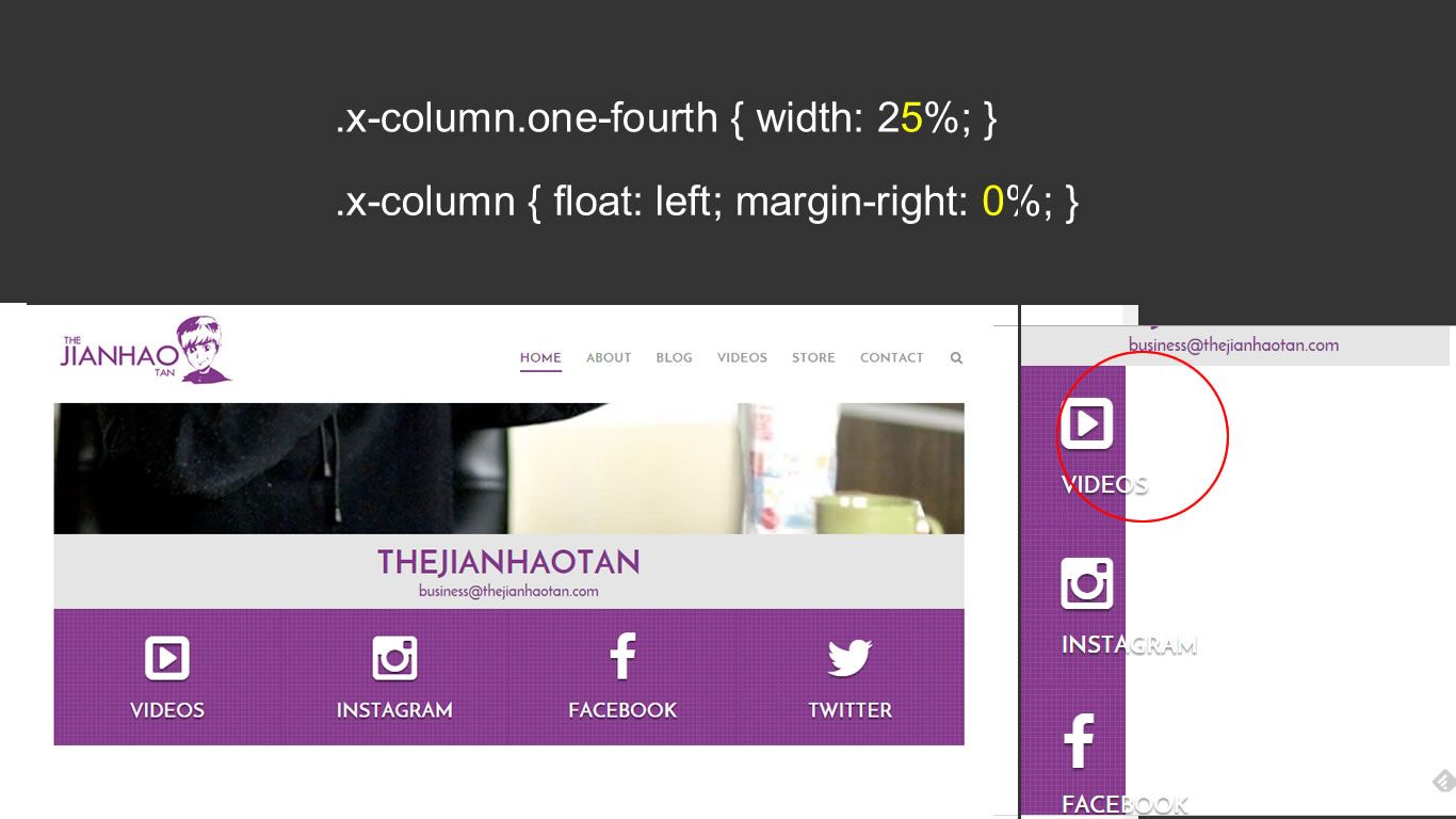
Encounter an issue. Remember I brought the button together?
It shows perfectly on PC but when on mobile, the button shrink. *crying in the corner*
Any idea what makes it turn out this way? By mathematical 25% x4 = 100% hahaha
Is there a mobile code part I should change?
<br>
The original column is like this on PC and the button shows fully on mobile.
site: test.miaowafupafu.com
Thanks
RgdsOctober 4, 2014 at 2:12 pm #118562RadModeratorHi there,
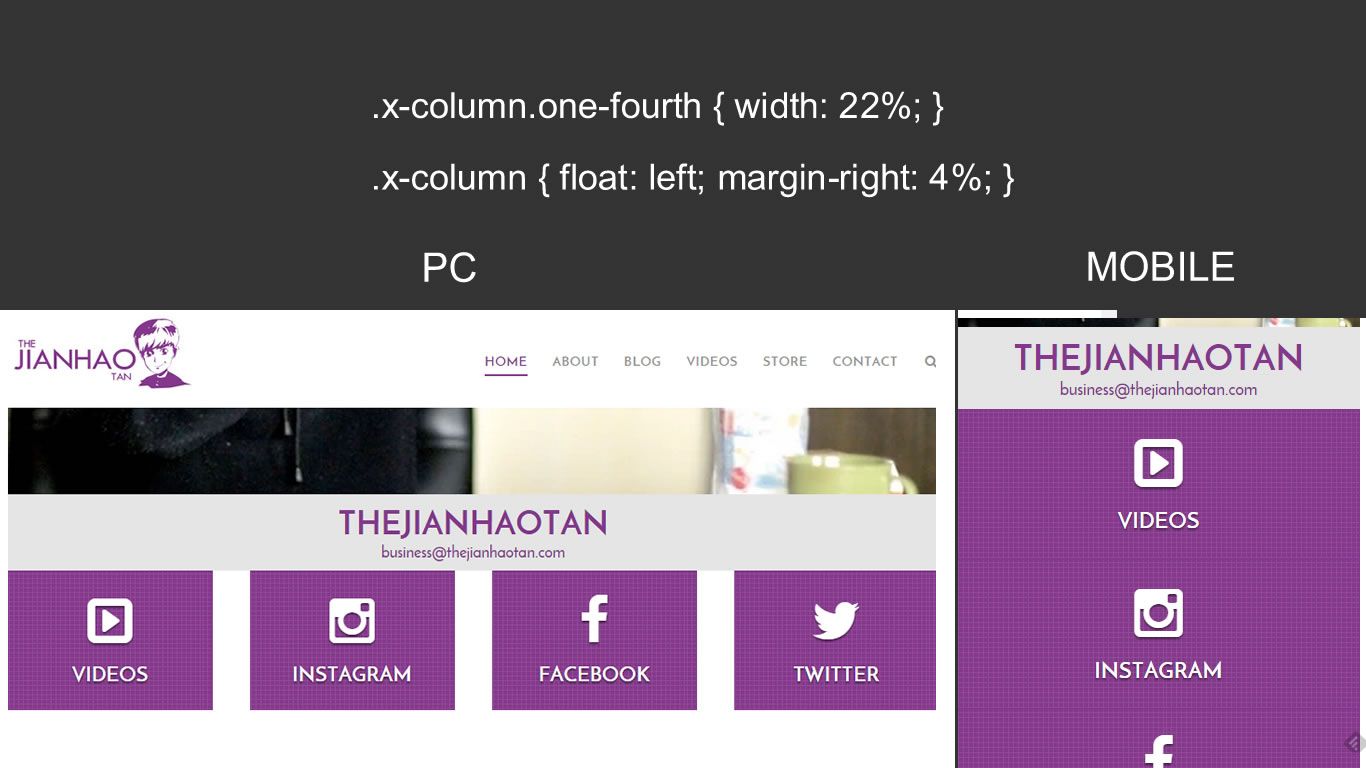
When applying css to specific views, you will have to wrap them @media query.
Example :
@media ( min-width : 980px ) {
   .x-column.one-fourth { width: 25%; }
   .x-column {float:left; margin-right: 0%; }
}
Mobile/tablet view starts from 979px and below. Then desktop should be 980px and up.
Cheers!
October 5, 2014 at 9:01 pm #119032akiraceoParticipantOMG You’re the man!!!!
Everything is fixed!!! 😀Thank youuuu soo much for the support 🙂
October 6, 2014 at 2:15 am #119128Paul RModeratorYou’re welcome. 🙂
-
AuthorPosts
- <script> jQuery(function($){ $("#no-reply-116977 .bbp-template-notice, .bbp-no-topic .bbp-template-notice").removeClass('bbp-template-notice'); }); </script>
