-
AuthorPosts
-
September 4, 2015 at 5:18 pm #379264
Hello,
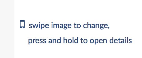
I would like to have the mobile phone icon enlarged so that its height spans that of the lines of text it is next to. The text is just one Text Element that has a line return after the word “change,” . I would also like to make the lines of text a bit closer together so they give the appearance of a single statement. Here is the page:
http://www.lauraletchingerart.com/welcome
Here is the link to a close-up picture of the area I am talking about on the above page:
Thank you,
LauraSeptember 5, 2015 at 1:33 am #379436Hi there,
Please update icon’s inline CSS to :
font-size: 45px;color: #1a3151;float: left;Please add the following code in Customize -> Custom -> CSS :
p {
    line-height: 20px;
}
Hope it helps.
September 5, 2015 at 10:03 am #379635Hi,
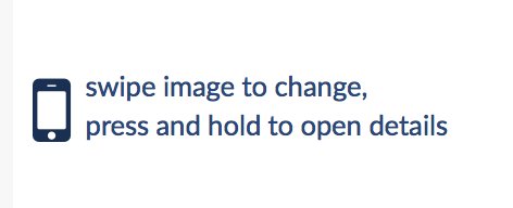
Thank you, it’s going in the right direction:
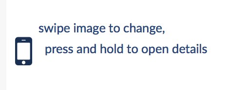
The text just needs to be centered vertically along the phone icon . . . is this possible?
UPDATE: It’s actually all good! The picture above was taken within Cornerstone; when I got rid of a couple of the spaces that were before the word “press”, and then save it and click “view page”, it displays properly:
Thanks very much, I appreciate it!
Laura
September 5, 2015 at 10:11 am #379641Hi There,
Please update the inline CSS to:
font-size: 50px;color: #1a3151;float: left;Then adding the following code in Customize -> Custom -> CSS :
#x-section-1 .x-text.left-text p {
    line-height: 22px;
    font-size: 18px;
}
Hope it helps.
September 5, 2015 at 10:15 am #379648Hi there,
Please see my “UPDATE” in the post above your last one; I think we must have been typing replies at the same time!
Thanks again, and have a great day.
Laura
September 5, 2015 at 10:19 am #379650Glad you’ve sorted it out.
If you need anything else, please let us know 🙂
September 5, 2015 at 12:44 pm #379721Hi again,
A similar question, different page . . .

Above is a picture of some of the WP edit page for this page:
http://www.lauraletchingerart.com/happy-trails
It seems that no matter what I put in for the mobile phone font size, it doesn’t change. . .
I would like to have a slightly larger phone, with the text vertically centered to it.Would you be able to help?
Thanks again,
LauraSeptember 5, 2015 at 2:45 pm #379781Hi Laura,
I’ve tried this shortcode in my local setup and the font size is working fine:
[icon type="mobile-phone" style="font-size: 20px"]Please try this shortcode and see if it works at your end.
Thanks!
September 5, 2015 at 3:35 pm #379798HI there,
Thanks for the code; it did indeed work for changing the phone size, but I’m also trying to get the color correct now. The color code that’s in there (#1a3151) works for only the “long-arrow-down”. I’ve tried different things, but I keep getting this lighter blue color in the text and the phone icon. Here’s the code at issue, you can see where I added: color: #1a3151;” to the shortcode you supplied, but I can’t seem to find the right way to add it. . .
<p style=”text-align: center;”><span style=”color: #333399;”>[icon type=”mobile-phone” style=”font-size: 18px” color: #1a3151;”] swipe image to change; details [icon style=”font-size:11px; color:#1a3151;float: ;” type=”long-arrow-down”]
</span></p>http://www.lauraletchingerart.com/happy-trails
UPDATE: OK. . . I kept fiddling and I finally got it:
<p style=”text-align: center;”><span style=”color: #1a3151;”>[icon style=”font-size:18px; color:#1a3151;float: ;” type=”mobile-phone”] swipe image to change; details [icon style=”font-size:11px; color:#1a3151;float: ;” type=”long-arrow-down”]
</span></p>Thanks very much,
LauraSeptember 5, 2015 at 8:54 pm #379897Hello There,
We are glad you’ve figured out a way to resolve your issue.
Thanks for letting us know!All the best.
-
AuthorPosts
