-
AuthorPosts
-
August 12, 2015 at 1:01 am #356712
Hi! I’m trying to get my main, most important photo to fit the entire thing, but the edges are cutting off even when I get it to 1500 x 750. I’d love to know how to ensure that doesn’t happen. As well, I was wondering if there is a way to choose what portion of the image is shown on mobile? My idea is to have text sitting above my hand, and I’d like to maintain that look on the mobile version of the site as well! Thank you so much for all your help, I hope these are easy problems to tackle!
August 12, 2015 at 1:02 am #356713This reply has been marked as private.August 12, 2015 at 1:14 am #356716Hi there,
Background-size property has some limitation, you can’t keep background image full width with appropriate width and height proportion on all screen sizes , you can add the following code one by one under Customize -> Custom -> CSS and check the result on your site.
.bg-image.parallax {
    background-size: 100% auto !important;
}
.bg-image.parallax { background-size: 100% 100% !important; }.bg-image.parallax { background-size: contain !important; }.bg-image.parallax { background-size: cover !important; }If you wish to use of above codes for mobile devices please try this :
@media (max-width:767px){.bg-image.parallax {
background-size: contain !important;
}
}`Hope it helps.
August 12, 2015 at 6:01 pm #357579Hi, this did not help with fitting the photo in! Is there anything else you can recommend? I imagine this must be a very common problem.
August 12, 2015 at 6:34 pm #357597The mobile code helped a lot!! Thank you so much.. but still not getting a nice fit with the picture!
August 12, 2015 at 6:37 pm #357601Could not be more grateful about the mobile code working honestly!! Don’t want to jinx it, but that has save dthe mobile appearance!
August 12, 2015 at 6:53 pm #357603And now the code doesn’t appear to be working! It sets apart all the photos as separate pieces on mobile!
August 12, 2015 at 7:13 pm #357616It is actually working again, but the photo still will not fit to the appropriate size
August 12, 2015 at 7:26 pm #357626And I don’t mean to bother you guys but I really need your help on this as soon as possible!
August 12, 2015 at 9:33 pm #357714Hi there,
Thanks for updating the thread! Would you mind providing us with login credentials so we can take a closer look? To do this, you can make a post with the following info:
– Link to your site
– WordPress Admin username / password
– FTP credentialsDon’t forget to select Set as private reply. This ensures your information is only visible to our staff.
August 12, 2015 at 10:11 pm #357735This reply has been marked as private.August 13, 2015 at 12:02 am #357840Hi there,
This looks a bit hard, would you mind providing a screenshot of your expected result on both mobile and desktop. The problem with backgrounds is that there is no fit to all solution. Like if your image is designed for landscape (desktop), and not applicable for portrait (mobile). I really need to see what’s expected result on both desktop and mobile through mockup design, then we can start from that. We will see if it’s easier for css, or just use visibility for each desktop and mobile.
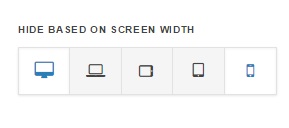
As for visibility, you can actually create two sections, with same content, and the only different will be background. The other section would use landscape image, the other will use portrait. And using visibility, hide one from desktop, and hide one from mobile.

Cheers!
August 13, 2015 at 12:13 am #357844This reply has been marked as private.August 13, 2015 at 12:16 am #357847This reply has been marked as private.August 13, 2015 at 12:25 am #357860This reply has been marked as private. -
AuthorPosts
