-
AuthorPosts
-
February 26, 2016 at 11:20 am #813625
Hi, first of all I love the theme and support.
I have some custom artwork that I would like to properly implement to my site. I would like the image to stay fixed as you scroll down (its a long image) and I would like the very top of the image to align with the top of the page (currently its cutting the top off).
Here is my site
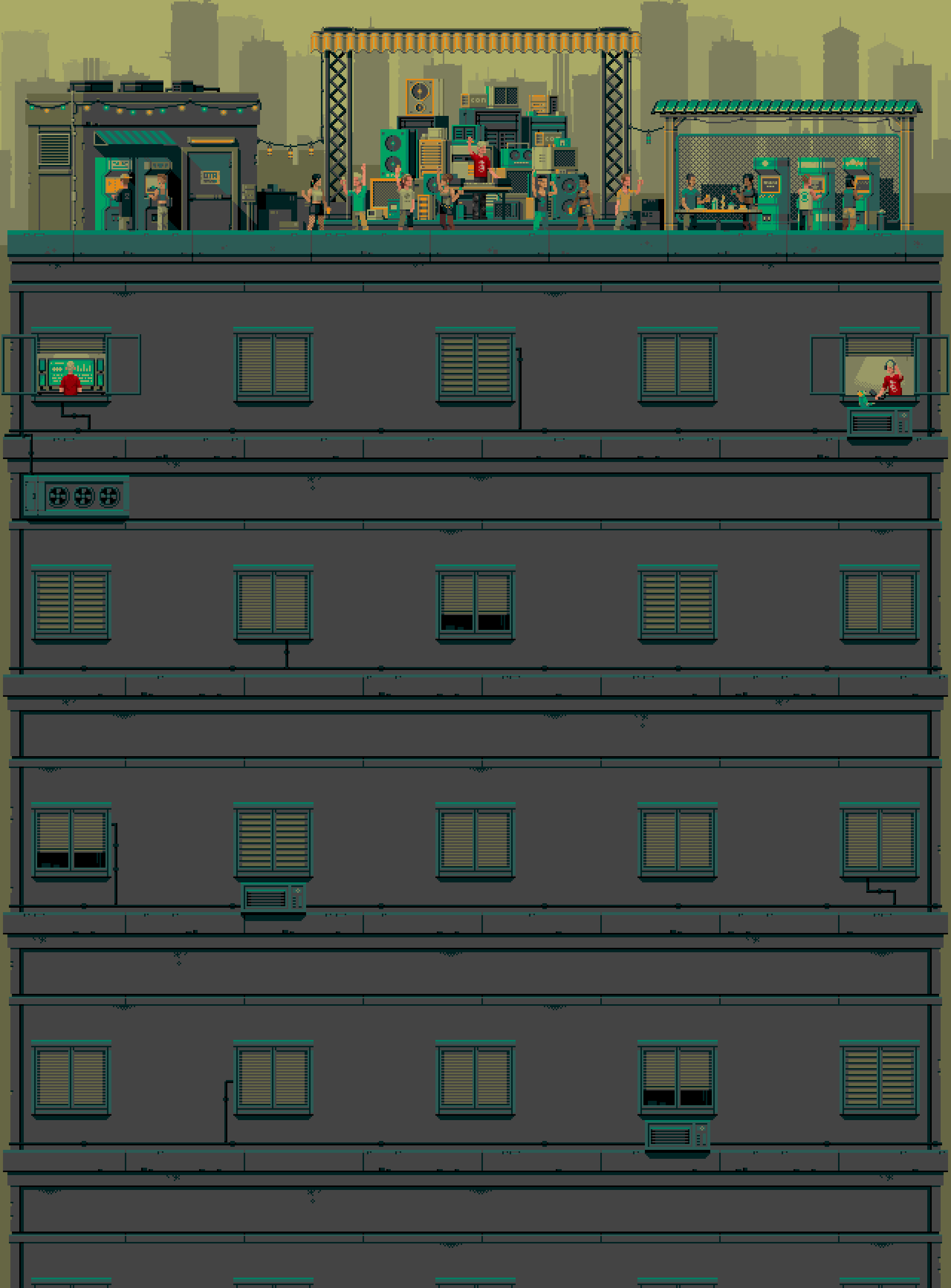
And here is the image like I am using
http://www.ashtonmorris.com/wp-content/uploads/2012/04/animExport01_NoSignLarge.gif
I can resize the image if necessary but I would like to get the sides to fully show. I have tried various forms of custom css from the forums here but none of them seem to work. Here is the custom css I currently have for reference.
.entry-wrap {
background-color: rgba(255,255,255,0.8);
}
.x-logobar { background-color: rgba(100, 100, 100, 0.0); }

a.x-brand {
margin-left: 70%;
}
I have WordPress version : WordPress 4.4.2 running X theme 4.3.4
And Cornerstone plugin 1.1.3
Also there is a custom menu/logo image that I am trying to sync up with the background image, any help with that would be amazing. Thank you so much in advance.
February 26, 2016 at 8:38 pm #814235Hi there,
Thanks for posting in.
Hmm, I noticed this CSS,
body { background: rgba(0, 0, 0, 0) url("http://www.ashtonmorris.com/wp-content/uploads/2012/04/animExport01_NoSignLarge.gif
") no-repeat scroll center top; } .backstretch { display: none!important; }
It’s not formatted very well due to line breaks after the last double quote.
Please change it to this,
body {
background: rgba(0, 0, 0, 0) url('http://www.ashtonmorris.com/wp-content/uploads/2012/04/animExport01_NoSignLarge.gif') no-repeat fixed center top;
}
.backstretch {
display: none!important;
}
Once fixed, I’ll check about the syncing. How should it look like?
Thanks!
February 26, 2016 at 9:34 pm #814273Thank you! It is much better already.
I changed the properties to scroll. Thats what I was going for but I didn’t know the proper terminology.
The sides of the full image are not showing. Is there way I can change the image width, but still keep it responsive? If needed I can alter the image size in photoshop.
Here is the full image with the logo attached. http://imgur.com/XIisnob
I would like to do my best to have the logo match up with the BG image like in that picture. I understand that when resizing it it isn’t going to be perfect though. But hopefully we can set it up so that on a normal monitor format it will look decent.Also once I resize it, I would like to do my best to get the characters dancing in the BG image to be above the body and menus of the site so they are visible. If you would be able to point me in the right direction with that, I would greatly appreciate it.
Thanks again, sorry for asking for so much. 🙂
February 27, 2016 at 5:58 am #814611Hi There,
Please update this CSS a bit:
body {
background: rgba(0, 0, 0, 0) url('http://www.ashtonmorris.com/wp-content/uploads/2012/04/animExport01_NoSignLarge.gif') no-repeat fixed center top;
background-size: 100% 100%;
}
Hope it helps 🙂
February 27, 2016 at 3:49 pm #814959Hi, Thank you it does look much better now.
Unfortunately though the image now is not responsive and squishes whenever you look at it in a mobile device or smaller monitor. Is there a way to fix that?
Also the first replier was talking with me about moving my logo to fit the image. The logo is at the right point on the right side of the screen. But it is shrunken and too low. Is there a way that I can enlarge it and move it up just directly under the topbar?
Thanks!!
February 27, 2016 at 4:59 pm #815006Hi again,
Ok update time. I have gotten the logo to appear properly (for now). But I still find it very important that my background image is responsive. Can you help with that?
Also I would like to remove the white line above the navbar and under the topbar, is that possible.
Here is my site again http://www.ashtonmorris.com/
And here is the mess of css that I have compiled from different threads in my custom area for reference
.entry-wrap {
background-color: rgba(  213,93,93,0.0);
}
.x-logobar { background-color: rgba(100, 100, 100, 0.0); }

a.x-brand {
margin-left: 75%;
}

body {
background: rgba(0, 0, 0, 0) url('http://www.ashtonmorris.com/wp-content/uploads/2012/04/animExport01_NoSignLarge.gif') no-repeat scroll center top;
background-size: 100% 100%;
}

.x-social-global a {
	color: #ffcc66;
}

.x-social-global a:hover {
	color: #CC0000;
}

.x-navbar {
    border-bottom: none;
    box-shadow: none;
}
February 28, 2016 at 12:23 am #815301Hello There,
Thanks for the updates!
To remove the white line above the navbar and under the topbar, please add the following css code in the customizer, Appearance > Customize > Custom > CSS
.x-topbar,
.x-logobar,
.x-navbar {
    border: none;
    box-shadow: none;
}
To better explain you how the background image works, please check out this topic:
https://community.theme.co/forums/topic/section-background-image-2/#post-691126Hope this helps.
February 29, 2016 at 12:19 pm #817135Thank you that helped.
Ok I have solved my full screen BG image issue with this free plugin (which works great).
https://wordpress.org/plugins/simple-full-screen-background-image/
I have erased the background image custom css that we added above incase that messed with the plugins information. But I would still like my image to scroll with the mouse (not fixed). Is there a way to add custom css that only effects the scroll function and leaves the rest of the code this plugin left intact?
February 29, 2016 at 9:15 pm #817644Hi There,
Try adding this in your customizer’s custom CSS:
img#fsb_image{
position: absolute !important;
}
Hope it helps.
Let us know how it goes.
Thanks.
March 2, 2016 at 9:40 pm #821263Perfect! Thank you so much!! I have one last question.
Can I make the Navbar not go above a certain height, or percentage away from the top of the page?
When I check my background image on different screen sizes the nav bar goes above some of the artwork and blocks it. Is there any css that I can add to keep it from going to high?
Thanks again
March 3, 2016 at 12:30 am #821463Hello There,
To adjust your navbar on different screen size, please add the following css code in the customizer, Appearance > Customize > Custom > CSS at the very end of your other custom css
@media(max-width: 1300px){
    .x-logobar-inner {
      padding-bottom: 200px;
    }
}

@media(max-width: 979px){
    .x-logobar-inner {
      padding-bottom: 150px;
    }
}
We would loved to know if this has work for you. Thank you.
March 3, 2016 at 10:31 am #822145Wow that works really well. Thank you again!
March 3, 2016 at 4:11 pm #822577We’re delighted to assist you with this.
Cheers!
-
AuthorPosts
