Tagged: cornerstone
-
AuthorPosts
-
May 8, 2016 at 5:40 pm #981366
Hi there,
Thanks, that confirms it. The CSS given at #910150 has the result the same as this
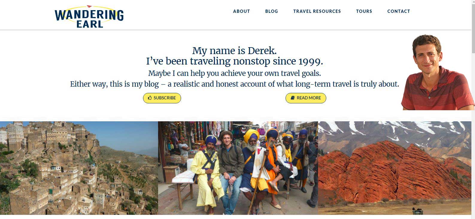
https://s3.amazonaws.com/community-themeco/app/uploads/2016/05/08111857/Desired_wide.jpg
The question is, when should we consider the bigger and smaller screen since there are many devices?
Please add this CSS,
  .home #x-section-1 {
  background-image: url(http://staging.wanderingearl.com/wp-content/uploads/2016/04/Wandering-Earl.png);
    background-repeat: no-repeat;
    background-position-x: right;
    background-position-y: bottom;
    min-height: 300px;
    border: thin solid transparent;
  }

@media ( max-width: 1570px) {

.home #x-section-1 {
padding-top: 339px !important;
background-position: center 85px;
}

}
Cheers!
May 10, 2016 at 10:20 am #984253Hey guys thanks for all the help but after all that, my client has decided to go a different direction with the homepage and no further work on this issue is needed. Thanks again for your excellent support!
May 10, 2016 at 1:24 pm #984538You are welcome,
Let us know if you need further help.
Thanks,
Joao
-
AuthorPosts
