I just noticed today that the menu navicon is not working for mobile devices, it looks like its linking to a random page on the website and not #. I’m not sure how to fix this. Please help. My website is https://mypropest.com
Blake
I just noticed today that the menu navicon is not working for mobile devices, it looks like its linking to a random page on the website and not #. I’m not sure how to fix this. Please help. My website is https://mypropest.com
Blake
Hello Blake,
Thanks for writing in!
I checked the website and can see X Theme version 2.0.1 and Cornerstone 3.2.0. Please update X Theme to latest version 6.5.5 and Cornerstone to 3.5.4 to avoid any compatibility issues on the website. In your case you will have to validate X Theme and Cornerstone manually as automatic update won’t work.
You can refer following resources to update X Theme.
In update guide, please scroll down to manual update section on instructions to update X Theme.
Thanks.
Thank you for your help. I have started the upgrade process and found that its going to take a lot of time so I decided to clone my site so as to be able to fix it while the site is still live. I’m unable to update Cornerstone on the cloned site because its a different domain, is there a workaround for this?
Nevermind I figured this part out.
Sure, please let us know if you have further issues with updates. Thanks!
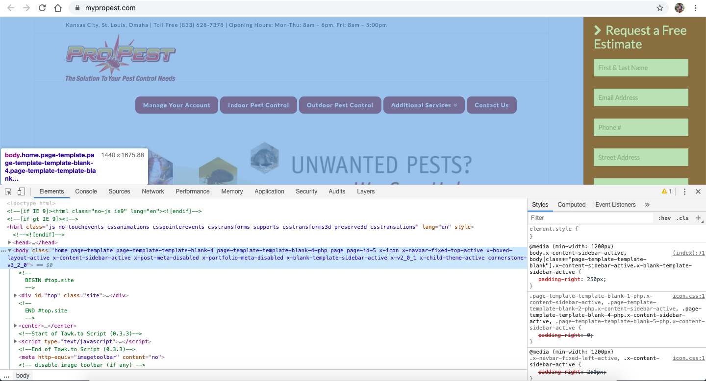
Ok so I have the site cloned and the remaining issue is the navbar on desktop size, I can not figure out how to get the nav buttons to look like buttons. For reference I’m trying to get the menu to look similar (doesn’t have to be exact) to mypropest.com. The site has been cloned to kcpropest.com and the buttons are totally off. I cant get the buttons to even show any color, let alone be inline with the logo.
I appreciate your help with this!
Hello Blake,
Thanks for updating the thread. 
Please add following CSS under X > Theme Options > CSS:
.x-navbar-static-active .x-navbar .desktop .x-nav>li>a>span, .x-navbar-fixed-top-active .x-navbar .desktop .x-nav>li>a>span {
    background-color: #87190C;
    border-radius: 15px;
    color: #fff;
}

.x-navbar .desktop .x-nav > li > a:not(.x-btn-navbar-woocommerce) {
    padding: 43px 3px 27px !important;
    font-size: 12px;
}

.masthead-inline .x-navbar .desktop .sub-menu {
    background-color: #87190C;
    border-radius: 20px;
}

.x-navbar .desktop .x-nav > li > a, .x-navbar .desktop .sub-menu a, .x-navbar .mobile .x-nav li a {
    color: #fff;
}
1- I have found the proper CSS code selector using the Chrome browser Developer Toolbar: https://www.youtube.com/watch?v=wcFnnxfA70g
2- For the CSS code itself, I suggest that you get started with this tutorial: https://www.youtube.com/watch?v=yfoY53QXEnI
Thanks.
This topic was automatically closed 10 days after the last reply. New replies are no longer allowed.