Hello There,
Thanks for writing in!
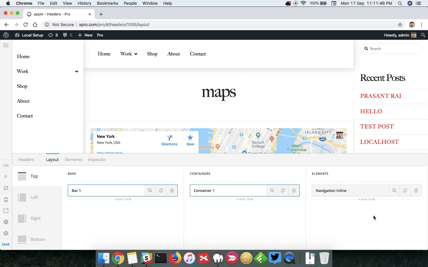
Please edit your header and in the bar settings, please set the content length to 100%. The horizontal Flex layout setting should be “Space between”

1.) To get the menu to align to the right, please click the container of the navigation inline and set the horizontal Flex Layout to “End”.

2.) To get the logo to align to the left, please click the container of the logo image and set the horizontal Flex Layout to “Start”.

3.) Please go to Pro > Theme Options > Buttons and select Pill.
4.) Please disable the Content Scrolling in your bar settings so that the sub menu will display.

5.) In smaller screens, the navigation inline will no longer display correct because there aren’t enough space to display the menu items. You will need to hide the navigation inline and add navigation dropdown or navigation collapsed which should only be visible in smaller screens. You can show/hide elements using the “Hide During Breakpoint” option in each of the element settings. To know more about “Hide During Breakpoint” option, please check this out: https://theme.co/apex/forum/t/hide-during-breakpoint-explained/17378
Hope this helps.