Some aspects are NOT mobile friendly

Hi there, I recentlyl received help from you with my add to cart button. I wanted it lined up under the products picture. I thought it was perfect expect it seems like small screens it is still not lining up. I’d love a fix for this please as the words are going over the add to cart and they products arnt lining up - see picture

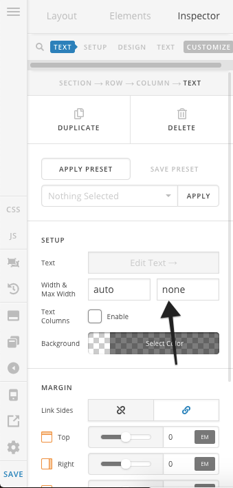
I also noticed on my home page, I tried to make two text areas width smaller but it seems on small devices it goes off the edge and there is no way to see it… see picture Is there a way to make the text width smaller on large screens without going off the screen on small?

As always thanks for the support

Hi,

These are not responsive because of the custom css that you have added.

  1. In your products page, I can see you have set your button to position absolute whic makes it overlap with the product name.

You need to increase min-height as the screen width becomes smaller which is not ideal.

eg. Add this in Theme Options > CSS

@media(max-width:850px) {
.woocommerce li.product .entry-header {
    min-height: 150px;
}
}

@media(max-width:767px) {
.woocommerce li.product .entry-header {
    min-height: 180px;
}
}

I suggest you use essential grid instead


https://www.themepunch.com/essgrid-doc/essential-grid-documentation/

  1. I can see you have added a fixed width to your text element. It prevents it from shrinking and stay on that width on smaller screen.

Please remove the width, you may replace it with max-width instead.

   max-width:400px;

Hope this helps

Thank you, ill change it in the CSS for now and Ill have a look into the plugin.

What about my text on the home page not being responsive once I changed the width of it?

Hello Nonie,

When setting the width of the text element, you must also set the maximum width so that it will be responsive enough as soon as the screen size is less than the set width of the text element.

Hope this helps. Please let us know how it goes.

Thank you but the picture you attached isnt working. What max width would I set it to so its responsive?

Hello Nonie,

Thanks for updating the thread.

In the text element under Setup > Width & Max Width, please set Max Width. Here’s a screenshot that you can take a look.

Thanks.

Thank you that’s all fixed up now. I wanted to bring these images in closer together toobut there is no option for selecting widths. When on mobile these pictures are stacked one ontop of each one at a time and I hoped if I brought them in closer together they would be two in a row on mobile. Is there anyway I can do this?

Hello @TinyLewy,

Do you want something like this?
https://d1wuojemv4s7aw.cloudfront.net/items/3Z0F3l0B3y0Y3D0e2x11/[b7920ce35ffe1af023cc16c760d19f86]_Image+2018-10-12+at+8.50.41+PM.png?X-CloudApp-Visitor-Id=3182107&v=d4176d11

Please edit your page and make sure that the width of your images has an auto width and a maximum width of 100%. The retina and dimensions should be disabled also. Please check the image below as an example:

Hope this helps.

This topic was automatically closed 10 days after the last reply. New replies are no longer allowed.