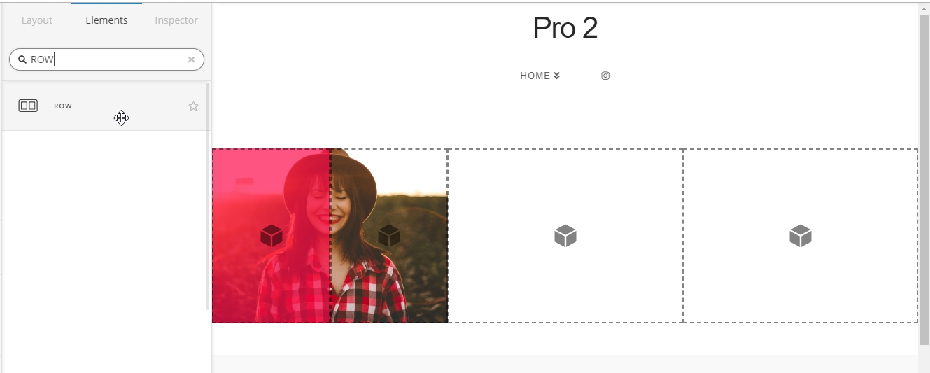
Hi there, I’m wondering if I can adjust the background upper layer of a section in Cornerstone to cover only half of the lower layer. Here’s how we want it to look. Please let me know if this is possible.

Thanks!
Hi there, I’m wondering if I can adjust the background upper layer of a section in Cornerstone to cover only half of the lower layer. Here’s how we want it to look. Please let me know if this is possible.
Thanks!
Hi @Web_Services,
Can you provide us the url of the page where we can see that.
I suggest you add that background in your column element instead of adding it as background upper layer.
Thanks
Hi Paul, yes, it’s at our main homepage of zibafoods.com
I was thinking the column idea originally too, but our client wants the background image to span what would be both columns, not sure how to do that
Hi @Web_Services,

That is possible as a Section background. Have the image on the Section’s lower background (no upper background). And then add the semi-transparent white background (either upper or lower) on the left column and leave the right-column clear.
In regards with the column, before if we do that effect in Column it would be a little bit tricky, but now with the ROW element you can nest a 1/2 column inside a column, so you can do that pretty much how you will do it with a section.
Hope that helps,
Cheers!
So close to working! Thanks for pointing out that ROW element, I hadn’t seen that before.
With the differences in content length, I’m getting a space at the bottom where the transparent layer isn’t covering. Is there a way to force that background to extend to the bottom of the column?

Hi @Web_Services,
Turn on the Marginless Columns option of the nested ROW, and all of its columns will have the same height.

Hope it helps,
Cheers!
Thanks for the quick reply, but that didn’t work
Hi,
In that case, please provide us the page URL and a login credentials in a secure note so we can take a closer look.
Thanks,
Ok, just posted secure note
Hi @Web_Services,
Thanks for the credentials, so yeah it’s a bit tricky than expected, I ended up using the Flexbox CSS.
I’ve added this to the Page > CSS
@media (min-width: 980px) {
	.display-flex {
		display: flex !important;
	}
 .flex-full-height {
 	display: flex  !important;
    height: 100%;
 }
}
Then applied the class display-flex to the parent ROW, and applied the class flex-full-height to the child ROWs.
Hope it helps,
Cheers!
Excellent, thank you!!
You’re welcome.
This topic was automatically closed 10 days after the last reply. New replies are no longer allowed.