Hi there,
Kindly purge the cache and deactivate the W3 cache temporarily till this matter solves as each time we see another view than the one you described.
To make sure that there is no other factor in the way please turn off the Parallax effect in the Revolution Slider.
Then follow up the same method @Bark201 mentioned to hide the slider on mobile devices.
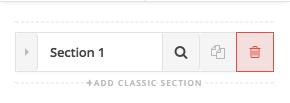
After that kindly add a section as the first section of the page in the Cornerstone.
Then Click on the advanced option of the background option inside the Section. You will need to click on the magnifying glass icon of the section to see the settings:

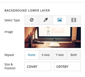
After that, kindly add a background image to the section which will act as the substitute image of the slider for mobile screens.
Set the Size to Cover to make sure the image will take up the whole section space:
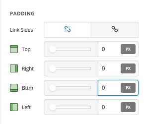
Then scroll down the options screen to make sure that the Padding options are set to 0. The default is 45px:
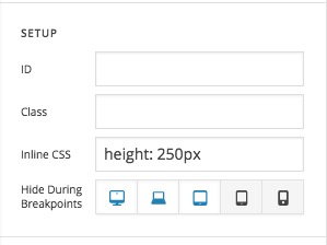
Then, please click on the Customize tab of the section options and hide this whole section for bigger screens:

Also, add the height: 250px inline CSS code there to make sure it will have that height for the mobile screens or whatever height you prefer:
Finally, delete the Image Element inside the section and keep it empty as you already have the image as a background of the section.
If you still have problems kindly get back to us with the URL/User/Pass of your website using the Secure Note functionality of the post to follow up the case for you.
Thank you.


