I am trying to make our xtheme site responsive for some time, but can’t seem to figure it out. For example many of the images on the site simply crop when on a mobile device and they do not resize.
Our home page has an image background in a content band, but it just crops all of the time.
And the buttons don’t resize, they just become offset.
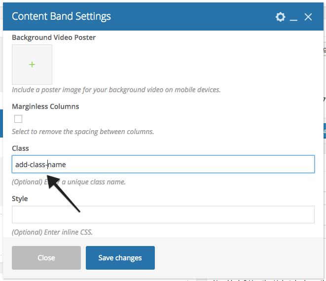
If you would like to add custom class name, in that case just replace .x-content-band.bg-image with class name you have added to Content band.
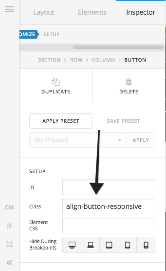
To scale buttons properly on mobile devices, you need to adjust few settings. First please add a class name to button element under Customize > Class. After that add following CSS under X > Theme Options > CSS:
@media only screen and (max-width: 600px) {
    .alignleft.align-button-responsive-left {
    margin-right: 5px;
}

.alignright.align-button-responsive-right {
    margin-left: 5px;
}
}
You can change the class name as per your requirement.