Hi, how can I make the margins of the text on a page be different for desktop version of the website and the mobile version. I have 1 more question regarding the mobile, how can I change the behaviour of BG image of the section.
For example if you go the bottom of the page: http://nova.valentin.graphics/index.php/home/ just before the footer there is an image that shrinks on the mobile version and doesn’t stick to the bottom and it looks bad, can you guide me how to fix this too. Thanks.
Hello @vlntnt,
Thanks for asking. 
- You can have 2 sections, one for mobile and other one for desktop and set the margins accordingly as per requirement. You can control the visibility from Customize > Setup > Hide During Breakpoints. To lean more about Hide During Breakpoints, please take a look at following resource.
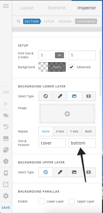
2. If you would like to position background image to the bottom area of the section then please create one more section and assign the background image. Let the position be bottom (display on mobile).
Next, control the visibility under Customize > Setup > Hide During Breakpoints.
Thanks.
Thanks a lot!
You are most welcome.
This topic was automatically closed 10 days after the last reply. New replies are no longer allowed.