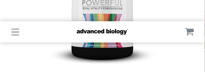
Pro mobile menu gap at top

I saw a few other posts and the fixes didn’t work for me. When switching to mobile, there is a gap between the top of the page and the top of the mobile menu when scrolling down, see attached. It happens on all of my menus. I will soon have a few dozen menus, so I’d love a fix that will take care of all of them at once. What’s the deal with this, why is is it happening?
Hello @lancebarton,

Thanks for asking. :slight_smile:

Can you please share website URL for us to take a closer look?

Thanks.

Please check here: http://54.191.189.56/

Hi again,

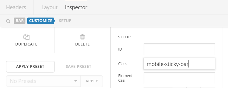
Thank you for providing the URL. Please give your mobile sticky bar a class first e.g mobile-sticky-bar (see screenshot)

Then add the following code in the Theme Options > CSS:

.mobile-sticky-bar.x-bar-fixed {
    top: 0 !important;
    z-index: 9999;
}

Hope this helps!

Seems to be working now! Thank you so much for the help!!!

You’re welcome!
We’re glad we were able to help you out.

This topic was automatically closed 10 days after the last reply. New replies are no longer allowed.