Possibly to Do a different display for desktop and mobile?

Hi,
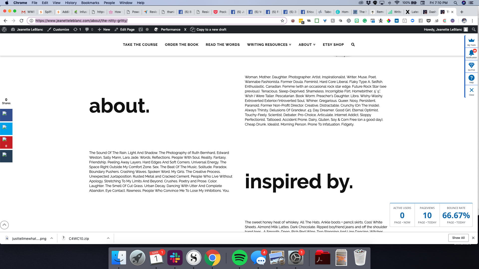
I just played with a new about page design in cornerstone, it looks great on desktop, but I realized that in creating alternating banks of headers and text that the view doesn’t work on mobile

desktop

mobile.

Is there any way to have the alternating bands on desktop but to have the headers above the text for each section on mobile?

Thanks so much
Jeanette
Hi Jeanette,

Thank you for writing in, yes that is possible, to do that, on the Sections where the headline is on the right column, duplicate the ROW.

On the duplicate ROW interchange the headline and text, so it should be the headline on left, text on the right.

Now you got two Rows, the magic happens with Hide During Breakpoint feature.

The idea is to hide the original Row on a small and extra small screen.

The duplicate Row will do the opposite, shows up on small and extra small screen, but hidden on extra large, large, and medium screens.

Bonus tip: View the page in mobile preview so you can easily edit those duplicated Rows.


Let us know how it goes,
Cheers!

This feels like pure magic! I am intimidated by the process but will let you know if i get it :wink:

Let us know how it goes! :slight_smile:

This topic was automatically closed 10 days after the last reply. New replies are no longer allowed.