Hello when I open my menu on mobile it won’t show the entire menu when it is opened. Can someone please help mecan I fix this
Hello Justin,
Thanks for writing in! You maybe having a caching since you are install W3 Total Cache. Did you also install Autoptimize plugin? Please clear all your caching plugins and regenerate any minified JS and CSS files. Clear your mobile phone’s cache or use private browsing mode and test your site again.
Please let us know how it goes.
Hello Justin,
The given credentials in your previous thread no longer works. Would you mind providing us the url of your site with login credentials so we can take a closer look?
To do this, you can create a secure note with the following info:
– Link to your site
– WordPress Admin username / password
To know how to create a secure note, please check this out: https://theme.co/apex/forum/t/how-to-get-support/288
Thank you.
Hi Justin,
I have checked your site and I see that you have updated your Cornerstone plugin to the latest version (v3.4.6) but you’re still using an older version of X theme (v6.1.6) which creates incompatibility issues.
The latest version of X theme is (v6.4.6) as you can see it from here (https://theme.co/changelog/) and you can update your theme accordingly by following our guide here (https://theme.co/apex/forum/t/setup-updating-your-themes-and-plugins/62).
Once you’re fully updated, make sure to clear full cache by following this guide here (https://www.wpbeginner.com/beginners-guide/how-to-clear-your-cache-in-wordpress/) and re-test your issue again.
Let us know how it goes.
Thanks!
Hi I updated the theme and it still has the same issue
Hello Justin,
Thanks for updating the thread.
I tried narrowing down to the issue that might be causing with navigation on mobile devices. When testing for plugin conflict in front end I am getting 500 error message. So there’s some plugin causing the problem. Please do following:
- Under Plugins > Installed Plugins, try testing for plugin conflict by disabling all plugins and then reactivating one at a time to narrow down.
- I also see you have done bunch of customizations in child theme. Please activate parent theme and see it that resolves the issue.
Please let us know the outcome of above solutions. In case problem is still there then give us the permission to test further. Website may have temporary layout issues while we are troubleshooting.
Thanks.
okay I will try that with the plugins.
- Is the parent theme where I have the red “X” in the attached photo?


Also,
I just went to look at my website and the hamburger menu is move and the menu was open when I got to the website.
I haven’t changed anything… If somehow someone was trying to get it to work can you change it back?
The hamburger menu used to be on the top right on the home page and the menu didn’t open till clicked on… it never had the underlines either.
never mind the last post . I refreshed and it was back to normal
Hi Justin,
Please find and remove this from your custom CSS.
@media (max-width: 767px) {
	header.masthead .x-navbar.x-navbar-fixed-top {
	    position: fixed;
	}
}
And that should enable you to scroll the mobile menu.
Thanks,
that took away he menu scrolling with the page. Now it doesn’t work and I added the code back in.
I need the menu to scroll with the page on mobile…
Once I had that working then if you open the menu you can’t scroll down while the menu was open.
But now the menu doesn’t even scroll with the page any more.
Hi Justin,
There was a syntax error in your custom CSS. I’ve used this tool to correct it:
https://e10host.com/css-beautifier
Everything looks good now.
Cheers!
I still can’t scroll to see the entire menu on mobile. Once I click the hamburger menu and the menu opens I can scroll down to see all menu items
Hi,
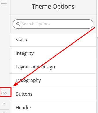
To enable scroll, you can try adding this in Theme Options > CSS
@media(max-width:767px) {
.x-nav-wrap.mobile {
    max-height: 250px;
    overflow-y: scroll;
}
}
You may change 250px to adjust the visible area.
Hope that helps
It will scroll now but it doesn’t show the button which is at the bottom of the menu on mobile. Is it possible to make it scroll down a little more?
Also some how the phone icon in the menu got delete it was next to the hamburger how can I re ad that?
Hello Justin,
I have just updated your css.
.menu {
	color: red;
}

.navigation {
	background-color: #333 /* darkgrey */;
}

.x-nav-wrap.desktop {
	margin-top: 30px;
}

.x-brand {
	margin-left: 20px;
}

.x-brand {
	margin-top: 2px;
}

.x-navbar .desktop .x-nav > li > a:hover,
.x-navbar .desktop .x-nav > .x-active > a,
.x-navbar .desktop .x-nav > .current-menu-item > a {
	box-shadow: none !important;
}

.x-navbar {
	background-color: #000000;
	position: relative;
	width: 100%;
	border: none;
	box-shadow: none;
}

@media(min-width: 768px) {
	.x-navbar {
		position: fixed;
	}
}

.x-colophon.bottom {
	background-color: black;
}

.x-btn-navbar.collapsed {
	background: black;
	color: fff;
}

body .x-btn-navbar.collapsed,
body .x-btn-navbar.collapsed:hover,
body .x-btn-navbar,
body .x-btn-navbar:hover {
	background: #000;
	color: #fff;
}

.desktop .sub-menu {
	background-color: #000000;
}

.desktop .sub-menu a {
	font-size: 20px;
}

.x-navbar .desktop .x-nav li>a>span:after {
	display: none;
}

.desktop .sub-menu a {
	border-bottom: 1px solid #ddd;
}

.desktop .sub-menu li:last-child a {
	border-bottom: none;
}

footer.x-colophon.bottom a, footer.x-colophon.bottom p {
	color: grey;
}

@media(max-width: 767px) {
	.x-brand img {
		width: 85px;
	}

	.x-navbar .x-container.max.width {
		max-width: 99%;
		width: 100%;
	};
}

.x-navbar .mobile .x-nav li>a {
	text-align: center;
	border: 1px solid #ffffff00;
}

/*.x-nav-wrap.mobile {
	min-height: 100vh;
}*/

.x-navbar .mobile .x-nav li>a {
	font-size: 18px;
}

.x-navbar .mobile .x-nav li>a .x-sub-toggle .x-icon-angle-double-down:before,
.x-navbar .mobile .x-nav li>a .x-sub-toggle .x-icon-angle-double-down:before {
	content: "\f107" !important;
}

.x-navbar .mobile .x-nav li>a .x-sub-toggle {
	position: relative;
	left: auto;
	bottom: auto;
	top: auto;
	right: auto;
	display: inline-block;
}

.x-navbar .mobile .x-nav li>a .x-sub-toggle>span {
	margin-top: -15px;
}

.x-navbar .desktop .x-nav > li:last-child a {
	padding: 20px 29px;
	color: white;
}

.x-navbar .desktop .x-nav > li:last-child a {
	padding: 20px 29px;
	color: white;
}

.x-navbar .desktop .x-nav > li:last-child a:hover {
	border-color: grey;
	color: grey;
}

.x-navbar .desktop .x-nav > li:last-child a,
.x-navbar .mobile .x-nav > li:last-child a {
	padding: 10px 29px 10px;
	height: auto;
	color: white;
}

body .mobile .x-nav li > ul a {
	padding-top: 3px !important;
	padding-bottom: 3px !important;
}

.menu-item-228 a {
	color: red !important;
}

.desktop .sub-menu a {
	font-family: Arial, serif;
	font-size: 20px;
	color: red;
}

body.single-product {
	background-color: white;
}

#navbtn {
	background-color: #d52020;
	color: white;
	border-color: #d52020;
	padding: 8px 40px;
	margin-top: -10px;
}

.product_meta {
	display: none;
}

.woocommerce .button.product_type_simple:before,
.woocommerce .button.single_add_to_cart_button:before {
	display: none;
}

.woocommerce .quantity .input-text.qty.text {
	display: none;
}

.woocommerce-notices-wrapper {
	display: none;
}

.woocommerce-account form .payment_methods li,
.woocommerce-checkout form .payment_methods li {
	display: none;
}

.woocommerce-checkout .woocommerce-terms-and-conditions-wrapper {
	display: none;
}

.single-product .entry-wrap,
.woocommerce-checkout .entry-wrap,
.woocommerce-cart .entry-wrap {
	border: none;
	box-shadow: none;
}

td.product-remove a {
	font-size: 40px;
}

.wcppec-checkout-buttons.woo_pp_cart_buttons_div {
	display: none;
}

.sub-menu .x-anchor-text {
	font-family: "Lato",sans-serif;
}

.x-accordion-body, .x-accordion-heading {
	font-family: Arial;
}

footer.x-colophon.bottom .x-social-global a {
	font-size: 35px;
}

.x-navbar .mobile .x-nav li>a {
	font-family: Arial,"Helvetica Neue",Helvetica,sans-serif;
}

.x-colophon {
	border: 0 !important;
	box-shadow: none;
}

@media (max-width: 767px) {
	header.masthead .x-navbar.x-navbar-fixed-top {
		position: fixed;
	}

	header.masthead {
		min-height: 70px;
	}
}

.x-navbar .mobile .x-nav ul {
	display: block;
}
@media(max-width:767px) {
.x-nav-wrap.mobile {
    max-height: 90vh;
    overflow-y: scroll;
}
}
After making any tiny site changes, you always need to clear your site cache and also regenerate the minified JS/CSS files to avoid any errors. You browser cache needs refreshing too.
Please check your site now.
Thanks for helping me with that.
One last question… I am not sure where the phone icon that was next to the hamburger went? How can I get that back?
Hello Justin,
I have inspected the page and there is no indication that a phone icon exist next to the mobile menu icon. You might have removed it or something. Did you added it in your child theme? Or maybe the modifications were added in the parent theme which was then overwritten with the new updates. Could you please clarify how did you added the icon?
Thank you in advance.