I’m in PRO. How does one make a menu that is inline on desktops and “menu collapsed” hamburger only on mobile? I cannot see any settings that make this happen.
Hello John,
Thanks for writing in!
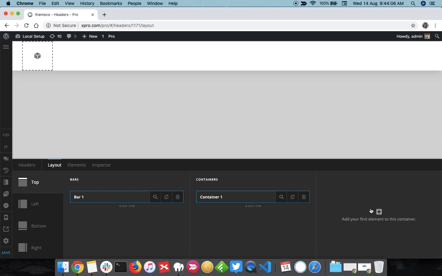
To display Navigation Collapsed only on mobile, you can use Hide During Breakpoint feature. Please inspect Navigation Collapsed element and under Customize > Setup > Hide During Breakpoint select Desktop and Laptop icon.
For more information, please take a look at following screencast.
Thanks.
That worked. Thanks!
While reviewing your screencast, I saw you slick the “mobile” icon in the left nav, thus revealing breakpoints. Do you have any documents on using this. The immediate question is: does one need to set specifications for all breakpoints, one breakpoint, some breakpoints?
I like Pro, but it sure is hard to learn the details.
Your screencast is very useful. AndI just discovered that if you right-click the screencast and selected "open in new window: you can actually see the details of your useful screencast.
Hello John,
In my previous reply I have shared the tutorial that describes Hide During Breakpoint feature in detail. Regarding specifications, it depends. Suppose you want the element to display only on Desktop, then you select all other icons i.e Laptop, Tablet, Mobile so that the element is shown only on Desktop screens.
Learning Pro is fairly easy. I suggest you to please take a look at our KB articles and videos to explore and learn more about Pro Theme.
https://theme.co/apex/forum/t/knowledge-base-overview
Thanks.
This topic was automatically closed 10 days after the last reply. New replies are no longer allowed.