Howdy @dopeanddisabled,
Thanks for writing in and sorry for the delay. Just for future reference, our system orders threads from oldest to newest, and responding to a thread will bump it back in line as it’s considered an updated response, that’s why it has taken us a while to see this thread pop up as we’ve had others that came before. Just wanted to let you know that for future questions as responses from our team can take up to 24 hours (sometimes more when it’s busy, and there’s a lot of activity at the moment with our recent release). All that being said, let’s move on to your question. 
With the setup you’re looking to go for, I would recommend using the “Stacked” navigation (which it appears that you are). A live example of how this functions can be seen here:
https://demo.theme.co/ethos-3/
You will notice that the logo is centered in a bar above the navigation on both desktop and mobile with this setup. This logo can either be text or an image based on how you set things up in the Theme Options.
While you are using the Stacked navigation, it appears that you have done some modifications to this, namely, completely hiding the bar the logo appears in:
.x-logobar {
  display: none !important;
  visibility: hidden !important;
}

@media (min-width: 980px) {
  .x-logobar {
    display: none !important;
    visibility: hidden !important;
  }
}
Both snippets of CSS above are taken directly from your website. It also appears that you’ve placed the logo into the center of your nav by placing it inside of a navigation item. All of this customization / tweaking of how this functionality works is what is making this layout appear to not work properly.
My recommendation would be to revert all of this back to how it is supposed to operate by revealing the .x-logobar element again and allowing the logo to simply be shown there. By having it above your navigation, you ensure that it is always out of the way and always perfectly centered for all screens. Also, when your logo is uploaded, you can ensure that it is halved and made “retina ready” by entering the width of the image source in the input below the upload:
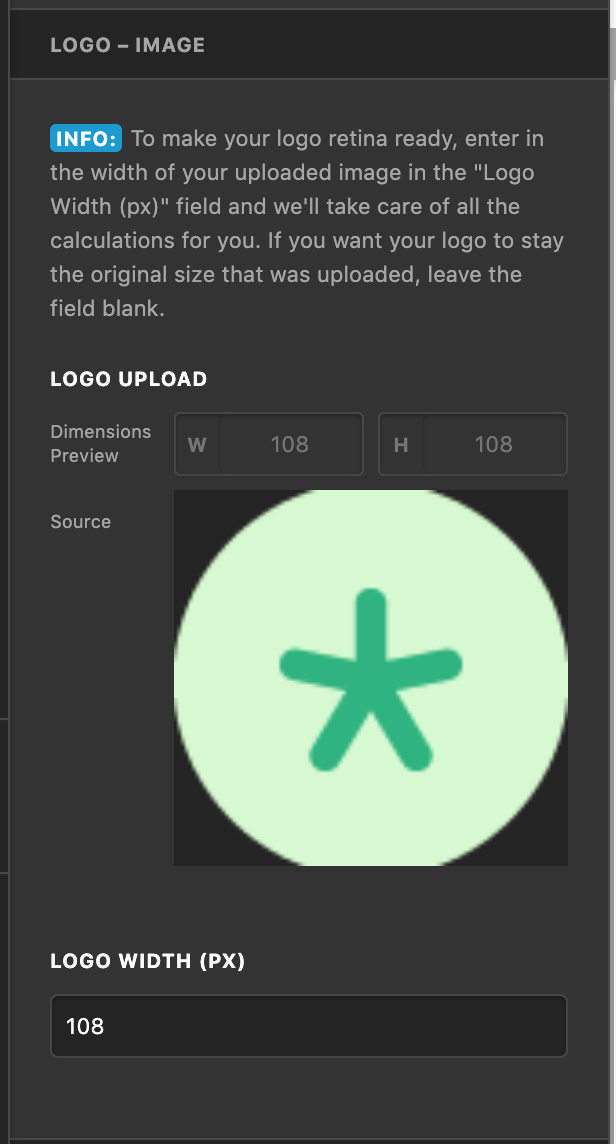
You can actually reduce the size even more of your image if you need to make it smaller by shrinking this value down. It will simply take the value you input and halve it so that your image size is reduced to look good on high pixel density displays, but this can also be used to further reduce the size if necessary.
I’m assuming you saw the word “LOGO” appear before you uploaded your image, as that is the default text, so that should be good now. Also, it is not possible to have a separate logo appear unless you were to overwrite the template files of your theme (you would need to do this to both output a new image and / or place it in a new spot). Customizations to template files are something that must be handled by each user, but you can learn more about how to do this here: https://theme.co/apex/forum/t/customizations-best-practices/205
If you are unsure of how to do this or don’t want to have to get into all of that due to your deadline, I would still strongly recommend what I mentioned above: show the logobar again, adjust the provided Theme Options settings to suit now that your logo is uploaded, adjust the sizing as needed, and you will have the centered look you’re after.
Hopefully this all helps to point you in the right direction, cheers!
