When I see the integrity demo I see a long form and then option of shipping to a different address and then the “Your Order” details. It becomes a long page.
Whereas in nomal themes and default Woocommerce the “Your order tab is on the right” like in the screenshot.
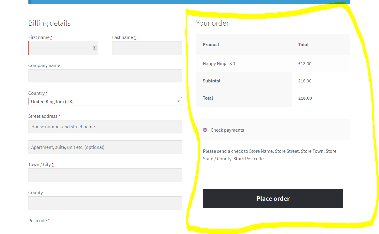
Please check screenshot in secure notes for seeing how current checkout page looks. It is how it should be in the Integrity stack, but I want it to be at the right side, how it is in the above screenshot. Thanks.
Hi There,
Could you please provide us with your website URL so we can take a closer look?
Thanks.
Sure. Please check secure note for the URL. Also, I have already made the change via CSS, but it’s not properly responsive. I am sure you would be having the best solution.
Also, please note that I have currently given my testing license to this domain, but the original site has it’s own license.
Thanks.
Hi,
Upon checking your website your solution looks good and responsive.
Please clarify what you need to fix,
Thank you
Please check now. I have removed the custom CSS. It is the default theme layout now. I want it to be like i had attached in the original post.
Also, is it possible to build submenus like the attached. I want to build it with Pro rather than using a plugin. I have reached close to it . But the submenus shown aren’t aligned the way they are on the original site. (Check secure note for details)
Thanks.
Hi There,
With the submenus, it looks like a megamenu. Unfortunately, megamenu is not yet supported in PRO. Try the following for the checkout:
    float: left;
    width: 48%;
    margin-right: 4%;
}
div#order_review {
    float: right;
    width: 48%;
}
.woocommerce-checkout form h3#order_review_heading {
    margin-top: 0; /* When it is in one column we need to top margin for spacing, now  for it to align on the left side top part we don't need it anymore this resetting to zero*/
}```
See [this](https://screencast-o-matic.com/watch/cbjbnGl72j) on how to inspect element for future CSS issues.
1 Like
After adding css, it did get the proper layout but not responsive. On mobile it wasn’t proper.
Also just to confirm, I am talking about only the checkout page.
Hello There,
Please add following CSS to make form responsive:
  @media only screen and (max-width: 500px) {
    .woocommerce-checkout div#customer_details {
        width:100%;
        float:none;
        margin: 0;
    }
   .woocommerce-checkout  div#order_review {clear:both;width:100%; float:none;}
   .woocommerce-checkout .woocommerce-checkout form h3#order_review_heading {
    margin-top: 0;
 }
}
Thanks.
Hi. Added the CSS but it’s not showing up properly. Please check. Thanks.
Hello There,
Please edit your checkout page and do not use Cornerstone. You only need this shortcode to display it correctly in smaller screens:
[woocommerce_checkout]
If you persist on using Cornerstone, it would not look good because of the paddings and margins of the section, row and column and since this page is using Blank - Container | Header, Footer. You should at least use the Blank - No Container | Header, Footer page template.
Hope this make sense.
Okay. That fixed the issue. I have set up uber menu for the mega menu. Imported the data from the original site. It looks fine, but on smaller devices, it’s not aligned how it is supposed to be.I am having problem with submenu only. Please check secure note for details.
I’ve actually switched the theme to X and used uber menu. It’s fixed now. I read ubermenu isn’t compatible in pro header. Thanks.
You’re welcome.
I have used Ubermenu for getting the same functionality. However submenus aren’t scrollable on smaller devices. When I made the mobile menu sticky via the following CSS code.
@media (max-width: 979px){.x-navbar-fixed-top{
	position: fixed !important;
}

body.x-navbar-fixed-top-active .x-navbar-wrap{
	height: auto;
	min-height: 46px;
}}
Please check secure note for updated domain name.
Hi There,
That CSS will not work as expected because the functionality is in Ubermenu. We can’t also have sticky/fixed menu on mobile. Please check the following documentation regarding the setup, structure and limitation of sticky mobile menu.
Hope this helps.