How do i fix these changes

i am using navigation inline in the footer to make the text clickable but i need to recolor and make the first text in the menu bigger.

This is a picture of what i need to change

https://gyazo.com/481d0fbad7bb26aa63c728a1dec6aaf4

How do i fix this?

i am using X PRO, footer customize

Hello Hans,

​To assist you better with this issue, would you mind providing us the url of your site with login credentials so we can take a closer look and check your footer? This is to ensure that we can provide you with a tailored answer to your situation.

To do this, you can create a secure note with the following info:
– Link to your site
– WordPress Admin username / password

To know how to create a secure note, please check this out: https://theme.co/apex/forum/t/how-to-get-support/288

Thank you.

i added a Secure note in the first post in this thread which is above your post

Hello Hans,

The flex layout of the container should be as “Column”.

And then insert a headline element and navigation inline element. For the headline element, do not add anything just plain text. You can style the headline like font family and color by using the headline settings.

Please check out my modifications to your footer.

How do i fix these things?

https://gyazo.com/70473ff3948044ac181f54868aa39f1e

Hello Hans,

You can position the contents of the container by changing the vertical and horizontal settings of the flex layout.

You do not need the global block or any gap element. Again, since you are using a headline element, please only insert a plain text. Do not place <h4><span> tags in the headline element. Please check the other headline as an example.

To better understand about using flex box and it’s settings, please check this out:

Thank you

there is two more change i need to do and the first one is to fix this for the Pc version:

https://gyazo.com/6bff6d7a8a15438b8b5154e4c8be0cdc

And the second is to make the footer laptop, ipad, mobile friendly:

Laptop: https://gyazo.com/3bb0627f34a988d17c362438964685bd

Ipad: https://gyazo.com/bd97ca0b2a899d81128673ca3914651d

Mobile1: https://gyazo.com/d70bed5da601be738eeb0e8dffc486b2

Mobile2: https://gyazo.com/ca954f8057e5957c87309402b8889009

Hi Hans,

For the first question, I suggest that you go to each container, and in the settings of that container you will have an option to set the maximum container width:

Set a value there to force the containers to maintain the width and do not go beyond that. The other point is that I suggest that you learn more about the Flex display. You can force the containers to spread equally using flex and do not have that inconsistency. Please kindly take time and read the details here.

If you manage to fix the spacing with proper Flex options, the smaller screens will be manageable much better. But in general if you want to have a special treatment of the containers or elements in smaller views I suggest that you use the Hide During Breakpoint feature.

Thank you.

how do i make the containers wider? right now it looks like this, which is not good

https://gyazo.com/03d844eb834bcdd29ccb86a7bb915d0f

Hey Hans,

It was mentioned previously by Christopher that:

He then gave the link to the Flexbox documentation so you understand the controls of the Header and Footer builder. Here it is again: https://theme.co/apex/forum/t/using-flexbox/24851

For the problem in mobile view where contents overlap, you need to duplicate your bars and set the duplicated bars’ Flex Layout to Column so the containers will stack. That stacked containers should be visible only in mobile using the Hide During Breakpoints feature.

Hope that helps.

Ok Thank you

What is the most optimal way to setup the mobile1 and mobile2 footer?

i need place the menus after each other like this:

https://gyazo.com/ff49ab9d09a79a50e12c010c9f9e55fb

This is my setup at the moment:

Moblie1: https://gyazo.com/13542743b9e3e67a679398ae48f906a6

Mobile2: https://gyazo.com/0a963e7c10d4af73c29377ceec39305d

Hey Hans,

I’ve mentioned the solution previously;

You can additionally set the Horizontal option to Center to center elements inside the bar.

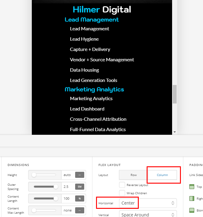
The Container and the rest of the elements have their own Flex options so you need to configure them separately. For instance, to center the Headline, you need to set the Flex Layout of the Container to Column

Again, because each element has its own Flex options, the Navigation Inline menu items will not automatically center. You need to set it up in the element.

With those examples, I hope you get the pattern now.

Hope that helps.

Thank you.

How do i do this?

https://gyazo.com/09844e4f0a59d5f5a115f58e524200c5

Hey Hans,

Please review the instructions:

You didn’t set the Container’s Flex Layout Horizontal to Center.

Thanks.

Thank you very much

it worked

You’re welcome, Hans.

This topic was automatically closed 10 days after the last reply. New replies are no longer allowed.