
Hi There @mmittal2000
Thanks for writing in! First of all, can you please try removing all of your custom CSS rules added to your site and test this issue further. Make sure to purge your server cache (if you’re using a caching plugin) and also clear your browser cache before testing. If you have a child theme setup, disable it temporarily as well and test.
Also please follow this video walkthrough here (https://www.youtube.com/watch?v=_ia5Lswi3ak) and make sure that your have setup your responsive text correctly.
If you’re still having issues, provide us with an example page URL to investigate your issue further.
Thanks!
This video has an option of setting -> Responsive text, that I dont see in Pro.
Also, there is no option of changing font size unit to calc or vm o anything as its a drop down in Pro theme,
This has been a big problem and I need quick help as most of the people are on mobile and they find it very very wiered. If needed, I can share the credentials.
Hello @mmittal2000,
Thanks for updating the thread. 
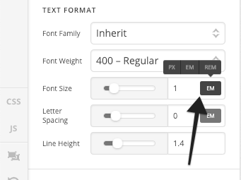
Please click on the Settings Cog icon and under Page Settings > Responsive Text. Here’s a screencast.
Please click on the unit value icon as shown in screenshot to change the font size in different units.
Thanks.
Adding a unit was already available and “Page Setting” is still not available.
My query is very basic and simple for PRO theme, that I have created header using cstomized header of Pro, and I want the text in top line as responsive, Could you please quickly help me resolve.
Its really showing very bad on mobile phones
Hi @mmittal2000,
Thanks for writing in!
Can you please send your website details so that we can have a look on to your issue.
Please provide following information:
Set it as Secure Note
- Link to your site
- WordPress Admin username / password
- FTP credentials
All the best!
This topic was automatically closed 10 days after the last reply. New replies are no longer allowed.
Hi,
Thank you for providing your login credentials.
To make your header responsive, you can utilize PRO Header visibility settings.

Add another ROW with exact same content but make your columns stack instead of inline.
Then make your original ROW to be visible only on desktop and the new ROW to be visible only in mobile.
I went ahead and added the row to give you an example.
You will be able to see it in action by clicking on this mobile icon and clicking on screen size on top

Additional Info:
Hope that helps