Header image full width

I’m looking for the best way to add a header image that scales for mobile. On this page http://skydivelangar-co-uk.ntc11-p1rea.seeinside.co.uk/experienced/ (you’ll need the password freefall to get in) I added a header image that’s a background to a section with min-height:450px; (otherwise it will collapse to almost no height on desktop).

It works OK on desktop but on mobile it only shows a tiny section from the center of the image, so that’s no good.

As a test at the bottom of the page is an ‘image’ element with VW 100 so it scales to 100% width. It works OK on mobile but on desktop it doesnt fill the width because the image element is constrained inside the column.

How best to achieve what I want?

Hello @redleaf,

Thanks for writing in!

Please be advised that the section height is dependent to the height of the row which is also dependent to the column height. To resolve this issue, please insert a row and one column and then set the minimum height of your column to 450 pixels. It is also best that you add a gap element in your column. Empty column tends to display nothing because of zero height.

We would love to know if this has worked for you. Thank you.

Sorry but that doesn’t really help and it could be I’m not explaining well. The height may not be relevant. What I want is for the image to fill 100% of the width on desktop and on mobile regardless of the height (the height can change between desktop and mobile).

Hello @redleaf,

I have checked the page and it is still the same structure.

To resolve this issue, please do the following:
1.) Insert a row and one column.
2.) And then, set the minimum height of your column to 450 pixels. And since you want fullscreen image, you will need to set a minimum height of 100vh in your column settings.
3.) It is also best that you add a gap element in your column. The empty column tends to display nothing because of zero height.

If nothing is helping, kindly provide us access to your site so that we can do these changes or give you an example of how to do it. Please create a secure note with the following info:
– Link to your site
– WordPress Admin username / password

To know how to create a secure note, please check this out: https://theme.co/apex/forum/t/how-to-get-support/288

Regards.

If I add a column I don’t see any inline CSS field for that? and if I set a height of 450 surely that wouldn’t work on mobile as the height would be less? I’m confused!

If you could do me an example on the page called “Experienced” I’d really appreciate it…

Hello @redleaf,

You do not need to add a custom element css. Just find the Minimum Height option in the column settings.

I went ahead and edited your page. Please check it now.

Hi Sorry - That’s not really doing what I want. I attach an image to try and show what I’m after…

Hey @redleaf,

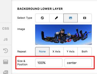
Sorry for the confusion. I have edited your page again and change the background size to 100% instead of cover. I then reset the minimum height if the column to 0 and I added a gap element so that on smaller screens, there will be enough space to display the background image.

And by the way, I would like you to try this demo here: https://davidwalsh.name/demo/background-size.html which would explain how background image works.

We use the background-image: cover; which would cover the whole area of the container. This is responsive enough which will always covers the whole area. The only thing to consider here is that if your image size is smaller, it will be stretch out and if you have a bigger image, it will get cut off.

Yes we can use background-size: 100% 100%; which is also responsive but your image will either be stretch out or get squeezed depending on the size of the container.

Yes we can also use background-size: 100% auto; but then as soon as you resize your browser or on smaller screen sizes, you will probably have white spaces around the image.

Or we can also use background-size: contain; but then this is not a good choice because you will see white spaces around your image.

If you want to specifically define the height of the column in each respective screen size, you can add more gap element with different height settings in the column. You just show/hide the gap element by utilizing the “Hide During Breakpoints” option. To know the “Hide During Breakpoints” option, please check this out: https://theme.co/apex/forum/t/hide-during-breakpoint-explained/17378

Hope this helps.

It’s better but still not usable. On desktop, with a large width, the top and bottom of the image are cropped off. On mobile there’s a huge white space above and below the image. I’m a bit surprised this is so complicated as it must be about the most common way to design a web site?

Hello @redleaf,

The background image became complicated because you have used it as a background image. I went ahead and edited your page again. I have removed your section and background image. I instead inserted an image element into the column.

Please check your page again.

It’s getting better! But now there’s a gap t the right when displayed on a wide desktop…

Hey @redleaf,

That happens because you set the Image element’s width to 1200px. Your image’s native width is 1500px though. That would still show the gap when viewing in a Full HD (1920 x 1080px) monitor. Please set the Width to 100% and upload an image that meets the monitor size you support. For example, if you support Full HD screens, upload an image with a native width of 1920px.

-----------------------------------------------------------------------------------

If you wish to continue with your small image, go back to the Section background setup and use percentage top padding value to maintain the aspect ratio of your image. I’ve created a test page in your site, please check the setup.

Hope that helps.

That’s great - thanks for the help.

You are most welcome!

This topic was automatically closed 10 days after the last reply. New replies are no longer allowed.