Header Builder: Logo size in Mobile

I need help in using your Header builder. The logo shrinks to a very small size in mobile devices.

How do you define different behaviors for the header in response to mobile/ tablet/ and desktop?

I would also like to now how make the “navigation inline” toggle with “navigation collapsed” according to display device.
Hello John,

Thanks for writing in!

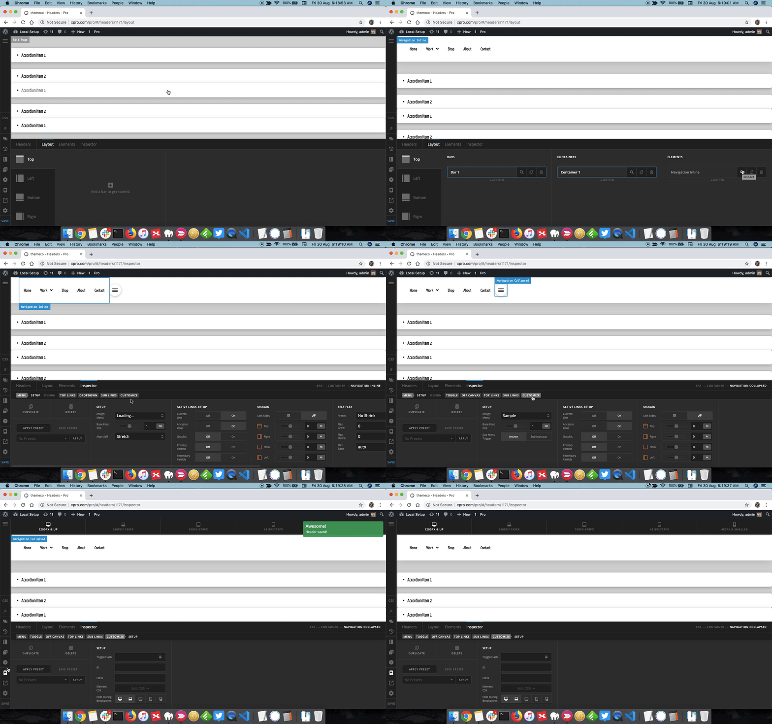
For this I would suggest you to use Hide During Breakpoint feature wherein you can design the element layout depending on the screen size. So let’s a you want . a specific look and feel for Desktop screen, in that case you can have the element showup only on desktop and hide on other screen sizes. Please take a look at following resource to learn more.

For this also I will suggest you to use Hide During breakpoint feature. You can have Navigation Inline display on Desktop and on mobile you can have Navigation Collapsed. Please see the screencast that I have recorded.

Thanks.

Thanks for the details!

You’re more than welcome, glad we could help.

Cheers!

This topic was automatically closed 10 days after the last reply. New replies are no longer allowed.