hi,
on my home page in the section “12 insane fields” the headline is centered but is not centered on mobile. How can it be centered on mobile and smaller?
Thanks
hi,
on my home page in the section “12 insane fields” the headline is centered but is not centered on mobile. How can it be centered on mobile and smaller?
Thanks
Hello There,
Thanks for writing in!
When I view your site in smaller screen, I am seeing this:

The headline is centered already. By the way, I noticed that you are using an older version of the theme. X 6.2.5 is now available in automatic updates! This release contains fixes for several issues so be sure to check out the changelog (https://theme.co/changelog/). Please do update to the latest version. After doing the updates, always remember to clear all caches when updating so that the code from the latest release is always in use. This will help you to avoid any potential errors.
Please let us know how it goes.
It is not centered on my phone see the image attached. 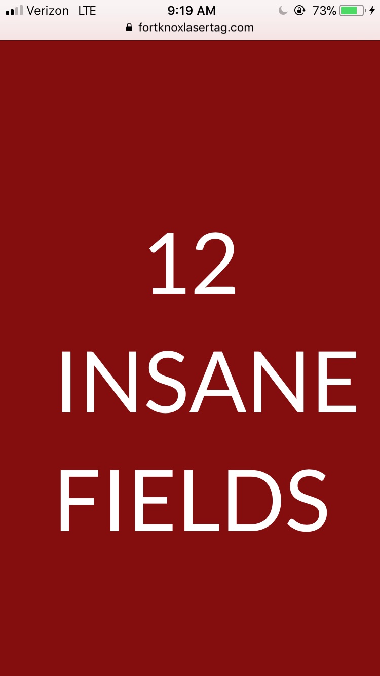
Hi There,
I could see that the headline text is too big on mobile version.
I recommend you to use the Responsive Text shortcode to make it smaller on mobile version:
Hope it helps 
thanks
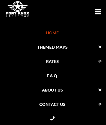
any reason why my mobile menu is now messed up?
The mobile menu i want centered text. How can i center that menu mobile text?
Also how can i have the menu lines be red?
Hi @fortknoxusa,
Looks okay on my end, except that yes, not centered. In that case, you can add this CSS too.
.x-navbar .mobile .x-nav li>a {
    text-align: center;
    border: 1px solid red;
}
You have existing custom CSS that alters the max-width of the navbar container, which is why there is no spacing. So I assume it’s intentional.
Thanks!
Hi
I did that and it is still not centered on mobile.
Hi @fortknoxusa,
It’s centered on my end, or perhaps you’re expecting a different center alignment?
Please provide further details about the alignment.
Thanks!
sorry i was talking about the section that says “12 insane fields” it is not centered on mobile. I tried doing responsive text but it’s still not working for me.
Hello There,
The headline is not centered because it does not fit with the container anymore. The font size is bigger which resulted to a wide headline element title.
You must apply responsive text for your headline and manage it in Settings > Responsive Text. To know more about responsive text, please check it from our knowledge base here:
https://community.theme.co/kb/shortcode-walkthrough-responsive-text/
http://demo.theme.co/integrity-1/shortcodes/responsive-text/
Hope this helps.
This topic was automatically closed 10 days after the last reply. New replies are no longer allowed.