Having featured image full width

Hi,
I would like the featured image on my pages to be full width. I have put the following code into the CSS

.single-post .entry-featured {
width:100%;
margin:0 auto;
display:block;
}

but i’m still finding images (such as Start Here - Planning tips - Choosing your holiday destination to be off centre. Can you help? If they can’t stretch right across, i’d be happy with them just being wider than the other blog post images but centre aligned.
Thanks

Hello @liz80y,

Thanks for writing in!

The given custom css will only work for the single blog post. If you want it to apply to the default pages, you will use this:

.page .entry-featured {
width:100%; 
margin:0 auto;
display:block;
}

The only problem is that the page template is wrap with a container that will not make the featured image totally fullwidth. You might want to change the page template to Layout - Fullwidth. To know more about the different page templates in the theme, please check this out:

Hop this helps.

Thanks for your reply.
I have followed your instructions and the options are there for changing the layout of the page but is there a similar option for the layout of a post? I have gone through and ticked anything that referred to full width. I think it’s probably right now. I think my images might not be wide enough which is causing the issue now. What code do I put in the CSS to make the featured image centred?

Thanks again for all your help.

Hey @liz80y,

There is no page template option for posts. A fullwidth featured image is not yet an option offered in our themes. In the future, with the planned Layout Builder feature, you will be able to create custom templates for a single post type and archives.

For now, I’ll show you a hack but please note that this will not be supported now nor in the future so if this doesn’t work on your end or this causes issues in your site, you need to consult with a third-party developer.

Please remove all the provided codes in this thread and add this new code in Theme Options > CSS.

.entry-thumb img {
    width:100%;
}

Then, add this code in Theme Options > JS.

(function($) {
	$('.single-post .entry-featured').insertAfter('.masthead');
})(jQuery);

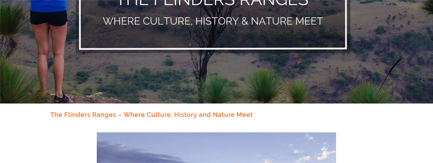
Below is a screenshot of the result:

As you can see, the hack uses Javascript and that is not the best way because Javascript conflicts coming from third-party scripts can break this override.

The best way is to override the template files. This, however, requires overriding more than 1 template file so I’ll only provide the template files that you need and the rest, you’ll need to learn how to override our themes using our theme customization guide at https://theme.co/apex/forum/t/customizations-best-practices/205

  • \wp-content\themes\x\framework\views\ethos\content.php
  • \wp-content\themes\x\framework\legacy\cranium\headers\views\ethos\wp-header.php

Hope that helps and thank you for understanding.

That’s great. Thanks for that.
I am trying to get the image sizes down while still being crisp. Some of these images are just not co-operating with being full width so is there code to make those particular images center aligned instead? For example. The featured image in ‘About Us’.

Thanks again.

Hello @liz80y,

To center the image like in your about us page, please add the following CSS code in the X > Theme Options > Global CSS (http://prntscr.com/evui3r)

.entry-featured,
.entry-featured .entry-thumb {
    text-align: center;
}

We would love to know if this has worked for you. Thank you.

This topic was automatically closed 10 days after the last reply. New replies are no longer allowed.