https://verobeach.marketing/news
How can I make the columns wrap for ipad mobile? They are all trying to squeeze in and are pushing off canvas.
https://verobeach.marketing/news
How can I make the columns wrap for ipad mobile? They are all trying to squeeze in and are pushing off canvas.
Hello @verobeachmarketing,
Thanks for asking. 
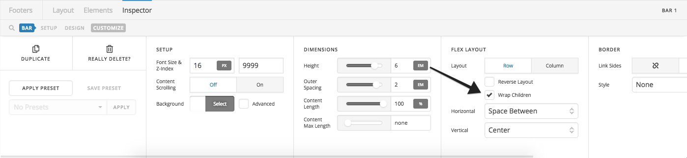
In your footer builder, open the Bar > Flex Layout select Wrap Children.
Thanks.
That does seem to help but some of the columns remain off the canvas.
Hi There,
Please watch the video below, this should help you understand how flexbox works.
Using Flexbox - you can skip to 12:40s mark.
Guide to Flexbox
Hope it helps,
Cheers!
I watched the video and I understand how it works. I tried changing some things but it is not doing what I want. The bar has wrap children, each container also has wrap children. They are not wrapping. I do not know what I am doing wrong. I have them all set to shrink and expand. Any help would be appreciated.
Hello There,
How should the footer looks like on the iPad? Does it needs to be the same look like the desktop screens? To assist you better with this issue, would you mind providing us the url of your site with login credentials so we can take a closer look at your footer settings?
To do this, you can create a secure note with the following info:
– Link to your site
– WordPress Admin username / password
To know how to create a secure note, please check this out: https://theme.co/apex/forum/t/how-to-get-support/288
Thank you.
https://verobeach.marketing/news/wp-admin
On iPad it could be two rows of two columns or one column with 4 rows.
I was just trying to get them to wrap under all in one column with 4 rows. A couple of them work but two do not.
Hi There,
I would like to check your website but it requires the authentication password.
Could you please provide them as well?

Many thanks.
I put additional info in the secure note. Thank you.
Hi,
Thank you for the login.
To make it 2 columns in ipad, you can add this in Header > CSS
@media(max-width:1200px) {
   .my-bar .x-bar-container {
       flex: 1 1 50%;
    }
}
If you want to make it 1 column in ipad, you can add this conde instead
@media(max-width:1200px) {
   .my-bar .x-bar-container {
       flex: 1 1 100%;
    }
}
I’ll list below some CSS/HTML resources that should help you to carry on these modifications on your own in the future:
Thanks
This works great for tablet but what about for mobile? How can I get it single column for mobile?
Initially, you can have multiple bars with different flex layout specific for each device. You can then hide the bars from devices by going to customize section and toggle on the Hide During Breakpoints option.

Then for mobile and tablet bars, you can change this setting to column

In summary, the header bar for mobile should be hidden from desktop and tablet, header bar for tablet should be hidden from mobile and desktop, and last, header bar for the desktop should be hidden from mobile and tablet. Which means 3 header bars. BUT, since you intend to have the same single column in tablet and mobile, then you can just use the same header bar making it just two header bars.
Example, this is First header bar for desktop

Then this second header bar for tablets, mobiles and other smaller devices

You don’t need CSS at all, but if you insist, then that CSS should work. Because the max-width means smaller than 1200px, which means it also covers mobile since it’s 767px. While min-width means greater-than.
Thanks!
makes sense, thank you
You’re welcome.
This topic was automatically closed 10 days after the last reply. New replies are no longer allowed.