I created a navigation using your pre-built template and noticed that the expandable menu still slide out to the side on mobile so you can’t see it. Can’t figure out how to change it either. Is there a simple setting I’m missing here?
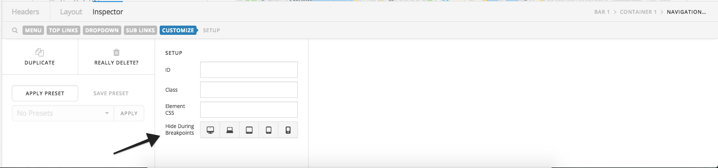
Rather then using navigation dropdown element, I suggest you to use Navigation Collapsed or Navigation Layered element for second and third level sub menu items. In case you want to show only on mobile devices then you can make the changes under Customize > Hide During Breakpoints.
You can learn more about Hide During Breakpoints in following article: