Hello, I seem to be unable to get rid of a ton of extraneous empty space between the entry header and entry content of this particular post - https://www.fondudes.com/the-10-essential-facts-about-pole-dancing/
Where is the space coming from and how do I control it at the source?
Jeremy
Hi there,
Actually that is not the space between the entry header and content. It is the padding/margin of the first section in the Cornerstone.
Please go to the options of the first section in the post and remove the padding/margin. It is 45 pixel now. For more information:
Thank you.
Thanks for your reply @christopher.amirian, the padding/margin of the cornerstone section wherein the post is nested is 0px, but there is still this persistent space beneath the post category, author, date etc. and the beginning of post content.
Hi There,
That padding is actually coming from the first section of your Cornerstone page.
Could you please try inspecting it and set the values accordingly.
As a temporary solution, you can add the following CSS rule into your page’s custom CSS area.
.el1.x-section {
    padding-top: 0;
}
Hope that helps.
Thanks!
Thanks for the prompt reply @mldarshana padding-top for .el1.x-section is indeed 0. I went ahead and put in the aforementioned CSS just to see what would happen and there was of course no result.
Hi There,
That’s weird because, on the front-end, the first section has a 45px top and bottom padding.
Please update the CSS code provided by Darshana to this:
.el1.x-section {
	padding-top: 0 !important;
}
If this does not work still, please provide us login credentials in a secure note so we can take a closer look.
Thanks,

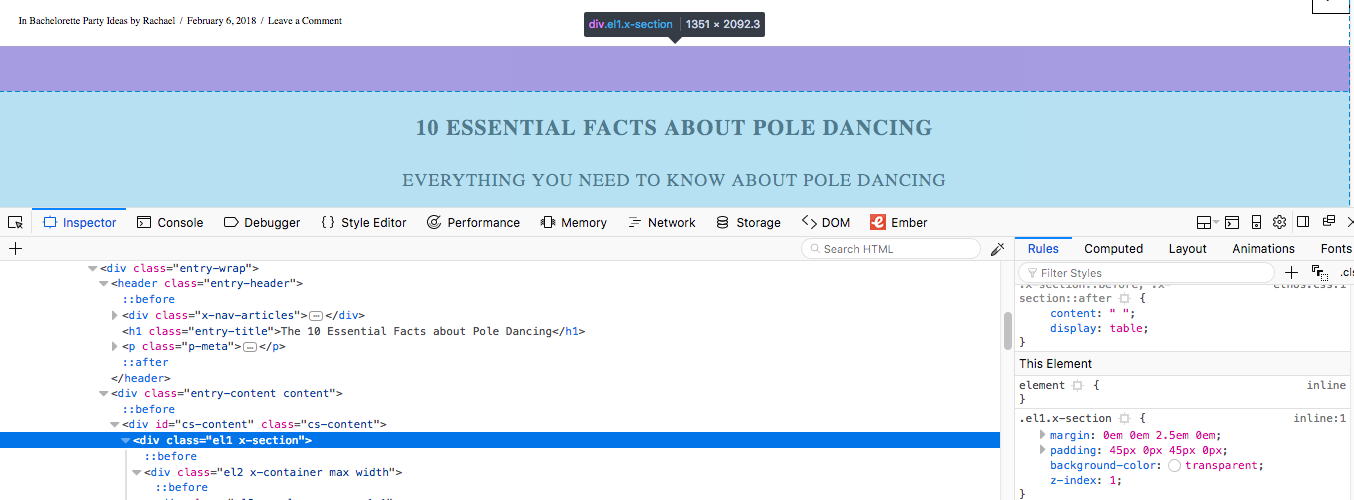
Thanks @friech. I did use the !imporant rule to no avail. Where are you seeing the padding is 45px? Attached is a screenshot of the code for .el1.x-section which shows padding as 0.
Hi There,
Yeah, I’m seeing that the first section’s padding is now set to 0. Did you already figure out the issue?
I did see 45px top and bottom padding on your first section before. You can actually it on the screenshot provided by Darshana above.
Maybe it’s a caching related perhaps?
Cheers!
I’m fiddling with the background of that section now to see how much of the empty space is associated with the area containing h1, date, etc. and the rest of the written content, and it appears there is space coming from both, however I can’t identify it in the source code. Anyway, it doesn’t look as bad now that I’ve plugged a background image in (which leads me to more questions, but I’ll save those for another thread). Thanks for everyone’s help!
Hi There,
Glad this sorted now, yes feel free to create a separate thread for your other queries.
Yes it looks closer now even without the bg-image that is because the padding 0 is already kicking in.
The remaining space between the first section and meta data is the default entry top margin, which you can adjust with the following custom CSS.
.single-post .entry-content {
	margin-top: 0;
}
The remaining bit space is the meta data line height.
And another thing, since you have wrapped that text below with an <h2> tag it also has a default top margin, which you can remove by adding a class mtn on it (e.g. <h2 class="mtn">)
<h2>Everything You Need to Know About Pole Dancing</h2>
Cheers!
Very informative @friech thank you so much! I’m fiddling with these now and observing the outcomes. Will start another thread.