Hello,
I’m attempting to center the mobile dropdown box in pro header mobile navigation. I would like the white box containing the links to be centered under the toggle.
Can you please help?
Thank you.
Hello,
I’m attempting to center the mobile dropdown box in pro header mobile navigation. I would like the white box containing the links to be centered under the toggle.
Can you please help?
Thank you.
Hello @StickAndGrow,
Thanks for asking. 
Please adjust the margin-right values of dropdown element from -2.5 to around -6em. Please see screenshot.
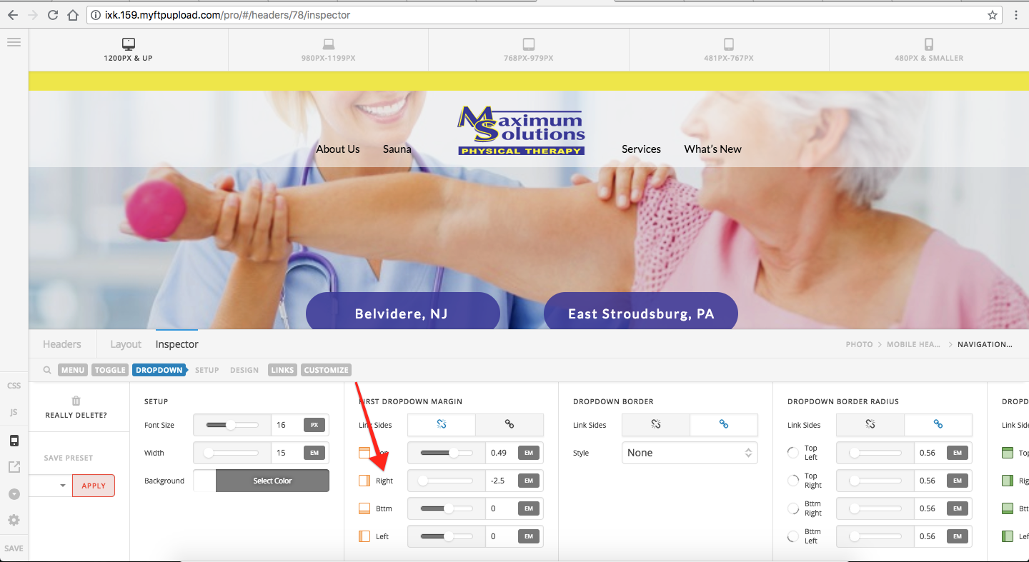
Thanks.
Thank you!
That fixes it for the 480px and smaller screens but throws it out of whack for 481-767. Do you have any suggestions to make it center on both that doesn’t require another break point?
Also, how do I make the drop down fall in front of the buttons instead of behind them?
Thanks!
Hi @StickAndGrow,
I suggest that you will utilize this hide base of screen sizes functionality. It will help you manage your design base on screensizes.
For more details, you could check the link below.
Hope it helps.
Let us know how it goes.
Thanks.
This topic was automatically closed 10 days after the last reply. New replies are no longer allowed.